Best Hotel Web Design Inspirations
As a web designer, you’ll sometimes be called upon to design websites for the hospitality industry, namely hotels. These are some of the toughest to design because you not only have to get the functional quotient right but also make them visually appealing. Hotel websites are visuals heavy because they need to tempt visitors to book a stay with the hotel. But they also need to be right up there on the functional scale to ensure visitors can book their accommodation easily and seamlessly.
This is a huge challenge but there are web designers who’ve not just designed effective hotel websites but ensured these sites act as an inspiration for other designers tasked with designing hotel websites.
Here’s taking a look at some of these sites:
01. Jannah

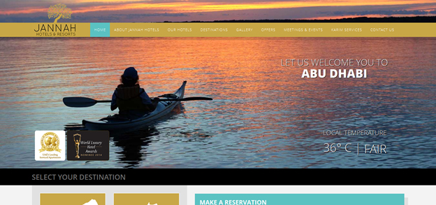
Welcoming onsite visitors with some fantastic images of Abu Dhabi and its attractions, the Jannah Hotels & Resorts website is a study in visual appeal. Built within a responsive framework using HTML5, this one is a neat and clean website that doesn’t try too hard to make an impression. With large background images being used as the centerpiece of the website visuals, there is still a lot of space available to focus on the functional aspects of the website.
02. Castle Gravenhof

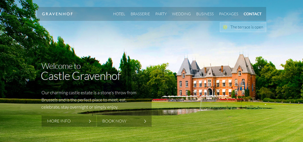
A fantastic image of the hotel greets visitors when they open the site; this is an image that is not just visually stunning but intensely captivating. This image forms the background of the page layout and the website’s long scrolling page take you through all the facilities of the hotel; and all this happens on the homepage. This website is a textbook case of how even a simple design can look immensely impressive.
03. Atlantis – The Palm

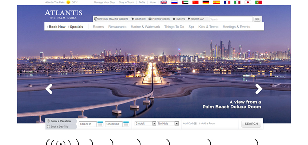
Atlantis – The Palm is a sprawling hotel in Dubai and has an amazing architectural design. The scrolling photographs on the website’s hero area are visually striking and focus on the hotel and all that it brings to the table. Ease of navigation and a convenient online booking system means the website meets all the functional benchmarks as well.
04. Plein Ciel and Tourelles Hotels

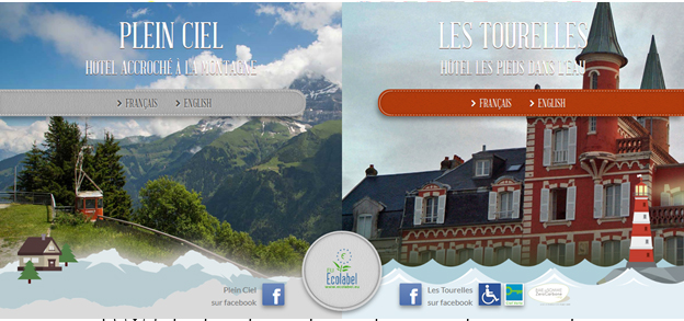
The first thing you notice when you open this website for two very prestigious hotels is that designers have tried to do away with the ‘squares’ and ‘rectangles’ usually associated with the layout of web pages. The focus is on rich graphics with responsive design and enhancing it with parallax scoring to boost the visual impact of the design.
05. Z Ocean Hotel

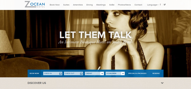
What this hotel website does excellently is it uses a simplistic design to showcase the intimacy it offers as a boutique hotel. The use of perfectly relevant images with an inherently seductive quality about them and the use of clickable content boxes that offer images of its amenities persuade visitors to know more about this hotel. The imagery and the functionality capture the essence of the hotel and what it aims to provide brilliantly.
06. Kentisbury Grange

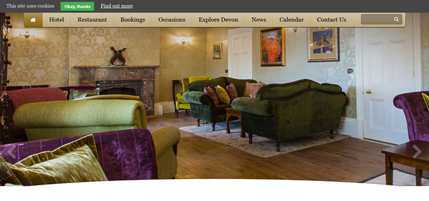
Pièce de résistance of the Kentisbury Grange website is its images slide show that showcases the attractions of the hotel. With some good use of color that in a way aligns with the imagery of the slideshow and a page packed with useful information in an easily consumable format, you have a website that is impressive and functional – a perfect combination for a hotel site.
07. Farmerhaus

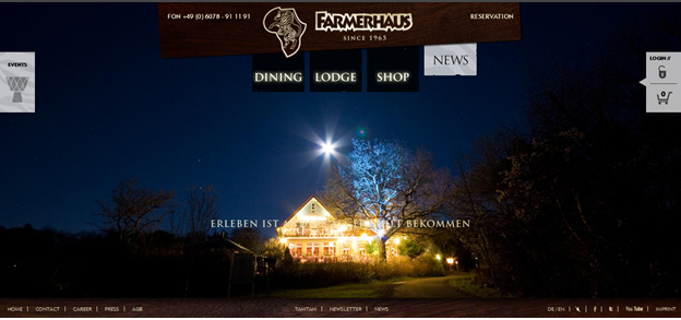
Farmerhaus is a South African restaurant and African Art hotel that is very proud of what it does. This pride is reflected through its website design. A major portion of the layout is occupied with large images of the property and these high resolution images show the hotel and the facilities it is offering in all their glory. The navigation is fairly simple with clickable buttons taking you to the ‘dining’, ‘lodge’ and ‘shop’ sections of the site.
08. Gramercy Park Hotel

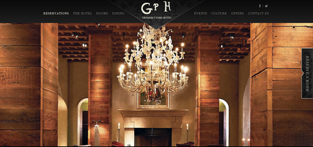
Gramercy Park is an iconic hotel and the website highlights this fact exceedingly well. This website is right up there on the creativity scale and designers have used a series of digital interactions on the site to display the creative spirit of the hotel. And everything comes together on a visually stunning parallax homepage that is a delight to go through.
09. Mina Seyahi Beach Resort and Marina

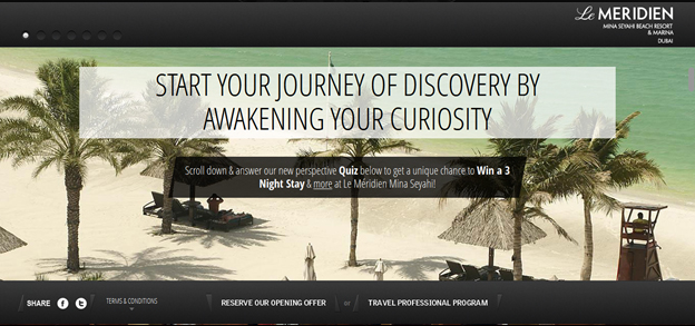
This one is a hotel belonging to the Le MERIDIEN Group. The hotel has won accolades for its fantastic hospitality and the website does a very good job of becoming an appropriate brand vehicle. As visitors keep scrolling down the homepage, they are greeted with great visuals that tell you why this hotel is one of the best in business. It is an attractive website that does full justice to the Le MERIDIEN brand.
10. Murmuri

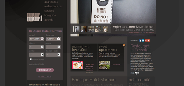
This one is a busy website with lots of things happening on it. It’s creative, innovative and the focus is on interactive elements to up the engagement ante of website visitors. The one great aspect of the site is that the busyness of the site doesn’t lead to clutter.
11. MacAllan Ridge

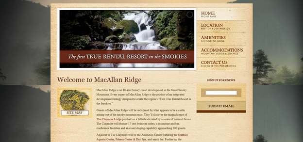
MacAllan Ridge is a Smoky Mountains rental resort and the textured website captures this fact well. It is a no-nonsense website that makes its point with zero flash and simple navigation. With its underlying simplicity, it persuades you to take a well-deserved break at the resort.
12. Kahala Resort

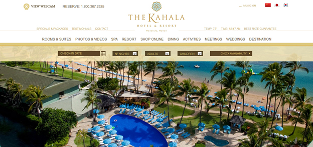
A deep understated elegance emanates from the website design of Kahala Hotel & Resort, Honolulu, Hawaii. One look at the imagery and you want to use the booking system. It gives you all the information you need about the luxury resort in a manner that is easy to access and consume. There is a use of lots of whitespace that makes this website look clean and beautiful, very much like what Hawaii is all about.
13. Bellagio

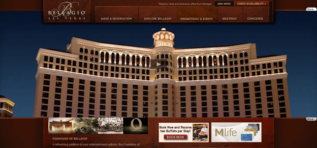
Think hotels, think Bellagio, think Las Vegas. The Bellagio is a magnificent hotel and the website captures this magnificence in its entirety. This is done by presenting the foundation of Bellagio in video format on the site. You know you want to a piece of this hotel when you take a look at the site.
14. Ace Hotel

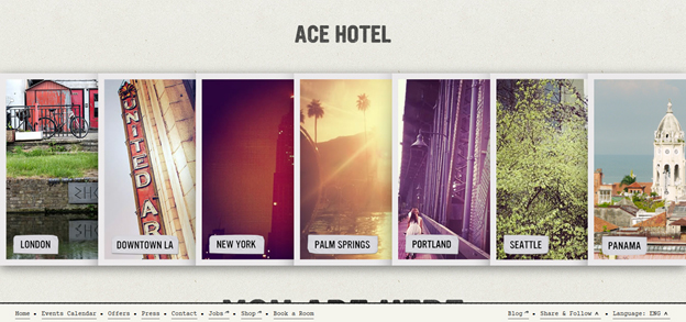
A chain of hotels aimed at the arty types, the vintage designing style makes no bones about it. A different kind of Polaroid effect is used to take visitors to different hotels. It’s out-of-the-box thinking at its best and still displays a certain kind of simplicity. It is this that works big time for the design.
15. Little Palm Island Resort & Spa

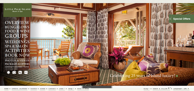
The whole idea behind a hotel website is that it should capture the ambiance of the hotel, its atmosphere, and the mood. This is something that the Little Palm Island Resort and Spa website do extremely well. The tour de force of the site are the large images of the hotel interiors that are not just visually impressive but give visitors an idea about the amenities provided by the hotel.
Conclusion
So, there you have it – A list of 15 hotel websites for your inspiration if you are ever called on to design a website for a hotel. Even if you aren’t, the fact that these sites subscribe to the best web design standards and designing techniques means they can provide the ideal inspiration for designing just about any kind of site.
