Best Video Game Web Designs
Video games are more than just a pastime. For many, they are art, beauty and social activities all rolled into one. There is much more that goes into a video game than the untrained eye will see. This is one reason why many video game websites are just as stunning. A great website design will show the attention to detail and artistry that was also put into the game.
So here we have our picks for the top 10 video game web designs :
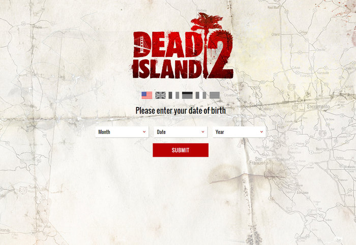
Dead Island: Riptide
First you are required to verify your age (per the game’s ESRB rating) and then you enter a beautiful, interactive site that just jumps right off the screen at you. There is a large, full screen slider at the top that moves from left to right with brightly colored images and screenshots from the game. You can also scroll down with your mouse to access different bits of content. The modern design and meshing of the colors and interactive features make this a great design.
Borderlands 2
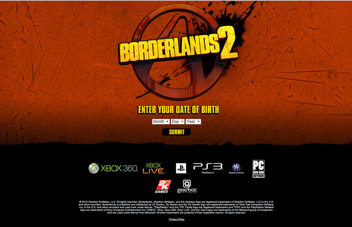
The colorful, cartoony shoot-and-loot game has a website that is just as fantastic. It brings the comic book feel to it and has an interesting side-scrolling navigation that is fun and easy to read. All the content you need is there; video, screenshots, wallpaper, media files, ringtones, character info and much more.
Halo Waypoint
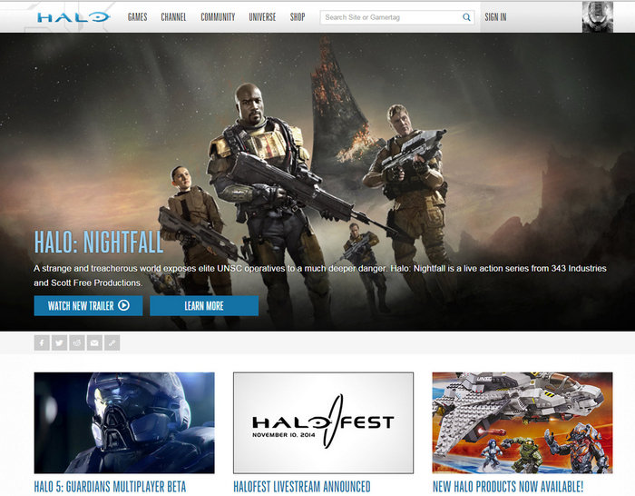
Everything about this website is going to make you want to play Halo. The theme matches the game yet is clean and simple so you find everything you need. The creativity and style of the game is brought in directly to the website and you also have the community experience such as game stats, leaderboards, forums and blogs. It’s not just a website, it’s a gaming community.
LEGO
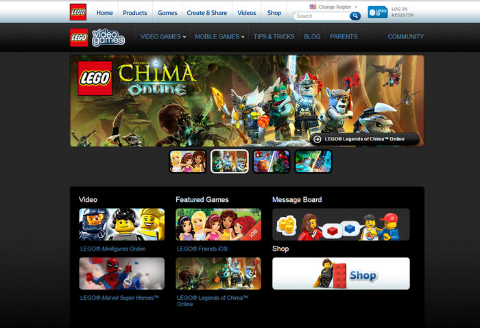
LEGO has a kid-friendly design that parents and LEGO fans of all ages will appreciate. The style is clean with good organization so you find just what you’re looking for. Featured games are displayed at the top with a good-sized slider of colorful images to catch the eye. It’s a simple, but very effective design.
Animal Crossing
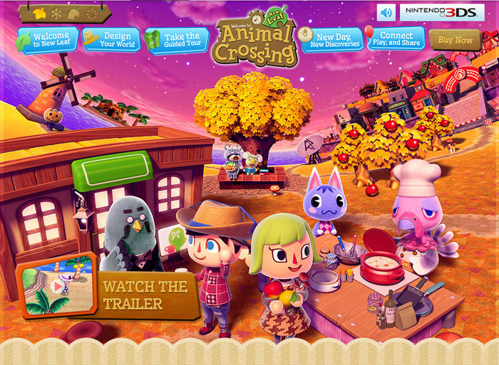
New Leaf – Here’s another kid design done well. You are greeted with game music in the background, the option to instantly view the trailer and bright colorful representations of the game characters fans are sure to recognize right away. The best part of this site design is all the animation and guided tours.
Watch Dogs
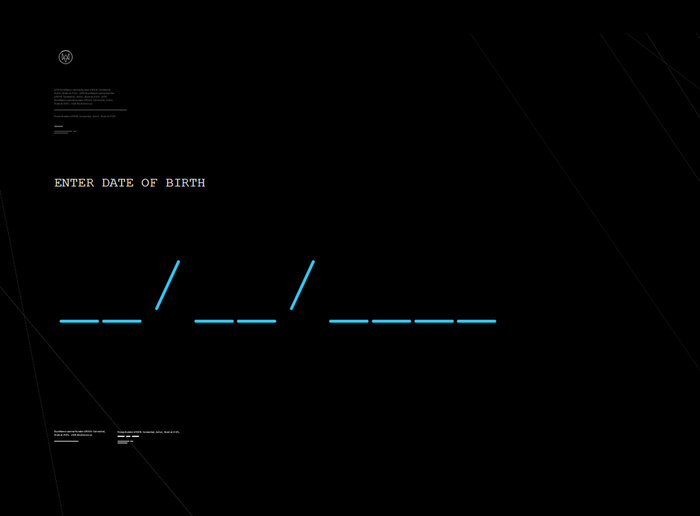
You will be required to enter your date of birth to gain access to the site (per the game’s ESRB rating). Even this process follows the theme of the game itself and is very interactive. Game trailers are big, bold and prominently displayed. The navigation is clean and crisp and it’s easy to find what you’re looking for. The layout is more intricate than many game websites but is done professionally and is not overwhelming. The videos play seamlessly.
Battlefield 4
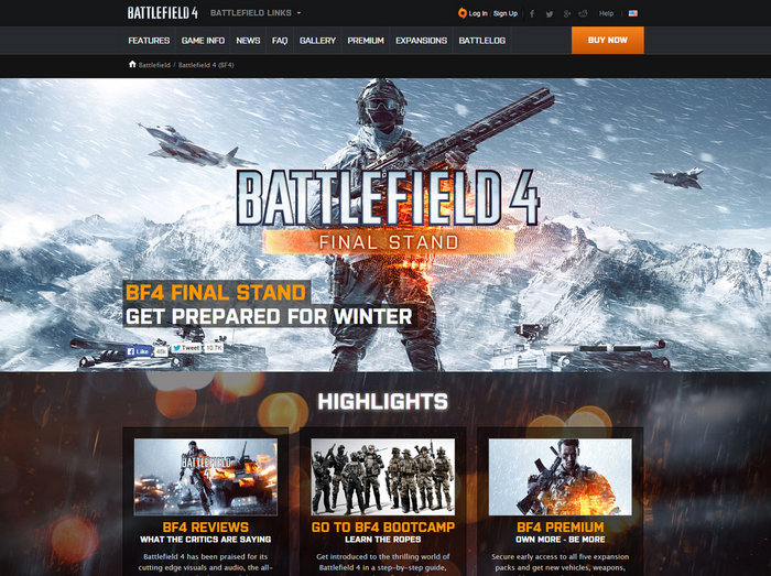
The website is beautifully done, just like the game, and it has more than just good looks. Navigation is simple and clean. It has a crisp but dark theme to match the game, it has many great and useful features, game highlights, and the ability to log in to Origin for playing the game right there at your fingertips.
Plants Vs. Zombies
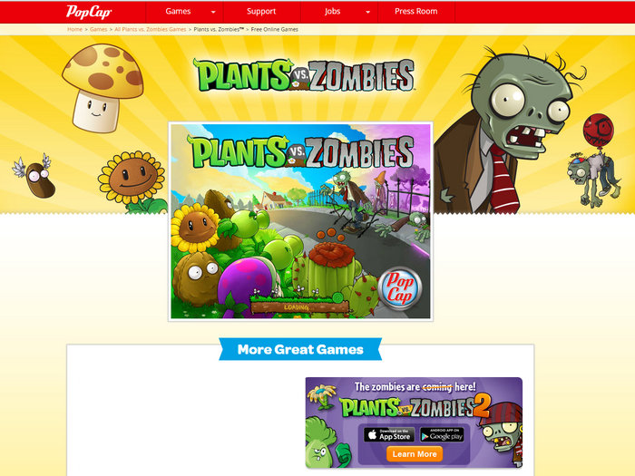
Great design that also allows you to play a browser version of the game directly on the site. PopCap does a good job bringing in all the colors and elements of this best-selling game to the website as well. It has all the important stuff you need to know right on one page, making a simple design that gives you everything you need in one place.
Zelda
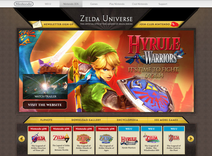
The Zelda website, much like the game itself, is crisp, clean and beautiful. It has a great use of graphics and colors, makes good use of the space, contains rich content but without being too “busy”. It has a speedy load time and options to scroll through every Zelda game for more info.
Wolfenstein
The New Order – Here we see creativity to the max with a fade-out feature and one page design. The background images make it all pop and it’s not hiding in the dark with a black or black/grey color scheme. Everything is right in one place and all you have to do is scroll down to see all the great content. It’s vibrant and creative but simple and resourceful at the same time.
