There are two primary reasons why a trucking company needs a website. First, a website is the most effective means for a company to generate business revenue. New customers are more likely to find you during their online search for a trucking company if you have an internet presence. Second, the internet is an excellent tool for locating qualified truck drivers. While advertising a job opening on a site may bring in a few applicants, it would be far better if there were a way for them to learn more about your company.
To build a good trucking website, you need to make it easy to navigate as an effective marketing tool and provide relevant information about your trucking business. Check out our list of the best trucking website designs to get inspiration for your next project.
Our Top Choices for Trucking Websites
1. MCO Transport Inc.
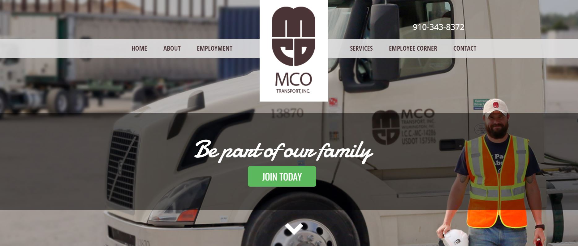
A visitor can tell right away that MCO Transport’s website is primarily designed to attract new drivers. Take a look at the components that the designer used to make this goal clear.
What We Like About It
The majority of trucking websites include photos of their trucks in the header. It is, after all, one of the most crucial aspects of the trucking business. In this case, however, the truck acts as the background image for one of MCO Transport’s drivers on the website. This element shows users that the website’s primary goal is to serve as a driver application portal.
If this objective isn’t clear yet, the hero text will certainly persuade you. Instead of a company tagline, it says, “Be part of our family,” In addition, the most prominent CTA button encourages visitors to “Join Today.”
Moreover, you can see a photo slideshow of a handful of the company’s drivers below the fold. Each image takes up the whole screen. Also, the designer places a quote from each driver explaining why they enjoy working with MCU. This section demonstrates that the company knows its drivers by name and treats them like family. After each quote, the same green “Join our Family” button appears.
Furthermore, you can find additional driver-related links in the navigation bar. By selecting a link from the drop-down menu, interested applicants can learn more about the benefits of working for this company. They can also submit their applications online using the Employment option.
2. Specialized Inc.
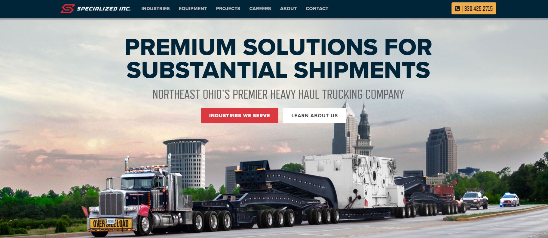
Not all trucks are the same. Therefore, a trucking website must identify the kind of equipment it offers so that visitors looking at the website can immediately see if you have what they require. This is especially true for businesses such as Specialized Inc.
What We Like About It
Specialized Inc. supplies large corporations with specialized transportation services. They collaborate with businesses in various industries, including power generation, injection molding, bespoke fabrication, and more. In addition, its trucks transport delicate equipment such as industrial boilers, mining gear, etc. That is why their website includes information on the many types of vehicles they sell and the various industries they cater to.
You can also see a portfolio of Specialized Inc.’s prior work on the company’s website. The images and descriptions are categorized into several industries. The portfolio shows a photo of how the transformer was loaded onto the truck. The text beneath it provides more contextual information. It outlines the key challenges that the company had to overcome for the project. These are essential details for businesses that have similar items for transport.
The website’s Equipment page is another helpful resource. This is where potential consumers can look at the many types of trucks that the firm owns. Each truck type comes with an image of the vehicle and its capacity and loadable deck space.
It also specifies the unique characteristics of each piece of equipment, such as the capacity to steer remotely or the availability of perimeter frames.
3. Sarens Group
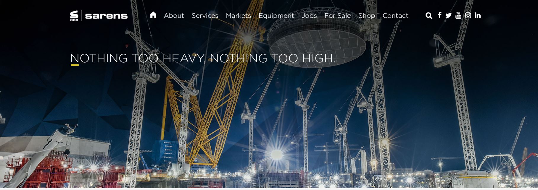
Driving a massive trailer is a daunting task. When you consider how difficult it is to transport an object worth millions of dollars, you can see why trucking is a serious industry. This sector needs the most advanced equipment and highly trained drivers. If you have those two elements, make sure to display them on your website prominently. On the Sarens Group website, you can see how to achieve this.
What We Like About It
When it comes to transportation, Sarens is a global leader. It offers transportation services to both small and major engineering firms across the world. In addition, the website’s writers create news stories about finished projects to highlight the company’s competence. Each article includes information on the job’s location and the firm with whom Sarens collaborated. It also discusses the company’s solutions as well as the equipment used,
Furthermore, all of the pieces provide information about the weight and dimensions of the items being transported. In this manner, if a future client wants to transport a comparable product, they will already be aware that this firm possesses the necessary expertise and equipment.
The website also has an Awards section that lists its achievements in the last three years. In addition to the certificates, the gallery also includes photos of the Sarens team receiving the prizes. This is an excellent way to put faces to the names of the company’s executives.
4. Vitesse Transport
You want to promote your company and its services in a distinctive way so that visitors remember you. It’s not enough to use a generic template if you want to stand out in a crowded market. Vitesse Transport’s website had a few tricks up its sleeve to make visitors remember its brand. These include animation, a bold color scheme, and a short video advertisement.
What We Like About It
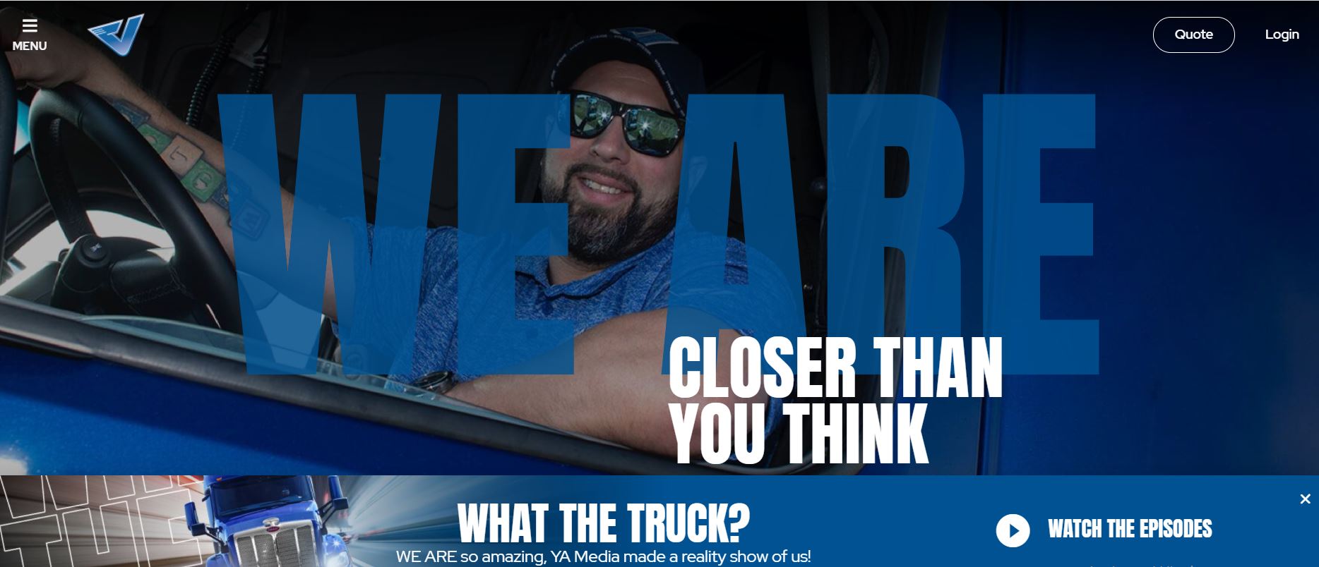
The two words that come to mind when looking at the Vitesse Transport website are cool and sleek. It’s a far cry from the standard trucking website, which has a white backdrop and static images. Instead, the color scheme for the entire website is blue and black. The designer uses the same shade of blue as the company’s vehicles.
Moreover, the hero seamlessly transitions from one stunning truck shot to the next. Also, the words “We are” are boldly written on top of the photos. Since the font is so huge, the words take up the whole screen. Aside from that, the two words are incorporated into several taglines that vary every few seconds. For example, one slogan reads, “We are leading the way,” and another is, “We are closer than you think.” There is also a link to explore the company’s services right beneath the tagline.
Visitors can find an advertisement for the company just below the fold. This fast-paced, professionally filmed video highlights the company’s vehicles, services, and employees. It also reiterates the company’s core values.
Furthermore, animated texts accompany the various sections on the webpage. Some glide in from the sides of the screen, while others move circularly. Scrolling triggers each animation, giving the webpage a dynamic appeal. The text, combined with dramatically illuminated images of the company’s trucks, works to keep the visitors’ attention.
A slide-out sidebar allows the user to make the most of the available screen space without sacrificing ease of navigation. In addition, the sidebar includes all of the links to the website’s relevant sections and the company’s social media accounts.
Conclusion
If your website’s primary purpose is to recruit drivers, you’ll want to make the application process as simple as possible for visitors. For this purpose, it’s a good idea to have clearly designated buttons and links to start the application process.
On the other hand, if you intend for the website to attract more customers, it should emphasize its expertise and the quality of its vehicles. Visitors will be able to tell the level of service they can anticipate from your trucking company if you have a gallery of awards or a blog about the firm’s previous projects.


