As a stock advisor, your job is to teach people how to get maximum returns from their investments. However, the industry is becoming increasingly competitive, and you must remain visible. So how are you supposed to get people to trust you not to lose their money? Your skills, of course, speak for themselves, but a well-designed internet presence is also critical.
An attractive website is your best chance to make a solid first impression. People are more likely to trust you if you have a professional-looking website design. In short, you need a website that is both aesthetically pleasing and easy to navigate.
Let’s look at some of the best stock advice websites and the design choices they have made.
1. Trade Ideas
Trade Ideas claims to be unique in that it is the only stock platform that teaches you how to trade and invest. Its website design draws you in immediately.
They have put in a lot of effort to make the website accessible. Therefore, the website boasts easy navigation with an enticing user-friendly interface.

What We Like About It
As soon as you get to the homepage, the dynamic background catches your attention. Atop that background is an explanation of their simulation program that teaches you how to invest in stocks. You can download the software here or get TI for the web. The top menu has options for navigation as well as log in.
In terms of inclusivity, the website design is one of a kind. On the right side, they’ve put an accessibility button with language options and modes for seizure safety, ADHD friendliness, and so on. You can get instant answers by clicking on the questions & answers button on the bottom left. Finally, there’s a strip with a list of stocks to keep an eye on.
The next section showcases their awards and recent updates. They also explain the tools that can help you in trade management. This section covers more detailed information about their program. If you scroll down a little, you’ll see a list of their users and testimonials. You can also sign up for their newsletter through the website.
2. Robinhood
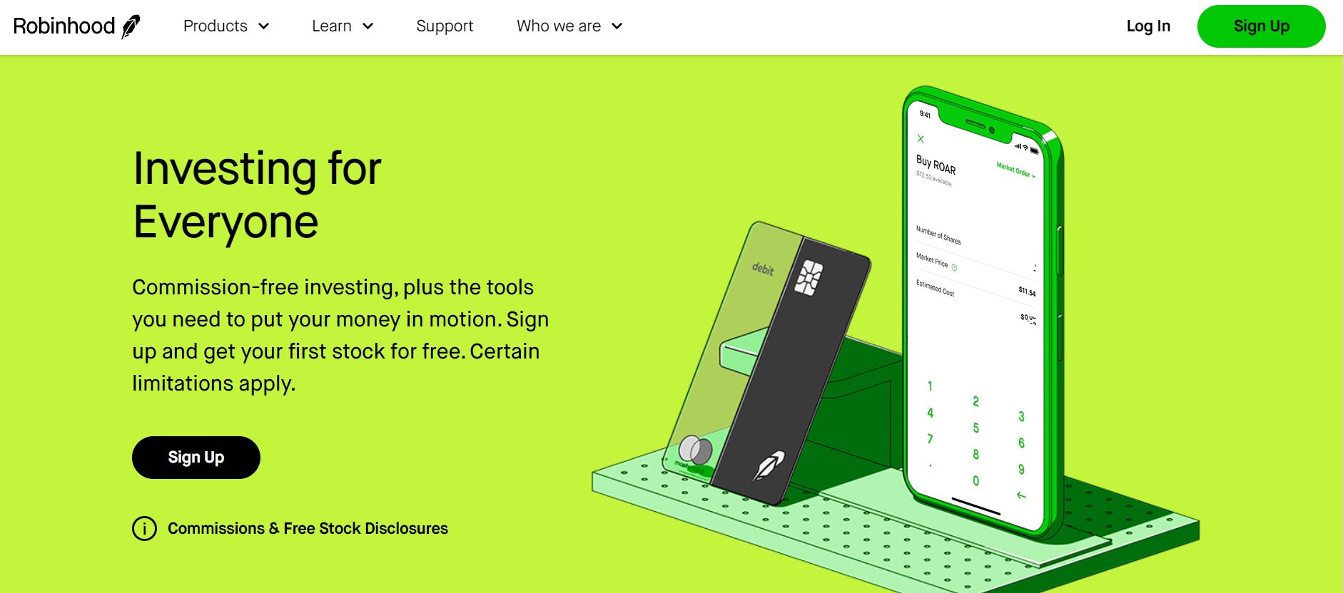
Robinhood is an investment service that helps you trade stocks. With its emphasis on green, the color scheme is reminiscent of the actual Robinhood. Overall, the website has a clean, modern design that is easy to navigate.
What We Like About It
A sticky navigation menu featuring product options, learn, support, and “Who We Are” sections can be found on the Robinhood website. It also allows you to make a new account or log in to your old one. The homepage header features a mobile phone with the app’s interface. They also display an offer for free stocks on the header.
Right below the header is the fee schedule. They offer IPO access along with added benefits. The rest of the webpage covers all the services they offer. You can also learn about their services like cash management, stocks, funds, gold & cryptocurrency.
The footer provides quick links to help you browse the website. You can also subscribe to their newsletter and read up on their policies. Finally, the bottom of the page covers disclaimers and copyright disclosures.
3. The Motley Fool
The Motley Fool is one of the top-rated stock advisors in the field. Their website has a clean design with a simplistic color scheme that goes well with their concept. The website interface is user-friendly, and even a beginner can easily find their way around. In addition to all that, the website has plenty of resources to help people understand how and when to invest.
What We Like About It
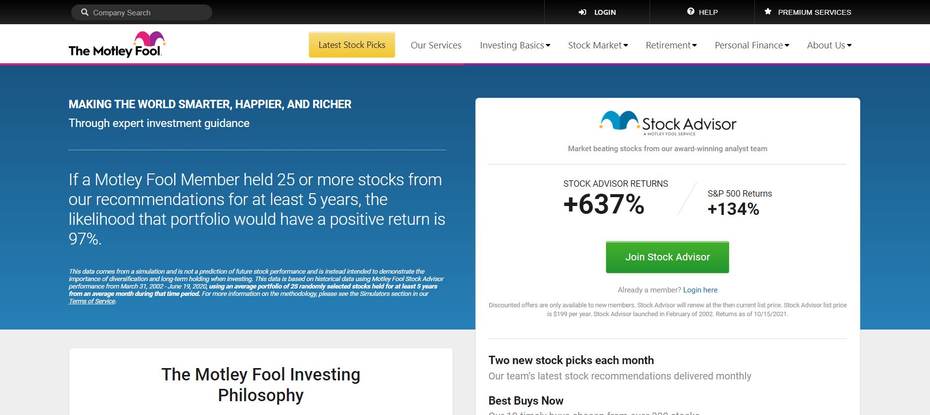
The Motley Fool website has a sticky navigation menu with a search function that makes it easy to find certain information. You can also use it to log in, see the latest stock picks, learn about their services, and more.
The header section discusses the advantages of investing with The Motley Fool. It includes the average percentage of the returns and a graph depicting their returns over the years. Visitors can also read about their investment philosophy on the home page.
The website designer has included an information section featuring stock-related articles along with expert opinions. You can also access their best-performing stocks and choose to invest in them. Moreover, they offer brokerage, investing, retirement, and other such services. You can click on any of these thumbnails, and the website will redirect you to the relevant page.
The final section is dedicated to information about The Motley Fool. The footer has quick links for navigation as well as links to their social media pages. You may also learn more about their legal policies by clicking here.
4. American Association of Individual Investors
The AAII is an independent organization focused on helping investors make profitable investments. They have gone with a basic website layout with all of their information presented in clear boxes. This keeps the information from getting jumbled.
Overall, all of the information is easy to access, and the limited call-to-actions mean people don’t get distracted.
What We Like About It
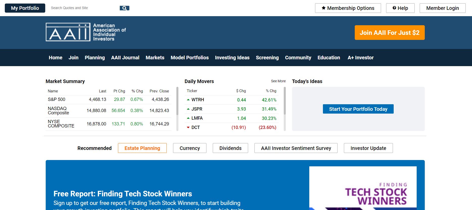
The AAII website allows you to sign up for the platform directly from the homepage. You can use the top menu to access your portfolio, get membership options, contact support, or log in. The sticky navigation menu has quick links to the entire website. You can click on any one of them to get to your desired page.
Below the menu are sections like the market summary, daily movers, and today’s ideas. They offer a free report of the tech stock winners that you can get by entering your email address. The next section covers all of their articles. Your portfolio, stock screens, preferences, and library are also accessible from this page.
Immediately after this, you can see a section that covers all the services they offer. You can click on any of these for more information. Moreover, you can see upcoming events or even find your community through the websites.
The footer has links divided into popular resources, more on AAII.com, popular AAII products, and popular AAII chapters. You can also learn about AAII and its policies here. As you scroll down, you will see an orange strip stating their members’ number and fee. You can click here to register yourself.
5. Junior Stock Review
Junior Stock Review is a stock advisory service with an aesthetic platform. The website makes use of bold colors to highlight its services. With its clean design, the website is quite easy to navigate. In addition, the website has a clear cookie warning and incredible functionality.

What We Like About It
By signing up with your email, you can receive the latest updates and reviews in your inbox for free. The top menu has options for premium subscriptions, about, previews, contact, and member’s area. Below that, you can see that the registrations are open for the latest seminars or other events that might pop up.
The header itself features a picture of the city with a caption for finding your financial freedom. If you scroll below that, you will see information about Junior Stock Review and its media features. You can use the search option to find all of the information you need. The best part? You may also use filters to narrow down your search.
The next section covers conversations with experts in their fields and various CEOs, although these are only available with a paid subscription. Furthermore, there are status reports on various businesses. You can contact them for queries through the form given in the section. Finally, the footer has links to reviews and web pages relevant to the website.
6. Edelweiss
Edelweiss is a smart investing service that guides you through the entire process. They have a decent color scheme, so the interface isn’t jarring to look at.
In addition, they have divided their information and delegated it to different pages. This means the visitor is not overwhelmed as soon as they get to the website.
What We Like About It
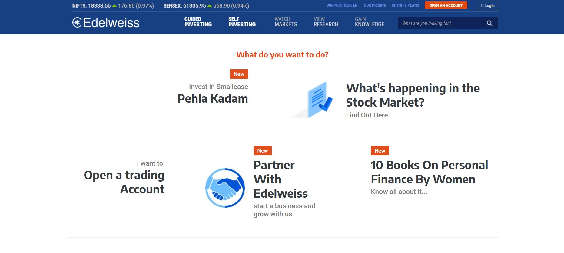
The Edelweiss website has a sticky navigation menu displaying the latest stock prices and links to the support center, pricing, and infinity plans. You can open your own account using the strip. The menu also includes a search feature along with additional navigation links.
The body of the website features links that you can click on depending on what you need. This includes links for investing, finding out what’s happening in the stock market, opening a trading account, partnering with Edelweiss, and more.
There’s also a strip right above the footer, which includes links to their FAQ section and contact details. You can use this to submit complaints to their support team. Finally, the footer itself features reasons why you should invest in them, along with a few navigation links.
Conclusion
That concludes our list. To design the right stock advice website, you should focus on the content you want to present. This includes market data and stats from your previous projects. Visitors must believe that you can help them make money. That is why a professional, easy-to-navigate interface is the way to go.
A cheap site can easily scare off potential clients, while an interface that is too sophisticated to use can throw them off. So feel free to take inspiration from the websites and get yourself the best stock advice website.


