Sport is a diversified sector with the power to bring people together. There is no standard template for developing a sports website, as the design varies depending on what your site contains. You must create a design that is appropriate for the services you plan to offer.
Are you stumped as to where to begin? Take a look at some well-known sports websites to choose what you want to feature on your own. We dug deep into the internet to find the best designs for you to use as inspiration.
1. Wimbledon
Wimbledon is the world’s most prestigious tennis tournament, and its website is up to par with its illustrious reputation. The website includes valuable information such as tournament dates, highlights from previous games, and more. It also helps fans stay up to date on the latest scores.
What We Like About It
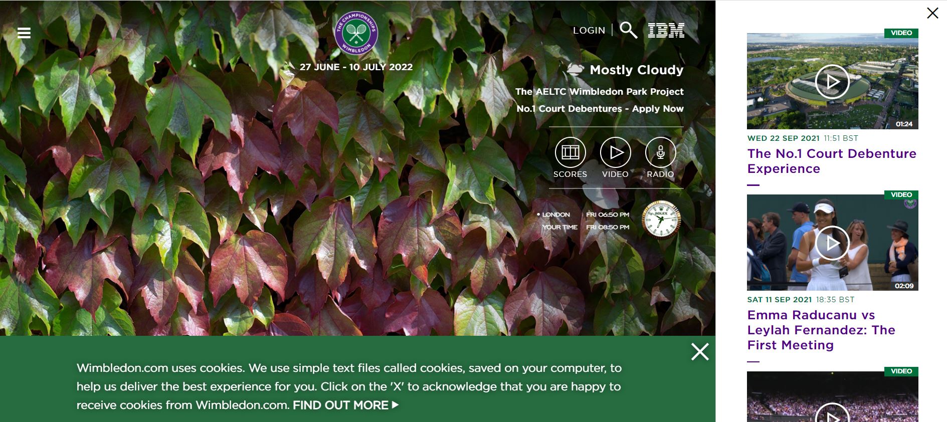
When you land on the homepage, a montage of photos from prior championships appears in the header. You can use the search option to navigate the website. In this section, the website also displays the current weather and time in London.
On the right side, there is a strip with videos to watch. What makes Wimbledon stand out is that they have ditched the top menu. Instead, you can access a slide-in menu by clicking the menu option at the top-left. Tickets, shops, apps, championships, museums & tours, and more are accessible via this menu.
The remainder of the homepage is devoted to Wimbledon news. You can use the links from the menu to filter information such as news, videos, images, and players. The footer also includes links to their social media accounts. Lastly, you can find information about job openings, contact details, media, and privacy policies at the bottom.
2. NBA
The NBA, or National Basketball Association, is the most prestigious men’s basketball league globally. As a result, it wouldn’t be unfair to expect them to have a top-notch website. Well, the NBA has certainly delivered. Their website is professional from start to finish, with all the information presented in an accessible fashion.
What We Like About It
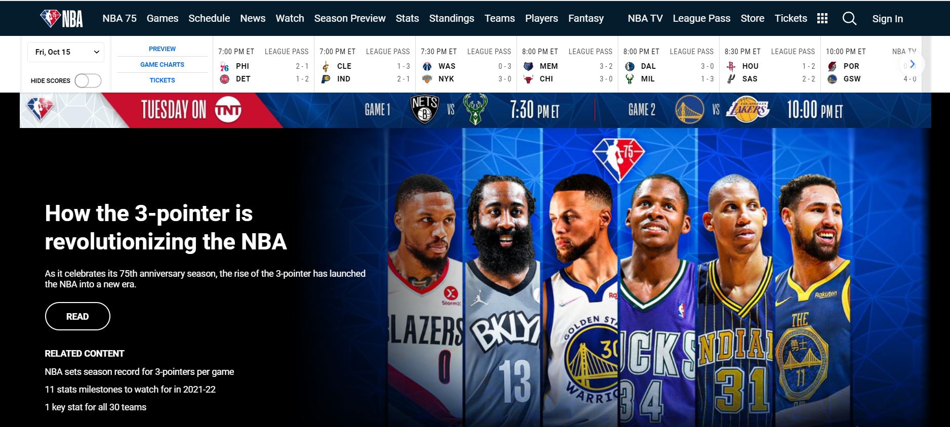
A sticky navigation menu is located at the top of the webpage. Games, Schedules, News, Watch a Game, Stats, Standings, Teams, Players, Hall of Fame, Fantasy, and NBABet, are all available on the menu. You can also use it to get tickets, watch NBA TV, get league passes, and shop in the store.
Furthermore, you can see highlights and snippets from the hall of fame in the website’s header. Headlines, 2021 Hall of Fame, Features, League Info, Career Retrospectives, Trending Now, Best Plays, and NBA TV Features are among the sections that make up the rest of the page. On top of that, each team’s statistics, including wins and losses, are also displayed on the homepage.
The NBA’s website also allows fans to sign up for premium membership. The NBA Organization, NBA Initiatives, Across The League, Shop, and Subscriptions are listed in the footer as quick links for navigating the website. In addition, the social networking links, along with customer support and privacy rules, are given at the bottom of the page.
3. Manchester City FC
Manchester City FC is an English soccer club that plays in the Premier League, the country’s top league. The website is designed in an easy-to-navigate layout and contains all relevant information. You can even register your child for football lessons on the website.
What We Like About It
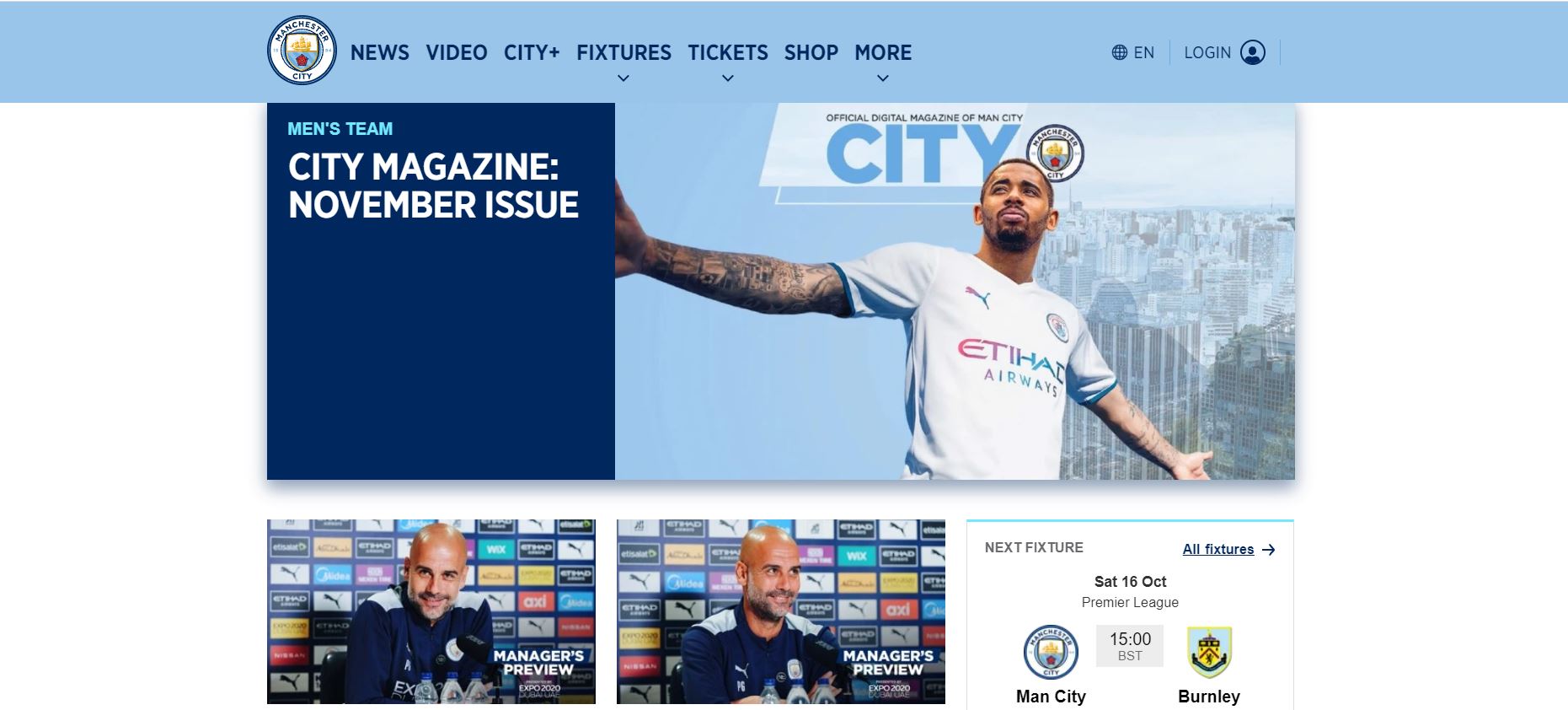
A pop-up appears as soon as you enter the website, allowing you to pin their start page on your browser. At the very top, there is an advertisement that you can click on to buy tickets. Next, the sticky navigation menu includes options for News, Video, City+, Fixtures, Tickets, and Shops. You can also select your preferred language from the menu bar. There are over 13 languages to pick from, each having its own set of social media pages.
The news, fixtures, last results, videos, women’s team, and academy are all covered in the header and following parts. You can also learn about their business relationships.
The footer includes links to their social media accounts, as well as the option to change the language. Accessibility, fair processing notice, cookie policy, privacy policy, terms of use, contact us, and sitemap are all available in this section.
4. Flame Gymnastics
The Flame gymnastics website stays true to its name with a red-dominated color palette. In addition, the website is comprehensive, providing all necessary information on events, locations, policies, and more with a few clicks. All in all, the design is sleek and simple, making navigation easy.
What We Like About It
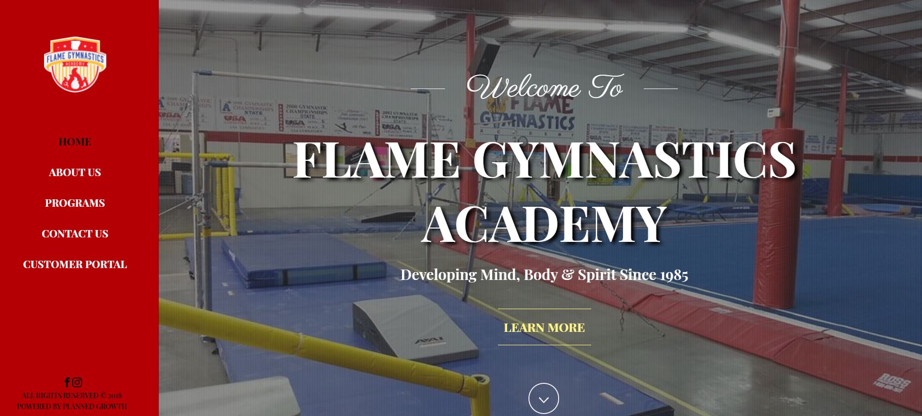
The designer has gone with a classic top menu for navigation, with the company logo on one side. Options such as Home, About Us, Events, Locations, Policies, and Contact Us are on the other side. The header includes a photo of the club members, their emblem, and a clear call to action to get started.
Next up, we have the review section. Client testimonials and feedback are key for establishing credibility. They also have a section on their website that assures customers that they hire instructors only after conducting the required background checks. To make it even better, the profiles of the coaches are available on the website.
After that, there’s a section that explains how the process works. They even have a free class where you can see if the coaches are a good fit for you or your kid. Following that, you’ll be able to see all of their locations. A phone number is displayed, which you can contact to get the free trial. Finally, the footer includes links to their social media accounts on Facebook, YouTube, and Instagram.
5. Kingston Heath Golf Club
Kingston Heath Golf Club has one of the most aesthetically pleasing websites on this list. The visuals are stunning, but that does not mean that they slacked off on functionality. On the contrary, they have put all the necessary information on the website while still keeping it simple and compact.

What We Like About It
The header on the homepage is a stunning picture of the club’s location with a welcome message. This grasps your attention immediately. At the top left, you can see the Kingston Heath Golf Club logo. The links to their social media handles are on the top-right, including Facebook, Instagram, and LinkedIn.
Instead of the traditional top menu bar, they’ve gone with a drop-down menu, which you can see in the top-right corner. If you click on it, you’ll be faced with a drop-down menu showing options like Members, Video, Course, Visitor, Corporate, and Contact.
The website’s body has a prominent section consisting of testimonials from members of the clubs. This includes feedback on both the facility and the courses offered. In addition, there is a two-minute video with scenes from inside the club, along with relevant information. You can also plan corporate events and buy their merchandise using the website.
Lastly, the footer has the company’s contact information and a Google Maps add-in for getting directions to their location.
Conclusion
All of the incredible web designs on our list should have provided you with some insight into what goes into creating a sports-related website. We’ve put together a diverse list, and depending on the aim of your website, you may need to tweak a few things.
If you teach sports, for example, you must include material to boost your credibility, as well as registration links. However, if your goal is to promote your league or team, you should have information about future games and ticket availability on your website.
Overall, keep in mind that while your website must be practical, you can’t slack off on aesthetics.


