When establishing a top resort website, you must highlight the best rooms and amenities. You’ll also want to include a list of available packages, discounts, and promotions. Moreover, there must be a booking option on the website so that the guests will be able to check the availability and make online reservations with convenience.
In light of the global pandemic, a valuable addition to most resort websites is their pandemic precaution notice. This shows the safety measures they employ to protect their guests’ well-being and safety. Most top resorts have this feature on their website homepages. This element assures their customers that they will enjoy their stay in a safe and secure environment.
Here are our choices for top resort websites to give you an idea for making your own.
Top Resort Website Designs
1. L’Horizon Resort & Spa
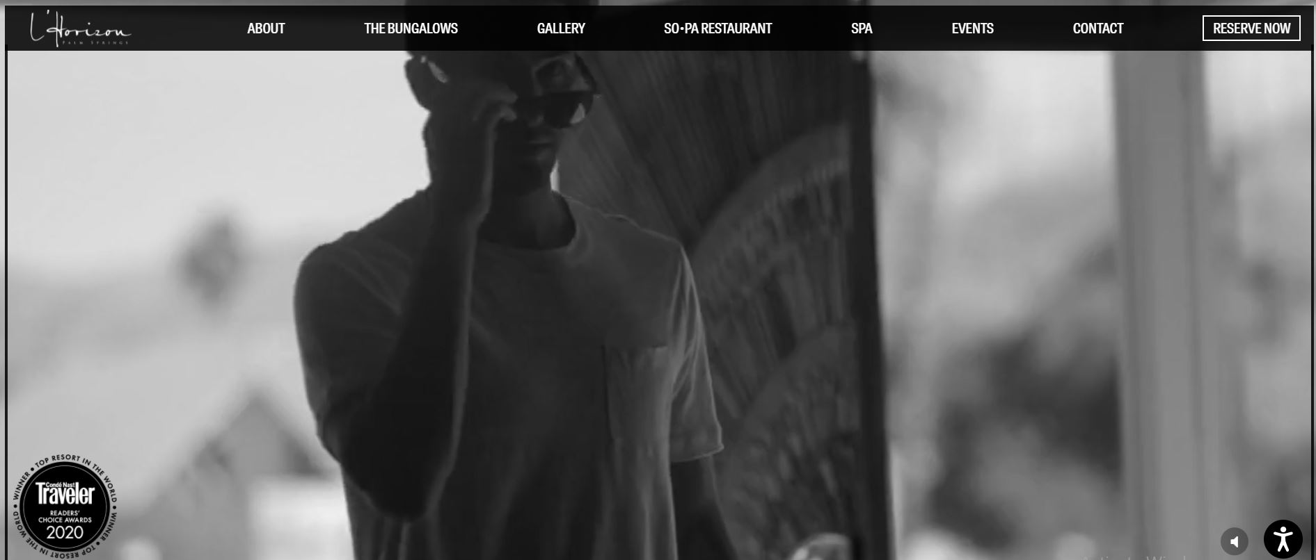
The L’Horizon Resort & Spa is Condé Nast Traveler’s winner of the Top Resort in the World, Reader’s Choice Award 2020. It is a luxury resort that caters only to adults.
You’ll see a simple yet elegant design reminiscent of the glamorous Hollywood vibe when you visit the site. Images on the site boast a mid-century-style resort but with modern-day technology.
What We Like About It
You can find a lot of information about the resort on the L’Horizon website. Still, a clean and organized header menu makes it easy for visitors to find the information they need. Featured are background stories about the resort’s history and its famous designer, Steve Hermann.
You will also find individual galleries for the resort’s accommodations, restaurants, and spas. Links to reserve rooms are also on each accommodation’s feature page. So, if visitors find a room that suits their needs, they can simply click the “Reserve Now” link and book it.
There are separate sections for accommodations, restaurants, and spas. Each section lists all the amenities it has to offer, including the available appliances for each room. You can find various tweakable settings on their booking page.
For example, you can specify the number of people you are booking a space for. You can also enter your check-in and check-out dates. The lowest prices for each day are immediately reflected on the bi-monthly calendar.
So, you can easily compare the prices. Filters are available to facilitate selecting your preferences. Once applied, the site will show you which accommodations will suit you best.
2. Naladhu Private Island Maldives
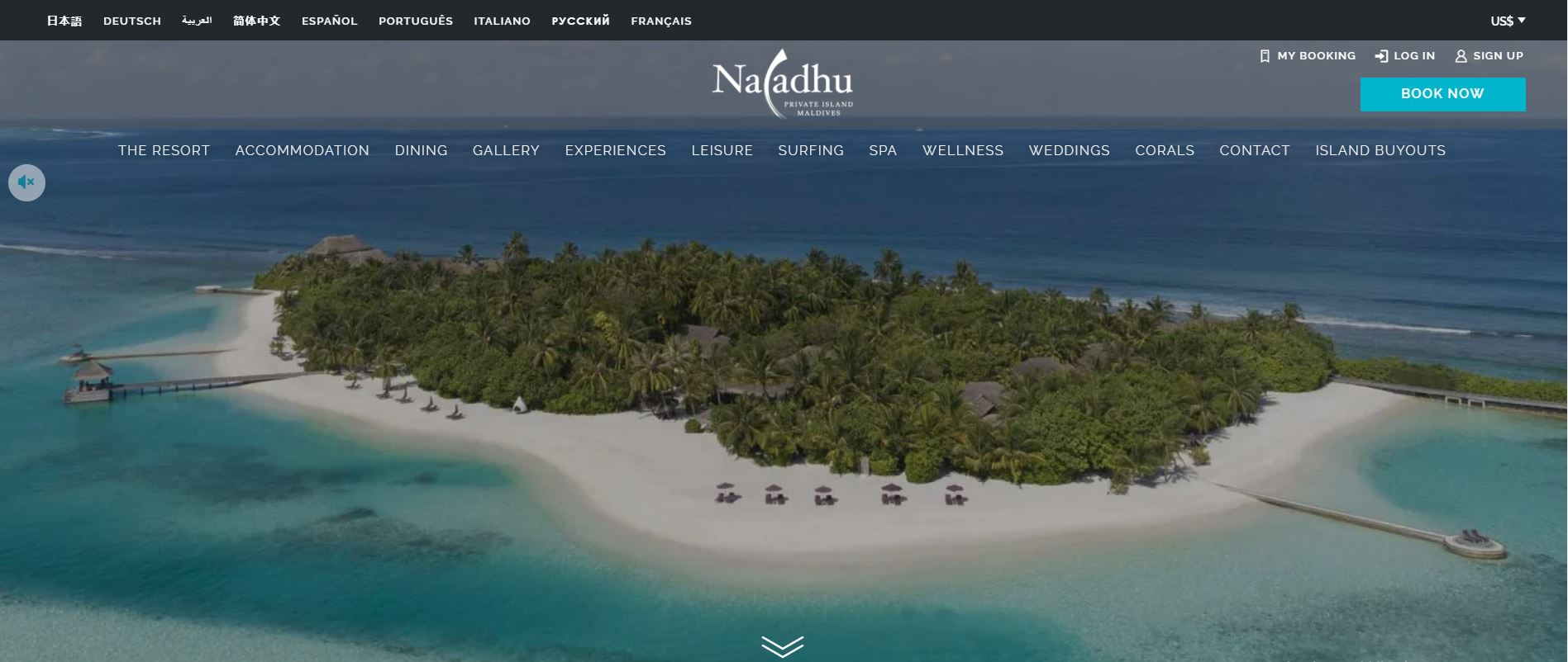
Naladhu is a luxury island resort in the Maldives. This exclusive island getaway’s website is image-heavy. The photographs are intended to entice visitors to experience what this island resort has to offer.
What We Like About It
The resort’s site caters to visitors worldwide, with an option to choose your language provided at the top of the homepage. A live chat feature is also available in case you don’t find the information you need.
At the top of the homepage, you will see a glimpse of the resort. The website also enumerates the island’s best features. Moreover, it highlights the experiences and indulgences that await you there.
One of the elements that help it stand out is the guest memory section, where the resort features posts from visitors about their resort stay.
The option to create your account is also available on the site. This is for those who want to keep track of their bookings. Reservations are made easy by the site’s booking page. Prices are also automatically adjusted as you choose dates and rooms from the selection.
Plus, all the necessary information about your choice of booking is comprehensively displayed. It has a clean UI and an easy-to-read breakdown of prices and booking details.
If you are having a hard time choosing, you can use the “Compare” feature, where you can select up to 3 of the island’s accommodations and compare these amenities side-by-side.
3. The Nai Harn Phuket
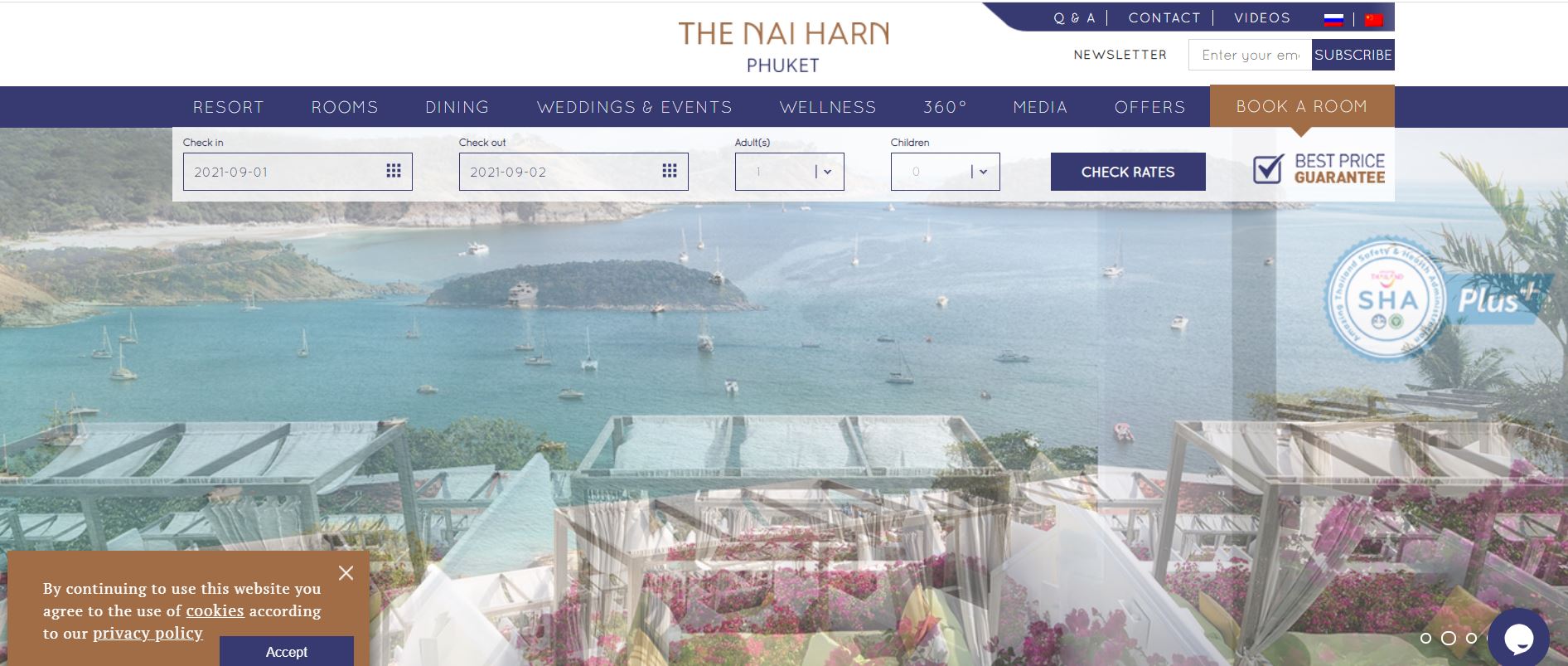
When you first open The Nai Harn’s website, a pop-up window will inform you that their entire resort staff is vaccinated against COVID-19. Clicking the link will redirect you to their international arrival protocol.
Their “Stay Safe – Stay Well” campaign for the Coronavirus is also on the homepage. Features like these help put visitors at ease. It lets them enjoy their stay without having to worry about getting sick.
What We Like About It
Gorgeous images of the resort welcome you to the site. Everything is well-categorized at the top of the menu, including available rooms for dining and wellness options. Additionally, a simple header booking feature makes it easy for the visitor to check hotel rates. There is also an access button to an inquiry form. Guests can leave their requests here to ask for more information.
Another unique feature of the website is its 360° section. This is where visitors get treated to a full view of the amenities of this 5-star Thai resort. This element is exciting for visitors since it makes them feel like they are at the location.
4. The Mulia, Mulia Resort & Villas
The Mulia, located in Nusa Dua, is one of Bali’s top resorts. It is a luxurious Asian resort that offers world-class amenities with a touch of European flavor.
What We Like About It
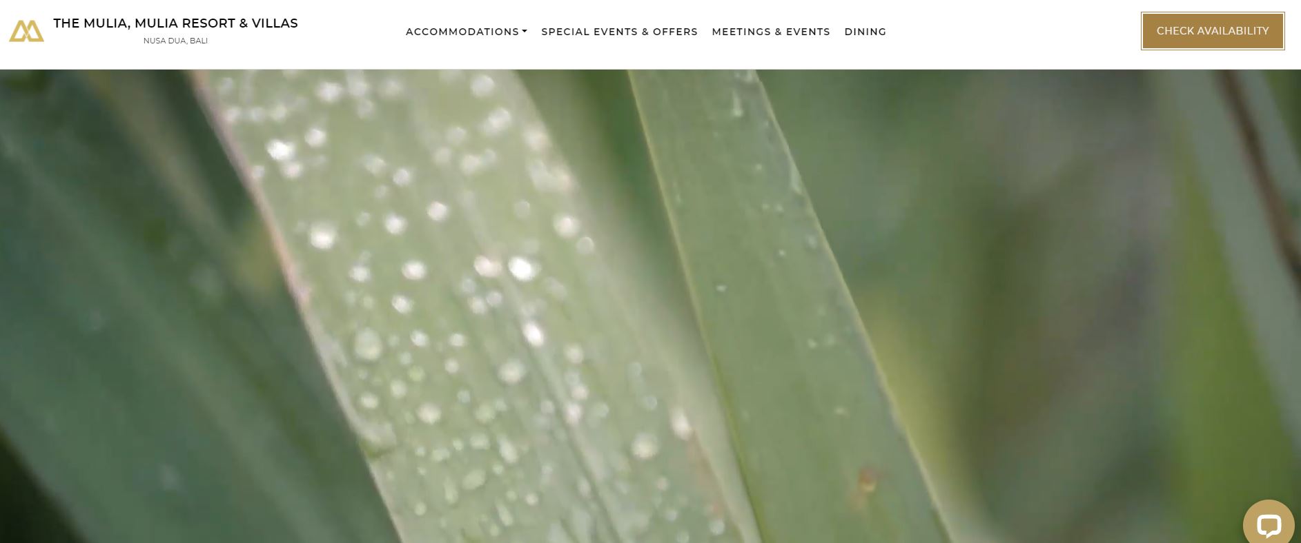
Upon entering the website, you’ll see a calm and serene video tour of the whole Bali resort experience, with the sounds of nature completing the peaceful experience. It automatically sets the mood for a relaxing browsing experience.
Scrolling down, you’ll find the usual room info, accommodation features, and special offers. However, what sets the site apart from other resort sites is its booking page. Their reservation feature not only offers bookings for the hotel but for flights as well, making it a one-stop-shop for visitors coming from outside of Bali.
5. Capella Lodge
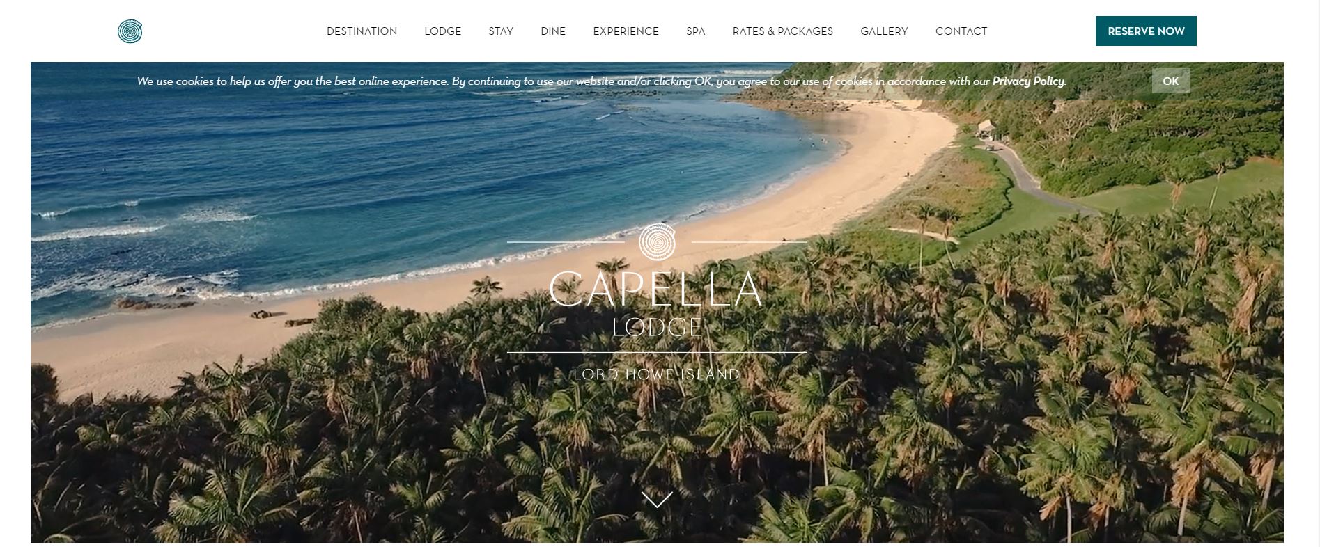
Capella Lodge is one of the best resorts in Australia. It is located on Lord Howe Island, a World Heritage Site. It is an island paradise that boasts of being the only accommodation with gorgeous views of the beach, lagoon, and mountains, a fact that is featured prominently on their site.
What We Like About It
An opening video features the breathtaking views and experiences this private island resort has to offer. Another good feature of the site is its overall design. It is clean and crisp. Although the website is full of content, it doesn’t feel cluttered. Navigating the site is easy with their header menu, which categorizes all the information about the resort.
Aside from the usual resort site elements, this resort’s website features a section on the year’s four seasons. Each season comes with its own set of island activities you can enjoy. In addition, the website enables you to choose from a variety of featured island expeditions and aquatic adventures.
For the accommodations, one can also view the actual floor plans for each suite, giving you an exact idea of what to expect out of each room. Lastly, the site also offers information on scheduled and charter flights as well as airport transfers.
Conclusion
A good resort website must catch the eyes of visitors at first sight. It must make them want to stay or spend their leisure time at your resort. You might want to invest in commissioning good-quality photos or videos of your resort’s best features, its rooms, and amenities.
Next, great write-ups or descriptions of your resort’s accommodations can help the visitor imagine the look and feel of the place, convincing them of how good a stay at your resort will be. Finally, it must be easy to navigate to make it convenient for visitors to check availability and rates and book the rooms.
You have to convert your site visitors’ excitement into bookings, so you have to make it easy to make their reservations.
