For businesses in any sector, including plumbing, having a decent website is essential. People who provide services must always have a means for potential clients to find them. Moreover, plumbers need a platform to demonstrate their expertise in installing water pipes and fittings, unclogging drains, and fixing toilets. This is how they will gain new clients.
Although plumbing professionals may be knowledgeable about water pipes, they might not be skilled at web design. That’s why we put up this list of the best plumbing websites to help you come up with ideas and inspiration. Check out the many styles and features you can use for your plumbing website.
Our Top Choices for Best Plumbing Websites
1. Atlas Plumbing & Rooter
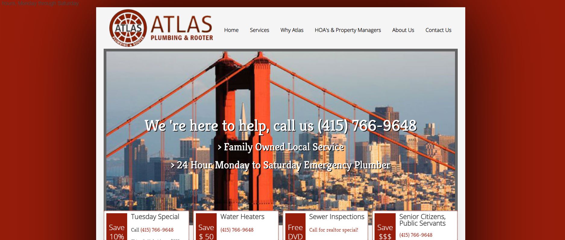
Plumbing services are not cheap, so people often search for firms that provide discounts for such services. Atlas Plumbing & Rooter’s website does an excellent job of presenting its promotions and discounts.
What We Like About It
With a bright color scheme, the website appears to be well-organized. The red and white design is striking without becoming garish. Moreover, its hero image makes it clear to visitors where the business is located. This is important since it would save clients a significant amount of time searching for a plumbing business.
When visitors come to the firm’s site, they will learn two things about the company right away. The first is that it is a family-owned business. The next feature is that it is available 24 hours a day, Monday through Saturday. This information would be helpful to any client who is experiencing a plumbing emergency.
The virtual discounts that are accessible immediately below the hero image are the best feature of this website. There are four distinct options available. The first one saves you 10% on your overall service charge, while the other one provides a $50 discount on water heaters.
When calling for sewage inspection services, visitors can also get a complimentary DVD. Finally, the company offers an undisclosed discount to government employees and senior citizens. If your business provides similar offers, make sure to feature them on the site, preferably above the fold.
2. Bragg Plumbing and Heating
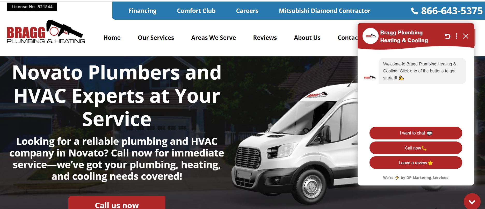
One of the essential qualities of a successful company website is that it is memorable. Viewers would most likely scan four or five websites before contacting the top three for quotes. One approach to making the website distinctive is to include high-quality photos and videos. Another option is to use animation to display the website’s content. See how Bragg Plumbing and Heating’s website stands out among its competitors.
What We Like About It
On Bragg Plumbing’s website, you can see the neatly arranged components of the homepage. Each section is divided into separate colored boxes, making it easier to scan everything. For example, the most critical elements are usually in maroon boxes with white font. As a result, the eyes naturally gravitate to the respective sections.
The company’s selling points are provided in three blue boxes below the fold, including “Personal Attention,” “No-Surprise Pricing,” and “Same-Day Service.” These are essential factors in a client’s decision to select a firm to handle their plumbing difficulties.
All of the contents appear to be animated as they slide in. Since the animation is initiated by scrolling down, the page has an interactive element. The more engaging a website is, the more likely it is to be remembered by the visitor.
3. Green Hills Plumbing
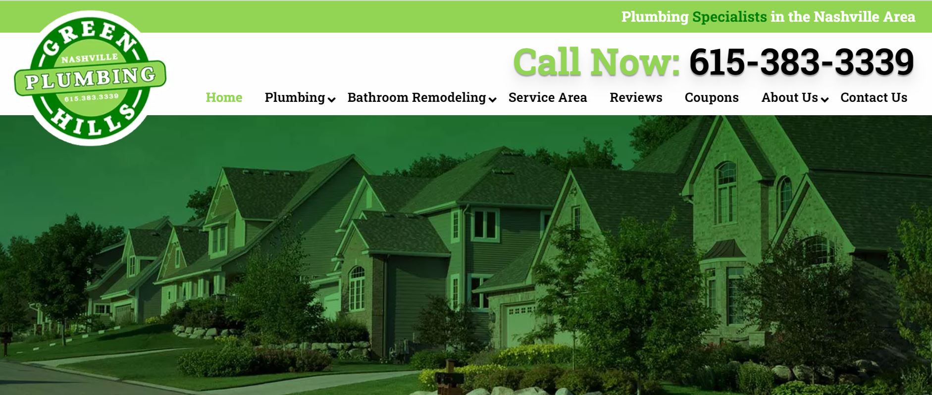
Using icons and illustrations is an excellent way to enhance the visual appeal of your website. However, you should avoid cramming the screen with too many images, drawings, and text, since you don’t want it to look crowded and perplexing. See how Green Hills Plumbing’s website uses graphics and icons to create a functional yet organized design.
What We Like About It
Green Hills Plumbing is another website that employs a lot of animations on its pages. Several elements appear at various times to focus the visitor’s attention on the most critical areas of the page. A bouncing arrow, for example, emerges on the site to direct your attention to icons you can mouse over and forms you can fill out.
On this website, a visitor can find a wealth of information. To keep things neat, the designer only displayed the headers of particular texts. The remainder of the info emerges when you hover your cursor over the icons. This approach keeps the website from seeming cluttered while still providing visitors with all of their required information.
“Specialists,” “Experts,” and “Best Trained” are among the keywords utilized by the designer. These words are intended to wow potential clients and persuade them that the firm can handle any plumbing issues they may have.
4. Expert Plumbing Solutions
Having a company overview video on your website is an excellent way to provide visitors with the information they want. We usually see these videos on the homepage of most websites. Expert Plumbing Solutions makes their video the first thing you see when you visit their homepage.
What We Like About It
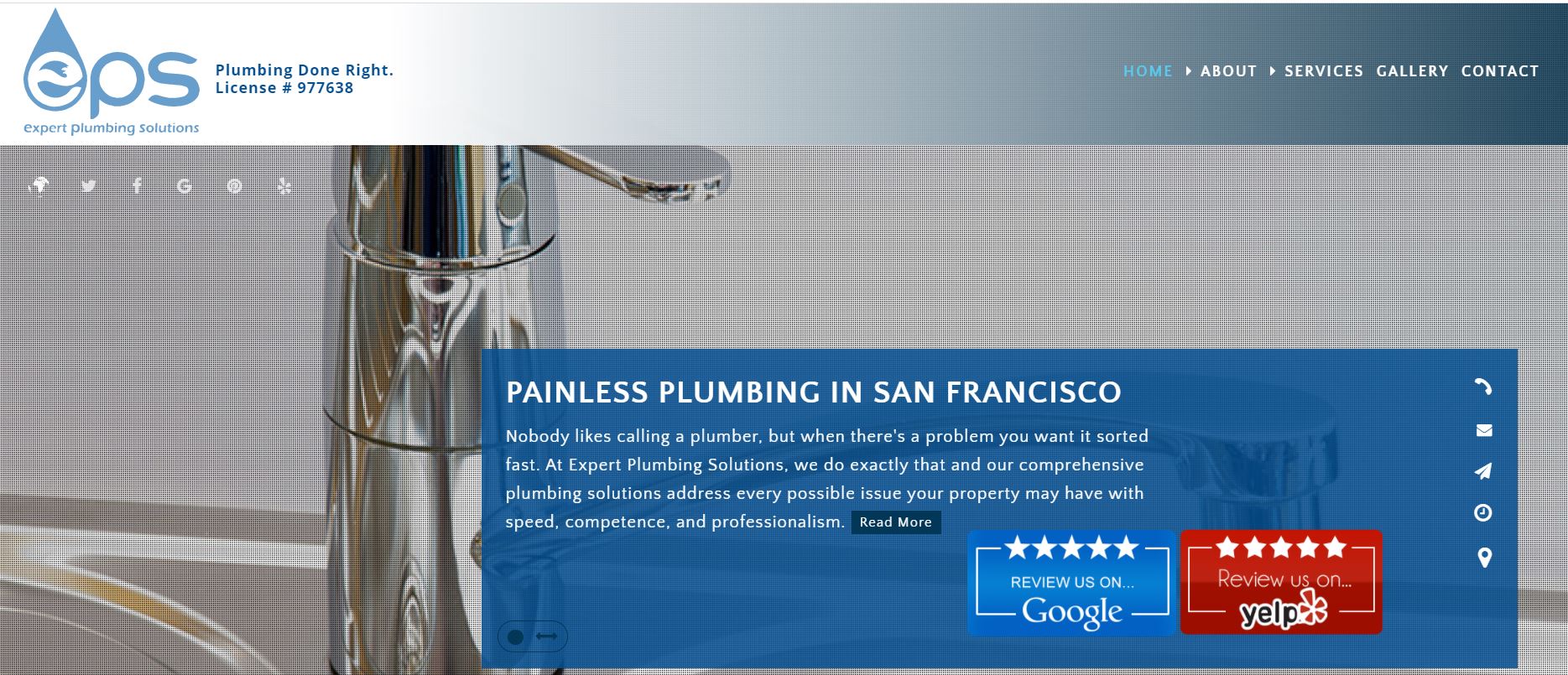
The introduction video from Expert Plumbing Solutions appears in a pop-up window rather than taking up space on the homepage. As a result, visitors won’t miss the site as they’ll have to close the window to get to the homepage. The video introduces the owner and his crew. Furthermore, it describes the company’s service area and lists the various services it provides.
Aside from the navigation bar, you can click buttons on the homepage that take you to the company’s Google and Yelp reviews. These are genuine user reviews, so you can be sure you’re getting unbiased information regarding the service’s quality. In addition, having a link to the review rather than publishing it on the website saves space on the page and gives visitors confidence in the reviews’ accuracy.
Just below the fold, the website describes the many services that the firm offers. You can see the service titles and brief explanations on a slider. Each category of service has a different background of greyscale pictures. Interestingly, the images become colored when you move your cursor over the grid.
5. Hope Plumbing
Your SEO ranking can improve considerably if you post a video tutorial about your business. It enhances the likelihood of attracting visitors to your website, especially if the topic is highly relevant to your target demographic. Take a look at how Hope Plumbing uses videos to attract new clients.
What We Like About It
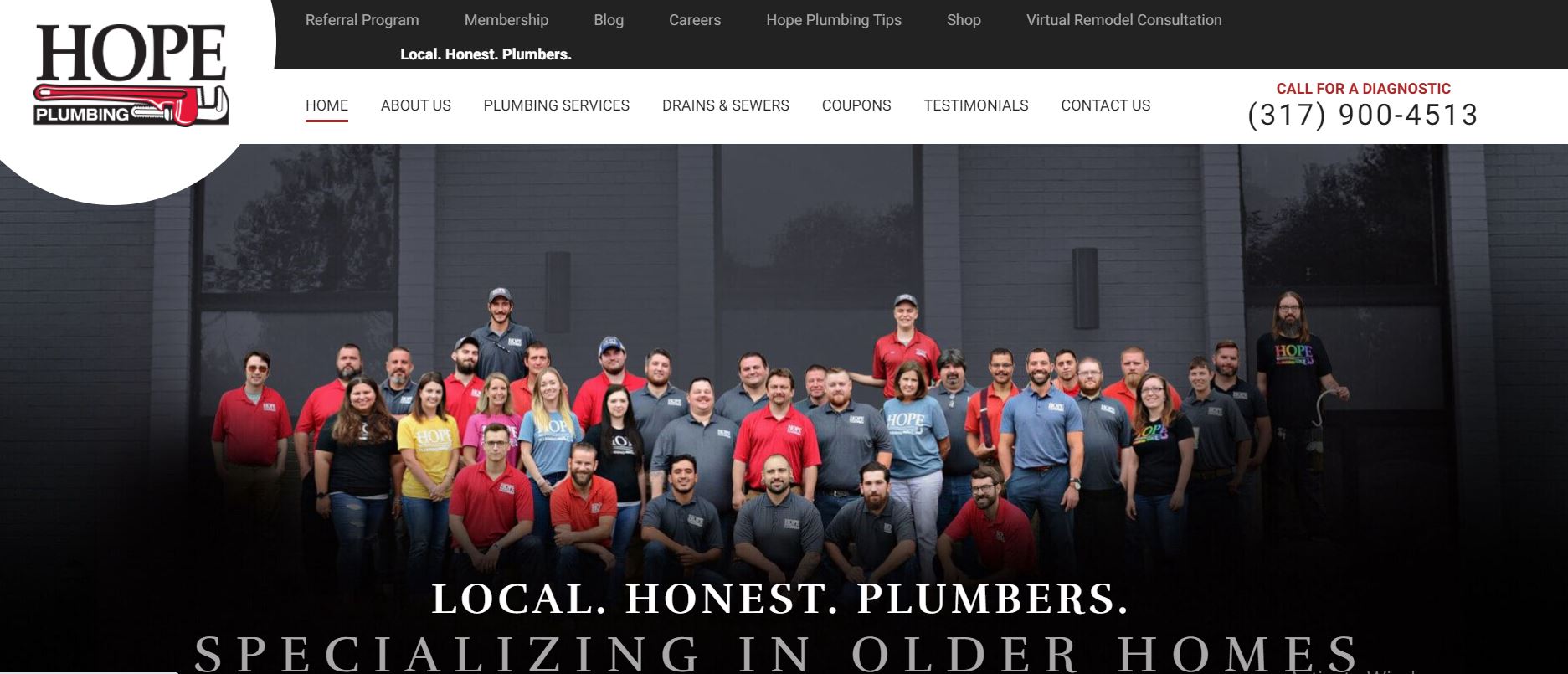
Hope Plumbing’s website is well-designed, with all the necessary elements to attract consumers and convert leads. “Local, honest plumbers specializing in older homes,” reads the hero message, which is spot on. It’s brief, yet it packs a punch with enough information to pique the interest of the intended audience.
In addition, the best feature of the website is its video section. While the site also hosts a blog, the videos are more likely to get a new client to visit the company’s website.
Moreover, the videos are highly instructive. For example, there’s one that discusses what you should avoid dumping down the garbage disposal. Another one talks about childproofing the bathroom. These clips have the potential to increase website traffic and convert inactive users into paying consumers.
Conclusion
The best websites we picked highlight a variety of valuable features that you should incorporate into your project. A company overview video is an efficient means of displaying information without taking too much space. Similarly, discount coupons, links to reviews, and animation are common ways to attract visitors’ interest.
Of course, you’ll need to include a list of your services as well as the top reasons why clients should choose your firm over others. These are just a few elements to think about putting on your website to help people looking for plumbing services find and hire you.


