Best Practices for Plastic Surgeon Website Design
There was a time when plastic surgery was seen as a taboo subject. Those who got the procedure done would usually keep it a secret from their friends and family. A plastic surgeon website aims to empower visitors to find the best doctor for their individual needs. It’s also a way for surgeons to showcase their work and attract more clients.
Here are some unique considerations that plastic surgeons should keep in mind when building their websites:
- Emphasize credentials and qualifications: Plastic surgery is highly specialized, and potential patients need to know they are in good hands. Make sure to highlight your credentials and qualifications on your website, including your education, training, and certifications.
- Showcase before and after photos: One of the most important things potential plastic surgery patients want to see is the results of previous procedures. Include high-quality before and after photos on your website to showcase the quality of your work and help potential patients better understand what they can expect from their procedure.
- Explain the procedure: A plastic surgery website should include detailed information about each procedure, including what to expect before, during, and after the procedure. This information can help put potential patients at ease and ensure they clearly understand what to expect.
- Highlight patient testimonials: Patient testimonials can be a powerful tool for building trust with potential patients. Consider including a section on your website where patients can share their experiences and describe the results they achieved with your help.
- Ensure privacy and security: It is essential to assure potential patients that their personal information will be protected and kept confidential. Make sure to include information on your website about how you protect patient privacy and ensure the security of sensitive information.
- Optimize for mobile: More and more people are using their mobile devices to search for information online. Make sure your plastic surgery website is optimized for mobile devices, providing a seamless user experience.
Best Plastic Surgeon Web Designs
Let’s look at some of the best plastic surgeon website designs to understand better the features that make up an effective website.
1. Rapaport Plastic Surgery
The majority of people considering plastic surgery desire to enhance their appearance. Keeping that in mind, it’s only natural that a visually attractive design would be more appealing to such users.
Rapaport Plastic Surgery’s website hits the mark with this one. Their website easily ranks first on our list of the best plastic surgeon website designs, with exquisite visuals and well-organized content.

What We Like About It
The website starts with a striking image that immediately grabs attention and establishes rapport with the user. The banner includes a few renowned brand logos, which is a strategic move to gain the trust of potential customers.
A button in the lower right corner reads “Schedule a Consultation.” The CTA placement is part of a subtle yet efficient approach for converting a casual visitor into a prospect.
The website then goes on to talk about Dr. David Rapaport, the face of the company. Special attention is drawn to the statement that the surgeon is board-certified. This is critical since credibility is often the first thing clients look for when choosing a plastic surgeon.
Furthermore, the website goes into detail regarding his background and achievements. This establishes the doctor’s expertise and assures the visitor that they’ll be in good hands if they pick this doctor.
The website’s gallery link takes you to a well-designed page with surgical procedures organized into separate categories. When you click one of the buttons, you’ll see before and after photos of actual clients who have undergone that procedure. These images appear authentic and unaltered, letting visitors know that they can anticipate actual results.
Next to the images, you can find information such as the client’s age, specific details, and even the time it took to complete the procedure.
Lastly, a sizeable call-to-action banner at the bottom of the page urges users to “Get In Contact” immediately.
2. Cangello Plastic Surgery
Dr. Cangello is a well-known plastic surgeon based in New York City and has a reputation for achieving stunning, natural-looking results.
To no surprise, his website is no different. A well-organized layout, easy navigation, and alluring images are enough to persuade visitors that he is the ideal surgeon for them.

What We Like About It
Cangello Plastic Surgery’s website starts with a picture of an attractive woman, followed by a text about Dr. David Cangello. The content is comprehensive as it discusses the surgeon’s qualifications and expertise. This paragraph is then continued on a separate page so visitors can learn more about the surgeon.
Furthermore, the website showcases videos of the doctor and his sample procedures.
Another fantastic feature of this website is the display of testimonials from previous clients. Although photos would’ve been better to accompany the reviews, it’s reassuring to know that the doctor has many satisfied clients.
You can also find a contact form for scheduling a private consultation at the bottom of the main page. This is an excellent approach to attracting potential clients.
First, the website establishes the doctor’s competence and encourages visitors to make appointments.
The gallery menu takes you to a webpage that details different surgeries and procedures the doctor performs. Clicking on the link will direct you to a page with before and after images of his previous patients.
The patients are labeled with numbers, which is an effective method to reassure visitors that the doctor is competent at what he does.
3. Alfredo Hoyos
Dr. Alfredo Hoyos is a Columbian plastic surgeon whose website showcases his abilities as a surgeon and an artist.
His website has a lot to offer to anyone looking for an accomplished plastic surgeon in Bogota.

What We Like About It
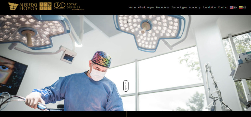
First and foremost, the website is easy to navigate, as it loads swiftly despite many photos. The site design flows like a story, starting from a picture of Dr. Hoyos in the operation room. The image instantly conveys a high level of expertise since it shows the surgeon in action.
The text below introduces the doctor and discusses his practice. There is also a link to a copy of his CV, which reads like a pamphlet.
Underneath the doctor’s introduction are icons representing the body parts you can get surgery on. When you click on one of the icons, you’ll get a link to the FAQs and an option to request a quote.
This is significant since, besides looking at images, customers often want to know how much a procedure will cost. The link takes you to a contact form where you can provide information about yourself and the sort of surgery you’re interested in.
4. Dr. Kenneth Kim
When you visit Dr. Kim’s website, it’s almost like reading a beauty magazine. The site design features a slew of stunning individuals who presumably went under his knife.
Let’s take a deeper look at his website and see what other features it has to offer.

What We Like About It
The first thing you will notice on Dr. Kim’s homepage is the image carousel within a carousel. The larger one has model-like women with the word “Dream” written over them in translucent letters.
Underneath that is another carousel with photos of the doctor’s patients displaying before-and-after results.
Immediately after that, there’s a CTA button to “See our Results.” You can click here if you’re interested in looking at more before and after images.
You’ll also find an introductory text for Dr. Kenneth Kim. An excellent feature of this writing is that it uses a bold font for essential facts about the surgeon.
The text emphasizes his board certification, the promise of personalized and natural-looking results, and his position as an assistant clinical professor at the UCLA School of Medicine.
The website has a lot of information, yet it doesn’t appear cluttered or crowded. The blog content is well-written and includes vital information on the various procedures, including pre and post-operative care.
The website also uses large images to draw the visitor’s attention. Furthermore, it has a sticky navbar that allows you to navigate any other website section effortlessly.
5. Stoker Plastic Surgery
Dr. Stoker touts himself as one of LA’s top cosmetic surgeons. However, what sets his website apart is its emphasis on the overall surgical experience.
Instead of just focusing on the doctor, the website also includes information on the neighborhood, the doctor’s office, and the surgery center.

What We Like About It
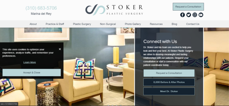
The website starts with the introduction of Dr. David Stoker. On the banner alone, there are two CTAs to check over his credentials and schedule an appointment.
In the same section is a link to 800 before and after photos gallery. That number of patients is enough to convince most visitors that the doctor is reliable and competent.
When looking for a plastic surgeon, it’s essential to feel at ease in their office, as well as the place of surgery. This is precisely where Dr. Stoker’s website hits the jackpot.
The website offers virtual tours of both locations, where you can see that the offices are modern, clean, and comfortable. The tour of the surgical center not only shows the sterile and pristine conditions but also details the center’s accreditation.
Since the surgeon has made several television appearances, a section is dedicated entirely to videos and articles about his media engagements.
A great feature that is unique to this website is the treatment planner. It showcases a list of conditions the center addresses, and when you select one, the planner presents you with several treatment options.
You don’t even have to leave the website to learn about various treatment options, as the blog section provides a wealth of information that’s simple and easy to understand.
Finally, a typical contact form is at the bottom of the page to send your questions or book a consultation.
Conclusion
A plastic surgeon’s website needs to showcase their credentials and prior accomplishments. Specifically, a before-and-after photo gallery is a must-have. Displaying testimonials and reviews from past clients can also significantly help potential clients. The website design must be aesthetically pleasing and feature numerous convincing photos. Visitors consider these primary factors when choosing a doctor to help them get the desired appearance.
The five best plastic surgeon website designs listed above include the right visuals and information that entice visitors to stick to the website and trust the service.


