Web Design for Photographers
In order for a professional photographer to differentiate from the pack, a quality web design should use striking images to capture an audience, as well as define a niche and then make something happen.
The following top 10 photographer web designs do just that, in no particular order:
Brandon Stanton
Stanton’s photos cover the breadth of New York and he constantly updates, so it’s clear he is an active photographer, out there shooting every day. Hover over the photos to see when they were taken and use it in your own blog. He won Best Use of Photography on the 2013 People’s Voice Webby Awards.

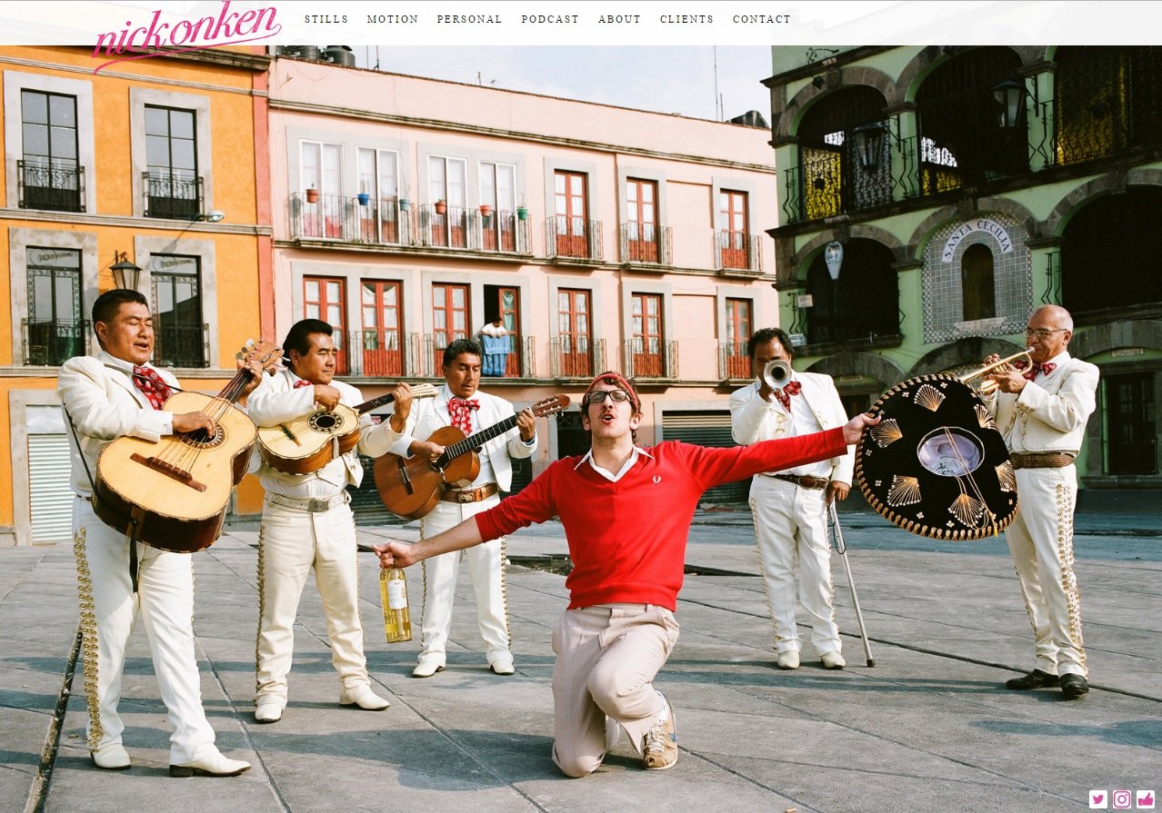
Nick Onken
After a second or two, a voice bubble appears at the lower right inviting you to “discover more about Nick.” More in depth info about the artist appears after the click.
Piotr Kulczycki
The first giant image provides an ultra slow zoom, almost so slow to be unnoticeable. Unobtrusive in the upper left corner sits the menu and when clicked, the info folds out. Take your cursor all the way to the right or left and the image shifts slightly letting you know there’s more to see. Web designs that use giant photos like his need to consider load time, and his load quickly

Jeremy Cowart
Immediately upon landing you’re asked to “subscribe to Jeremy’s email newsletter,” so it’s a quick call-to-action. After that, he defines his photography below images that scroll with easy navigation at the top.

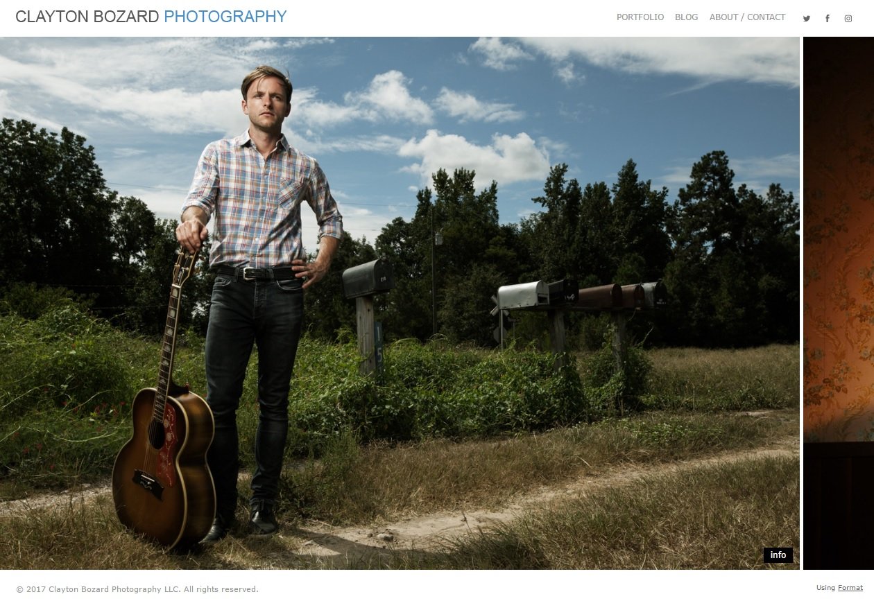
Clayton Bozard
The cursor becomes an arrow to scroll left or right through his photos at your leisure.
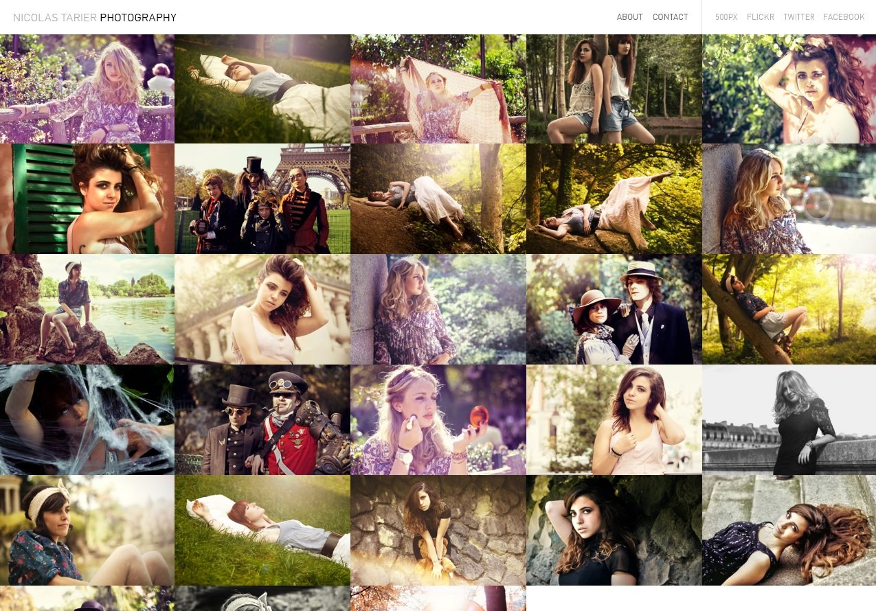
Nicolas Tarier
Tarier photographs models. Hover on a square to see the name of the model and click on the square to see more. Once you’re on the large images, the arrows to turn pages turn into previews of the next photo when you hover over them.
Timothy Hogan
Scrolling over text on this website expands to a full screen to show off the photographer’s photos.

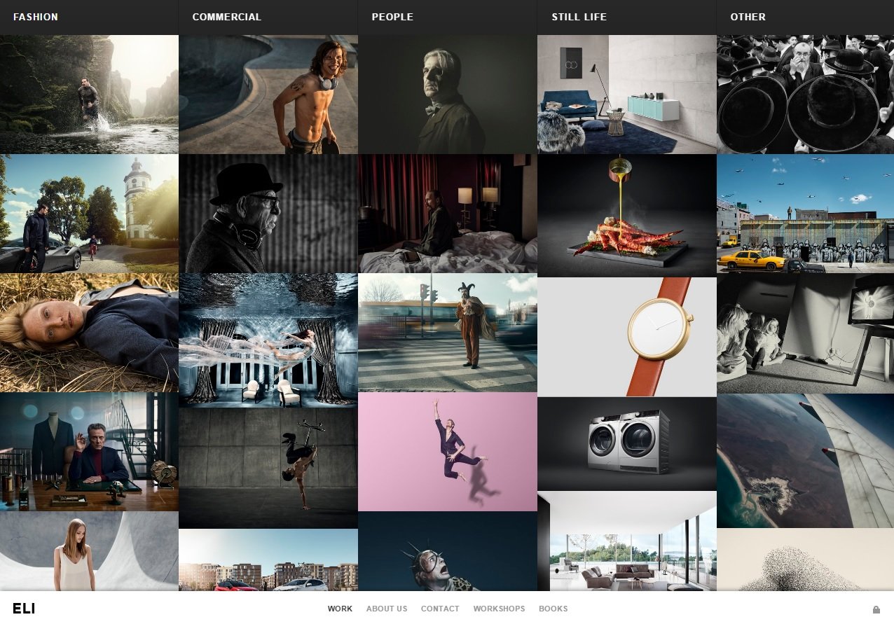
Eli Lajboschitz
This site represents a group of photographers, but the company started with Lajboschitz. Scroll or drag the bars within each subject then click.
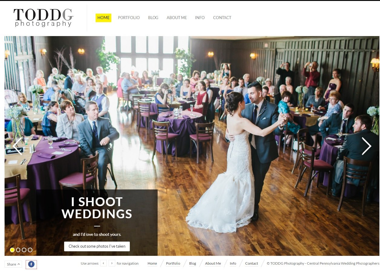
Todd Gearhard
This guy makes it clear what he does on the first page by proclaiming in no uncertain terms “I Shoot Weddings – and I’d love to shoot yours.”
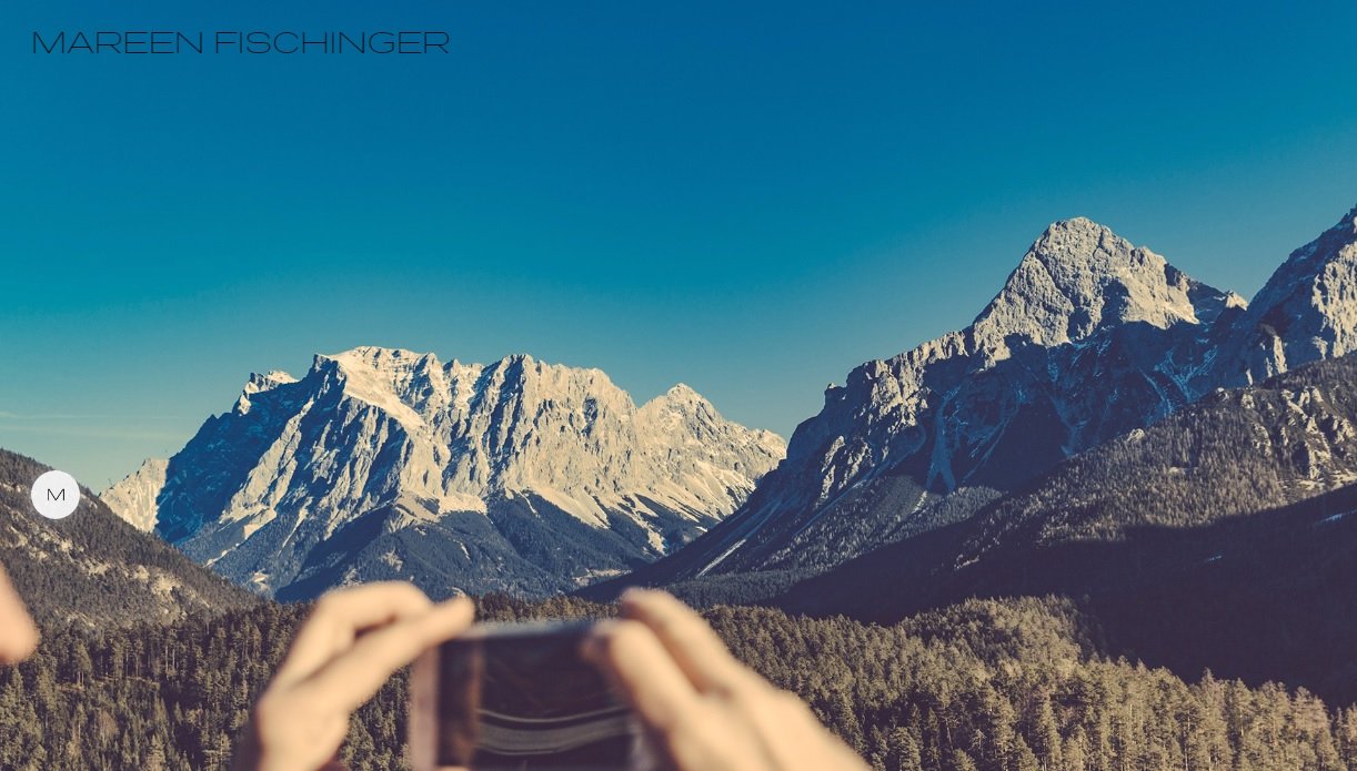
Mareen Fischinger
The pulsating “M” on the left expands to provide options.
The brain processes images quicker than text and these photographers capitalize on that fact by showcasing the images and leaving text to a minimum. For help putting your best photo forward, contact us.


