Our Roundup for Best Pharmacy Websites
Online pharmacies have grown in popularity in recent years because they made it possible for people to get their medicines without leaving their homes. However, you probably already know that having a physical store is not enough if you run a pharmacy business. The other pharmacies will snatch up your customers if they can provide a service you haven’t evolved to yet.
It is important to note that a pharmacy’s website shouldn’t just be its online store. It should also contain other elements that make it stand out from other e-commerce sites. Find out what those elements are by checking out our list of carefully selected best pharmacy website designs.
1. Drugmart.com
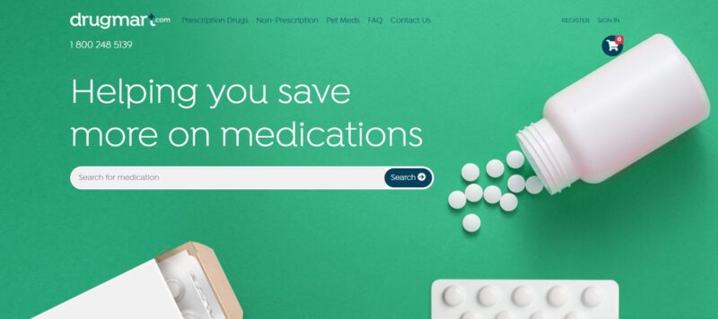
Since online pharmacies house thousands of medicines, the website must make it as easy as possible for visitors to find what they need. Drugmart has done this successfully with its website.

What We Like About It
Drugmart makes it convenient for its visitors to locate what they need. The designer has opted to display the search box on the header prominently. The visitors can simply type the name of the product they are searching for. The search box has an autocomplete function so the visitor can click on the item without typing the full name.
If you don’t remember the name of the medicine you are looking for, you can start your hunt using the links on the navigation bar. There are three options: prescription drugs, nonprescription drugs, and pet medicine. If you still can’t find what you are looking for, you can click on the chatbox and ask for assistance.
If the product you searched for is not in the pharmacy’s database, the website will prompt you to browse the product letter. There is a list of letters underneath the search box this time. This search option is perfect for people who can not remember the correct spelling of the product’s name. (Honestly, we don’t blame you.)
2. Drugs.com
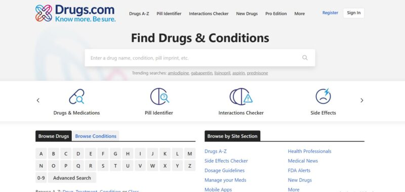
Drugs.com is another website that offers its visitors more than one way to find the medicine they need. Its search options are displayed in a slider to provide easy access for the visitors.

What We Like About It
Drugs.com has numerous search features on its website so that visitors can easily find the medicine they need. Besides having the search box on its header, it also offers multiple ways to find the medication its customers want to buy.
Above the fold, there is an option to browse the list of drugs by name. The website presents a grid of letters to choose the initial letter in the drug’s name. When you click one, the results show a list of the most popular medicine that begins with that letter.
If you are on Drugs.com’s website because of a particular symptom, you can also search for what to do using the same search feature. Just click on Browse Condition. So, if you are suffering from abdominal pain, you need to click on the letter A button and find “abdominal pain” on the list. The website will lead you to the corresponding care notes for abdominal pain. In addition, it lists down symptoms if you need to go back to the emergency department or contact a healthcare provider.
Another great feature that you will find on this website is their Pill Identifier. If visitors have leftover unlabelled medicines in their drawers, they can get help in identifying them through this feature. You will need to enter the imprint on the pill, its color, and shape. The website then presents the pill that matches your description. You can click on the name of the drug to find out what it is and what condition it is for. There is also a section on the product description page for warnings about taking a particular pill. The website is filled with helpful information that is valuable to their customers.
3. FaastPharmacy
FaastPharmacy does not have a physical store. Instead, customers conduct all transactions online. And, naturally, the website makes it super convenient for people to order and get their medicine.

What We Like About It
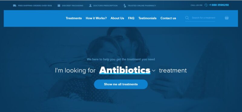
The website of this online pharmacy categorizes its products as treatments. Its hero is a drop-down menu that features the most popular drugs and conditions that visitors search for. If the one you are looking for is not included in this list, you can click the “Show Me All Treatments” button.
The Treatments page is composed of buttons for various common medical issues like alcoholism, Gastrointestinal, Surgery, Hypertension, and more. If you click on your symptom or condition, the page will reveal a page of the products related to it.
Because FaastPharmacy is purely an online store, it has to prove to its visitors that they can rely on it. This is why its homepage also has to highlight all of the business’s selling points. These are presented in grid form as icons and texts. The copy is easy to understand. If the visitor is interested in a pharmacy that offers fast delivery, bonus pills, and rebates, they would be interested in buying from this store.
Right below that, you will find its customers’ review section. Only two customer reviews are presented, but there is a link visitors can follow to see more. It also indicates the total number of reviews the store has already received plus its current ranking. An 8.9 out of 10 is a pretty good review score, which is why the website displays it proudly.
4. Blink Health
Getting medicine delivered to your home is accessible when you have a prescription. Online pharmacies are now making it easier for their customers to secure valid prescriptions by connecting them to a licensed medical professional. This is one service that Blink Health offers its clients.

What We Like About It
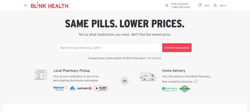
Blink connects its customers with drug manufacturers. Their main selling point is that they offer the lowest price for specific medicines. The website’s header prominently displays the company’s slogan, “Same Pills. Lower Prices.”
Ordering is easy because the website presents the steps one by one. The top section is for customers who already have prescriptions. When you click on the link to start the process, the website will ask you if Blink Pharmacy already has a copy of the prescription. The buttons are clear with accompanying icons to ensure that the customers understand what they are clicking. If the prescription is on file, the website will send the customer a verification code to start the ordering process. If the prescription is not yet in the pharmacy’s database, the website provides the customer with steps to follow so that the customer’s physician can send the requirements to the pharmacy.
The next section of the website is for customers who do not have a prescription. The website connects the customers with US-licensed physicians via a subscription plan. If the website visitors decide to avail themselves of the doctor’s services, they need to schedule an online doctor visit.
The website details the steps of the entire process using short copies and interesting illustrations. As a result, not too many words fill the pages. Plus, each page is broken down into several sections using different background colors.
The website also has a licensed pharmacist on standby to answer phone calls from 8 AM to 10 PM on weekdays. In addition, you can find a call button on the top right corner of the page. Clicking on this link will automatically open the phone function of any device.
Conclusion
Managing an illness is already difficult on its own. Buying the medicine to do that shouldn’t be. That’s why, when making a pharmacy website, the primary goal of any web designer is to make searching for and purchasing medicines as convenient as possible.
Medicines come with a ton of information that is hard for the layman to understand. A web designer must organize this information into an easily understandable format so that buyers don’t get too intimidated. In addition, the steps to purchasing the medicine on the website should be clear and intuitive.
Posting other features like a scheduler for online consultations with doctors or a pill identifier are also bonuses that customers highly appreciate. All these contribute to a great experience that ensures the customer’s continued patronage. And once a customer finds a convenient pharmacy website to order from, they are likely to stick around.


