Best Furniture Web Design Ideas & Inspiration
When you decorate your house, you spend hours searching for the perfect sofa, a beautiful accent rug, or a stylish and useful television stand. Many furniture stores realize that your first introduction to their company is their Web site, and have created stunning Web designs that highlight and emphasize the same attention to detail you want in your home.
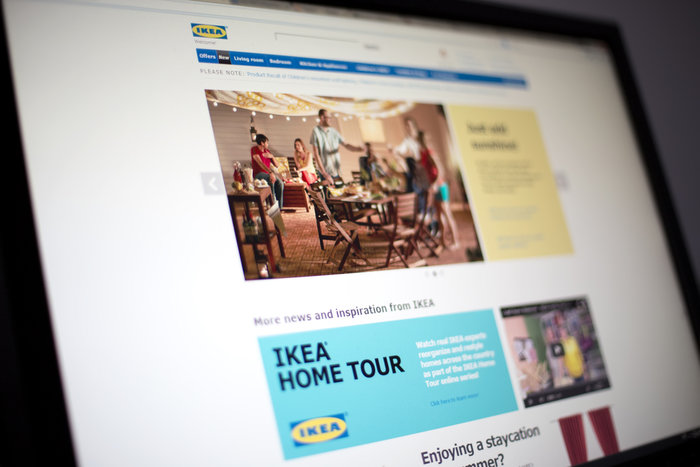
IKEA
The Swedish furniture giant is known for its compact, fashion-forward furniture solutions, especially for small spaces, but their Web site is just as advanced. Once you’ve selected from their expansive list of countries, their easy-to-navigate site includes individual pieces, as well as ways to group pieces together to create your ideal arrangement. Galleries show how other customers have used pieces, and their ever-popular kitchen planner helps you stay on track.

World Effect
We love the muted, neutral color themes that World Effect has chosen to accent their beautiful fair trade furniture. They allow you to sort not only by the pieces of furniture you’re looking to purchase, but also specific collections from producers as well as the regions where the furniture was built.
Magnolia Home Furniture
The furniture line may have been made even more popular by its celebrity owners, but the site’s clean, modular layout allows you to quickly find pieces for each room, or by the look you hope to achieve, with options ranging from the bold lines of industrial pieces to the whimsical, eclectic boho designs.
White on White
This New York-based retailer has a Web site that’s just as trendy and exciting as its physical showrooms. Contact information is easy to find in the header, pops of bold color stand out on the stark white background, and their blog features timely design topics.
Shackletons
Shackletons, a British company, builds more than comfortable, attractive furniture — they also built a visually-appealing, user-friendly Web site. Their dual-slider home-page navigation allows you to surf through various pieces of furniture while checking out case studies and articles about design and their company.
Blu Dot
The full-size front-page pictures are simple and effective, drawing your attention to their trendy pieces of furniture. An online catalog lets you virtually thumb through their newest releases, and the colors and shapes of their unique pieces are highlighted by the clean white background.
Lulu & Georgia
Bright, colorful images of their pieces in beautifully designed rooms make you want to re-create the look in your own home. A bold call-to-action stands out at the bottom of their gallery, inviting you to follow them on Facebook, and the linear sans serif menu fonts play nicely with the serif headers.
Dwell Studio
Dwell Studio’s monochromatic Web design works well with their popular Monochrome Mix furniture line. The place their menu and sales in the header, which means you don’t have to navigate back to find discount or coupon codes, and their favorite feature allows you to save pieces that interest you to a board to check out later.
The Cotswold Company
This company puts the proof of their trendy designs right on the front page, with links to their pieces in popular design publications. They also show the most recently purchased pieces and reviews in a slider gallery, allowing you to see what other customers love about their brand.
Apt 2B
They make the most of small living by showing how their pieces fit in both your living space and your life. The benefits they offer customers are clearly spelled out at the top of the page, and highlight the furniture that has been made in the United States.


