Best Farmers’ Market Web Design Inspirations
As organic and locally grown foods become increasingly popular, farmers markets continue to gain popularity with people looking to maintain a healthy lifestyle while supporting their local small businesses. Take a look at these ten web designs that highlight the local culture and all it has to offer to visitors interested in spending an afternoon at the farmers market.
10. Troy Waterfront Farmers Market
Troy, NY
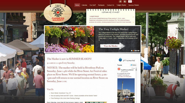
The intuitive design of this site is thanks to sophisticated web features including a horizontal scrolling image gallery and embedded “upcoming events” text frame. A full size street image of the market is enhanced with a watercolor editing effect and effectively used as the site’s background. Adding this effect creates a nostalgic softness to the site. For a market located just outside of the New York state capital, this is likely an intentional attempt to attract customers who want to escape from the hustle of city life. Troy Waterfront Farmers Market
9. Ada Farmers Market
Ada, MI
This website is clearly designed to leverage the power of social media. Every element of the homepage allows users to share or recommend via Facebook, and a frequently-updated blog is included as well. This web design is a good example of using visitors to increase traffic rather than keyword stuffing or other clumsy SEO approaches. Ada Farmers Market
8. Ithaca Farmers Market
Location: Ithaca, NY
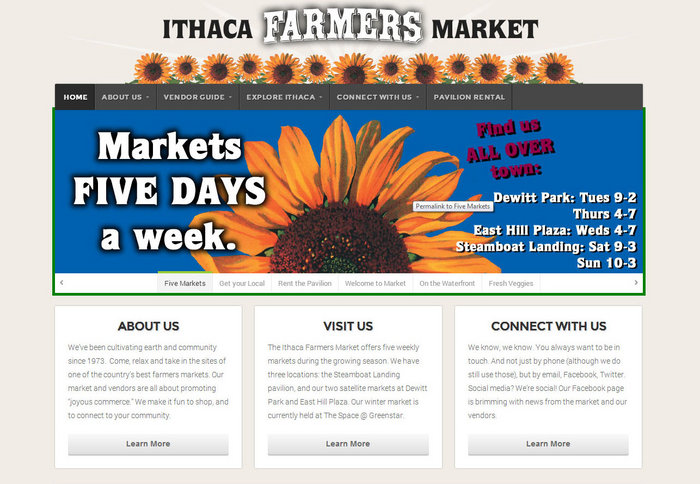
The light color scheme and simplistic web design layout allows visitors to focus on the repeated sunflower marquee and bustling photographs taken at the farmers market. The website makes it clear that this market is more than just a collection of stands; prominent links for pavilion rental and seller’s guides are woven throughout a layout that not only provides information for visitors but also serves to advertise to potential vendors. Ithaca Farmers Market
7. Westport Farmers Market
Westport, CT
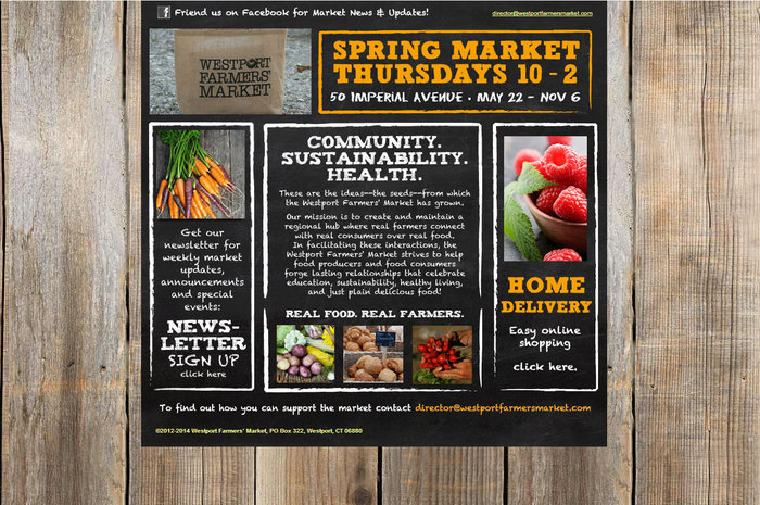
This rustic and homespun web design is ideal for a farmers market. But hidden within this approach are links to social media and an online ordering section. This site is an excellent example of a traditional website that seamlessly uses advanced web features. Westport Farmers Market
6. Trumansburg Farmers Market
Trumansburg, NY
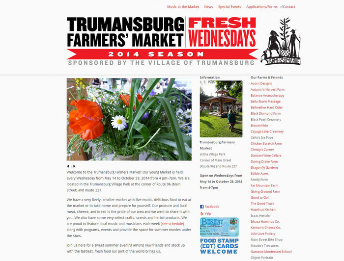
It’s clear that this website design is intended to network and create a community of market vendors. A prominent feature is the “Our Farms & Friends” column. Similar to a blogroll, this feature encourages reciprocal links on each respective site and draws traffic to the farmers market website. Trumansburg Farmers Market
5. Shreveport Farmers Market
Location: Shreveport, LA
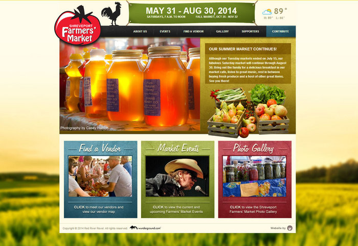
With graphic-based buttons along the bottom third of the site and a Google powered search box at the top, this website is designed to be easy to navigate. In fact, other than the subdued affiliate links located in the upper right, the main page consists of a mere nine links. This streamlined web approach encourages visitors to delve into each to see what the site has to offer. Shreveport Farmers Market
4. Seattle Neighborhood Farmer Markets
Seattle, WA
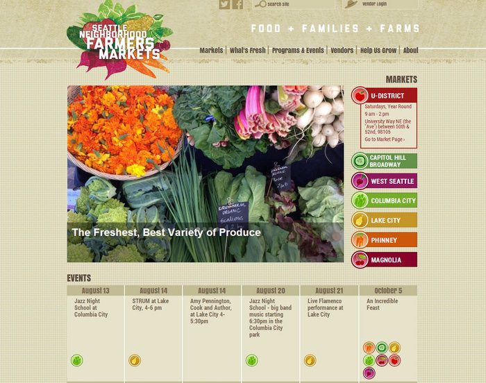
Everything about this website is a nod to the classic appeal of a farmers market. The logo consists of a realistic graphic of a bunch of vegetables and the background is reminiscent of a burlap produce sack. These features are subtle but create an overall visitor experience that sets the tone for what can be expected from this farmers market. Seattle Neighborhood Farmer Markets
3. Kalamazoo Farmers Market
Kalamazoo, MI
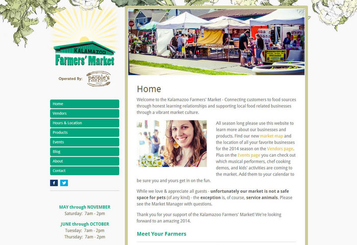
The web layout of this site is similar to what can be found in traditional blog templates. This creates a conversational tone throughout the site which compliments the local vendors and community approach of this farmers market.Kalamazoo Farmers Market
2. Mill City Farmers Market
Minneapolis, MN
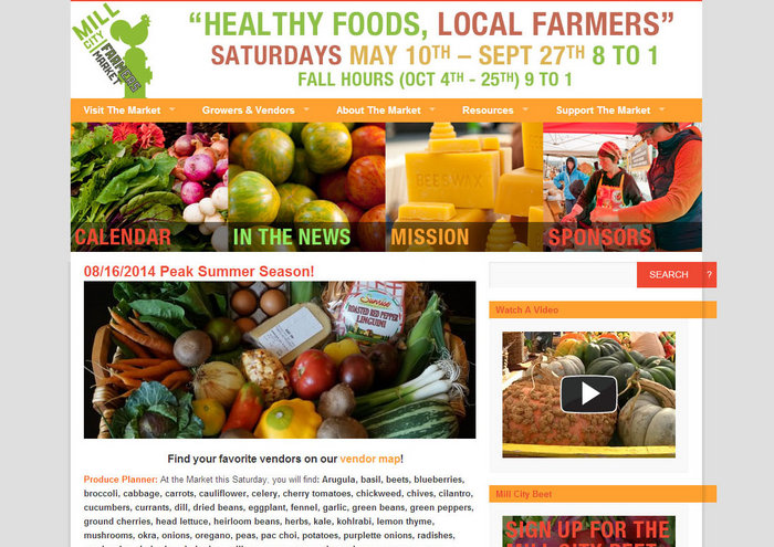
Vibrant colors and thick frames indicate that this site targets the trendy, urban lifestyle that surrounds this farmers market. The site is built on the WordPress framework, but advanced web design approaches and customized colors, fonts, and images make the site look far from the typical template. Mill City Farmers Market
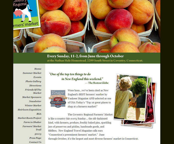
1. Coventry Farmers Market
Coventry, CT
This site is an example of how a dark website theme can actually be beautiful. The flat black background makes the header close up image of peaches leap from the screen. This contrast is tempered by the use of a secondary forest green color scheme to connect each component of the website layout. Coventry Farmers Market
Designing the perfect website is creating an online space that provides information to visitors in a way that brands and accurately portrays your small business. While each of the above sites are very different, they are all successful in doing so. If one of them has inspired you to begin work on your own website, contact us. We are ready to use our web design experience to help you create a web site for your small business!


