Engineering websites are notorious for being difficult to browse. Although we realize that this is an occupational hazard, it deters visitors from visiting your website. We already know that these websites can be made intriguing by using creative designs and simple navigation. We’re here to help you make your website stand out from the crowd.
We looked across the web for the best engineering website designs and compiled a list of our favorites. Take a look and see if any of these concepts pique your interest.
1. BAE Systems
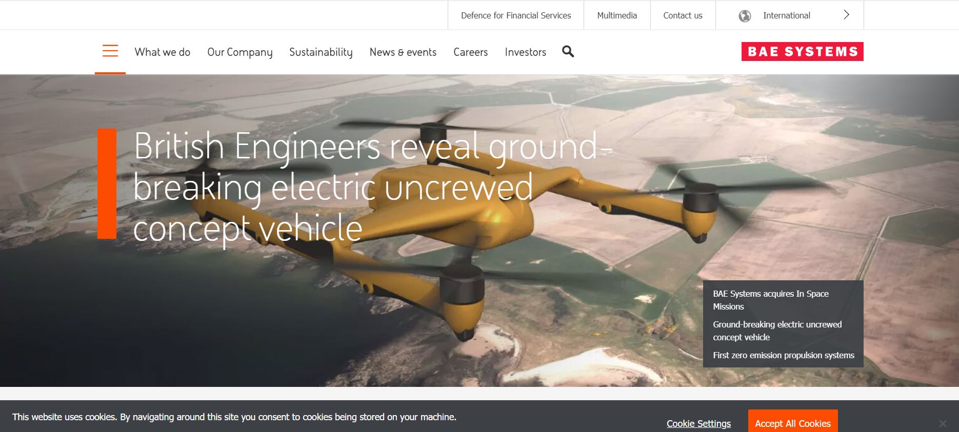
The British Aerospace Engineering (BAE) Systems is an international company considered to be among the best in defense. The website utilizes full-width photography and wields it to its aesthetic advantage. In addition to looks, the website is easy to navigate and efficient.
What We Like About It
The website features a sticky navigation menu at the top and a search tool to help you find what you’re looking for. The menu provides access to many facets of information, so you can hover your mouse over any option to view a more detailed menu for that category.
A slideshow is used in the header, with links to other pages on the website. They also use the header to draw attention to their most important initiatives and projects. The body of the website has been organized into parts, the majority of which are devoted to information on ongoing projects and developments. The mission statement is towards the bottom of the webpage, as are some statistics regarding their employees, investors, countries, and order backlog.
The website shows the ratings they’ve gotten from companies like MSCI. In addition, the footer provides information from the London Stock Exchange regarding their stock price. It also includes quick access to What We Do, Our Company, Sustainability, News & Events, Investors, Applied Intelligence, and Careers, split into categories.
2. Sta-Lok
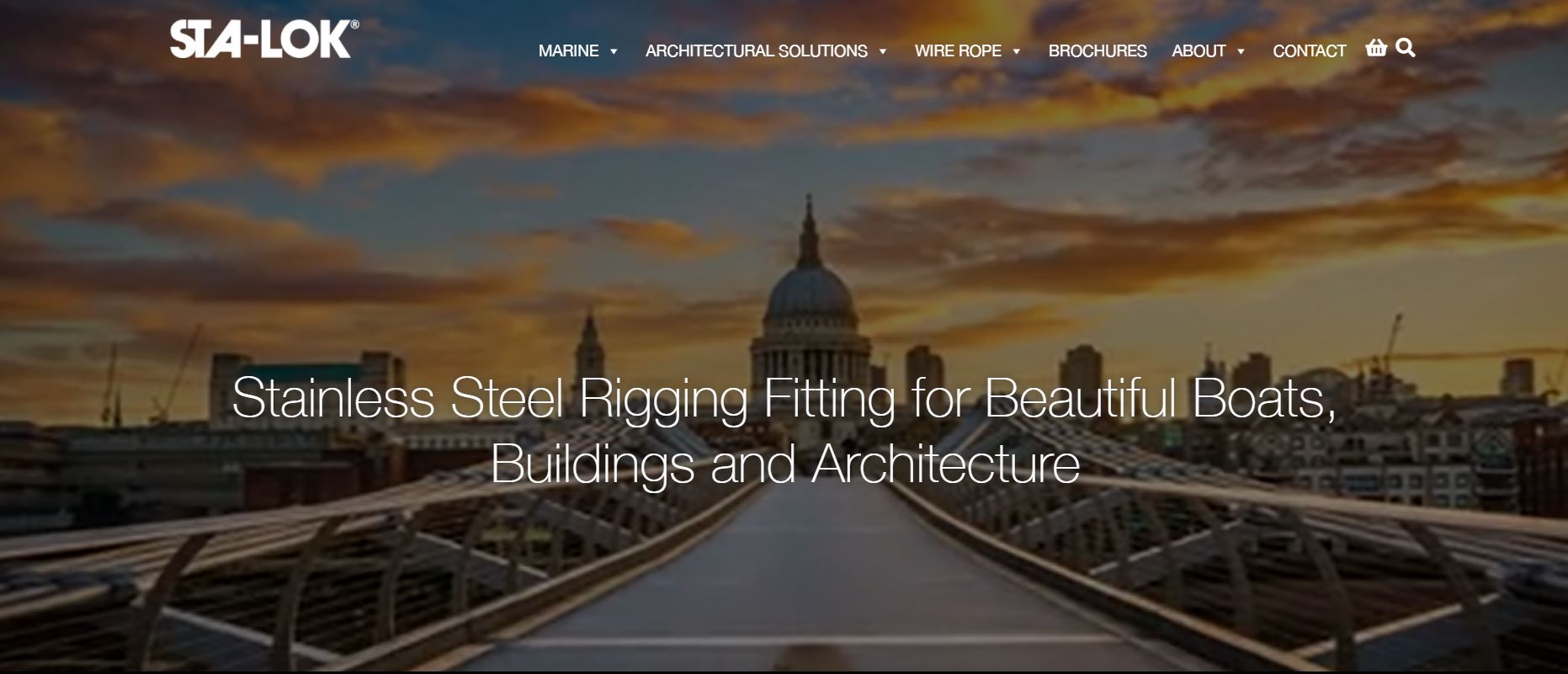
Sta-Lok is a UK-based engineering firm that specializes in manufacturing stainless steel riggings for various businesses. Their website has a stunning design with incredible photography and enticing visual effects. We found the website to be user-friendly, with links that described where they led.
What We Like About It
The website header features exquisite scenes of boats, buildings, and other things with their riggings. They have chosen a sticky navigation menu with options for five languages. The menu features links to Marine, Architectural Solutions, Wire Rope, Brochures, About, and Contact. The site also has a shop and a search feature that you can use at your ease.
Next, we have a section dedicated to why users should choose Sta-Lok, along with thumbnails of the solutions they provide. Following that is a news area that lists upcoming events and the most recent company news. They also include their partners’ testimonials, and a form visitors can fill in to communicate what they need.
The footer has all the contact information as well as navigation links for browsing the website. It also contains links to their social media accounts. Moreover, you can use the option at the bottom-right corner to chat with their support team.
3. Ford Engineering
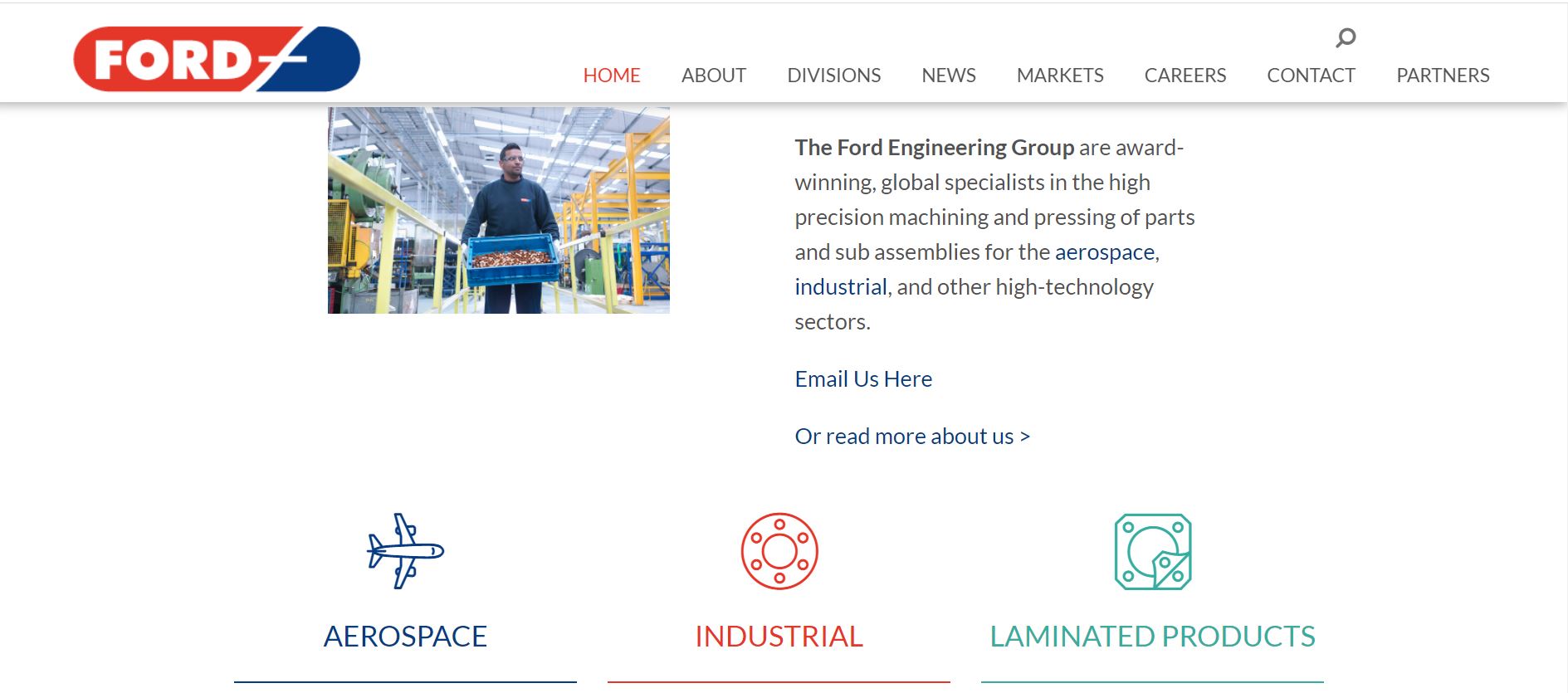
The Ford Engineering website has a minimal design that is easy to navigate. The website has a beautiful layout and is optimized for all devices. Overall, it is an excellent blend of aesthetics and usability.
What We Like About It
The website boasts a sticky navigation menu containing Ford Engineering’s logo and the search feature. It also includes links to Home, About, Division, News, Markets, Careers, Contact, and Partners. The header contains pictures with captions emphasizing their specialties. The header is a sliding one, so you can swipe through the images.
The following section provides a brief overview of the company. There’s also plenty of information about their aerospace, industrial, and laminated products. In addition, you can click on each project for more information and its business history.
Next, the website has a section dedicated to the company’s latest updates and news. You can also see sections for their Industrial, Aerospace, and Laminated products sections. Lastly, the footer features their contact information, privacy policy, and terms & conditions.
4. EPI Engineering
The EPI Engineering website design is another minimal layout that is easy to navigate. The content has been presented in clear blocks with links leading to more detailed information.
What We Like About It
EPI Engineering’s website takes the simple layout a step further by ditching the top navigation menu. Instead, they have a slide-in menu that you can access by clicking on the menu option. This slide-in menu features links for Home, Process Engineering, Cooling Water, Instrument Air, Steam And Condensate, Fire Protection, Process Safety, Partner Companies, About EPI, and Contact EPI.
The homepage header consists of a processing plant picture with a caption urging folks to rely on experts. Next, there are thumbnails for their services; You can click on these for detailed information on the services. The following part has an explanation of how EPI Engineering operates and why you should choose them.
At the bottom of the homepage, the footer contains contact information, including phone number and address, along with quick links to navigate the website, namely Home, Partners, About Us, and Contact EPI.
5. Marshall Aerospace
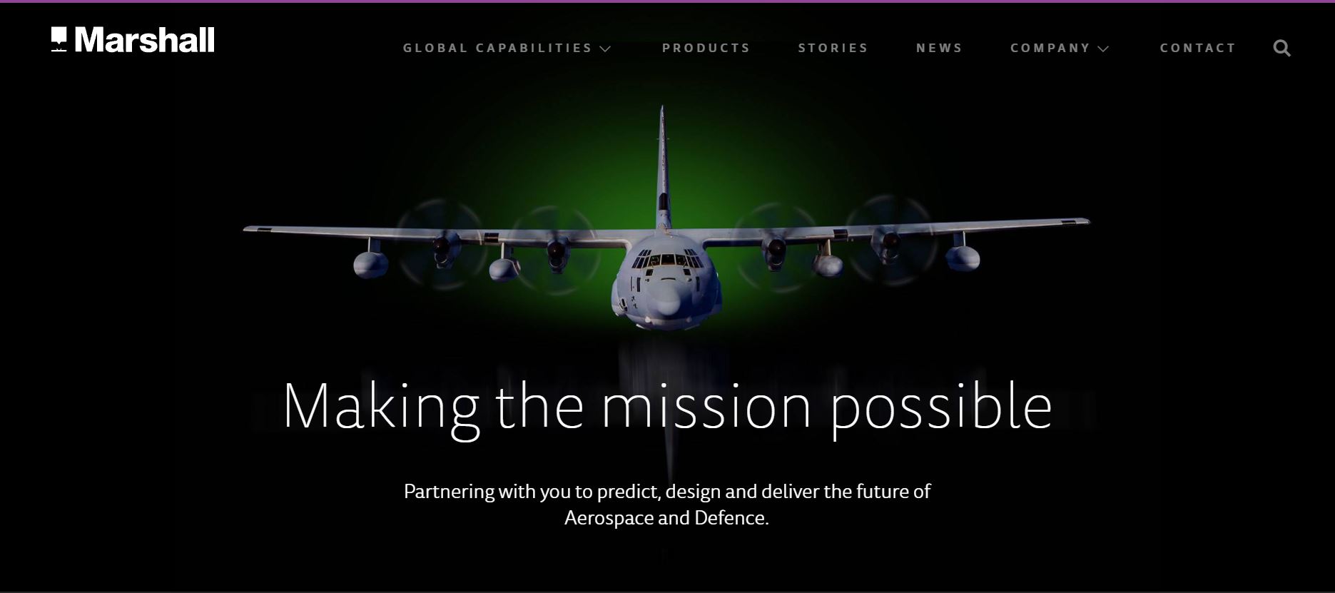
Marshall Aerospace certainly understood the assignment when it came to the website design. The site uses a dark color palette that is elegant and does not strain your eyes.
Aside from that, the website is simple to use, and all content is easily accessible. Combined with the captivating graphics, the impact is excellent.
What We Like About It
The top menu has Global Capabilities, Products, Stories, News, Company, and Contact options. There is also a search feature that you can use if you want to get quick access to specific information. Plus, the header has the picture of a plane with a declaration of the company’s passion for building the future of aerospace and defense.
Below that is a strip with links for the Managed Services, Integration, and Technologies pages. All these pages contain detailed information about the working process along with the accompanying graphics.
You can also read up on stories of their capabilities on the website, along with visiting sections for news, insights, and events. The footer has quick links for navigating the website and the copyright declaration and social media handles. If you want to read up on their anti-tax evasion, privacy, and modern slavery policies, you can do that here.
Conclusion
So there you have it. That was our list of the best engineering website designs. One thing that is common in all these websites is their accessibility. The website designs are beautiful and elegant, giving them a professional appearance.
If you want to attract more clients, your website design should exude a sense of solidity and professionalism. Comprehensive details of your previous projects can be an essential factor as well. Finally, the contact information should be prominently displayed.
We hope you find our efforts helpful, and we wish you the best of luck with your website design.
