10 Beautiful Dental Implant Website Design Examples for Dentists
If you have ever lost a tooth, you know how it affects your appearance, which is why most people opt to get dental implants to get their smiles back. However, dental clinics are intimidating places, and people are not keen to experiment in this field. Apart from your skills, you need to develop a good reputation for your practice. A website can go a long way in making that first impression and earning their trust. You must establish a good line of communication and help visitors get all the information they need to feel comfortable with you.
A well-designed website can do wonders in establishing you as a credible professional. We know you’re probably wondering what you can do to make your website stand out. No worries! We’ve got you covered. Take a look at our list of the best dental implant websites on the internet.
1. McFadden Dental Implant Center
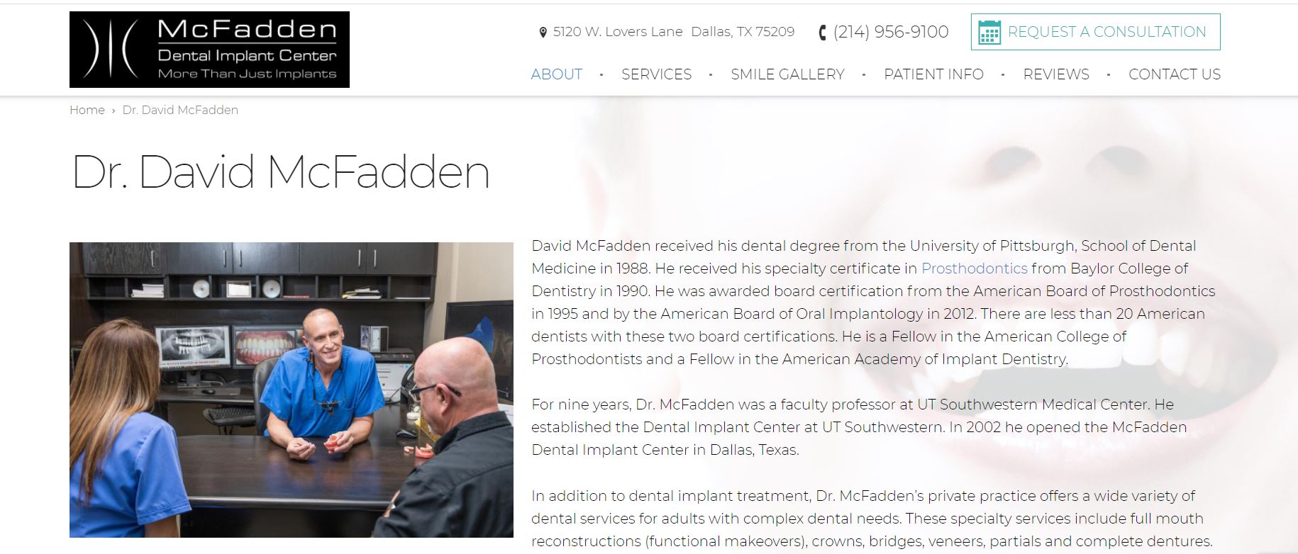
McFadden Dental Implants Center is a Texas-based practice that promises quality implants to its clients. Their website design is professional and is filled with explanations of the appointment procedure and how you will be treated at the center. This sort of content does a great deal for establishing a relationship with potential patients.
What We Like About It
The website has a convenient sticky navigation bar that is pretty comprehensive. It shows the center’s name and logo along with its slogan on the right. The left side has their address, phone number, and an option for requesting a consultation. The navigation options are the usual ones that don’t stand out. However, the smile gallery is an exciting addition.
The header features a picture of the center’s interior and has options for more information like what to consider before opting for implants. It also contains a testimonial section that visitors can look at. There’s also a video that you can access by clicking on the picture of Dr. McFadden. If you scroll down more, you’ll see brief information about Dr. McFadden. You can click on the options here to see a more detailed profile of him. The website also displays his rating based on patient reviews which you can access by clicking on the provided option.
Next, there is a list of their services that you can click on for more information. Below is a list of accreditations and a form that you can use to schedule an appointment. The footer contains quick links for navigation and their contact information.
2. 4M Dental Implant Center
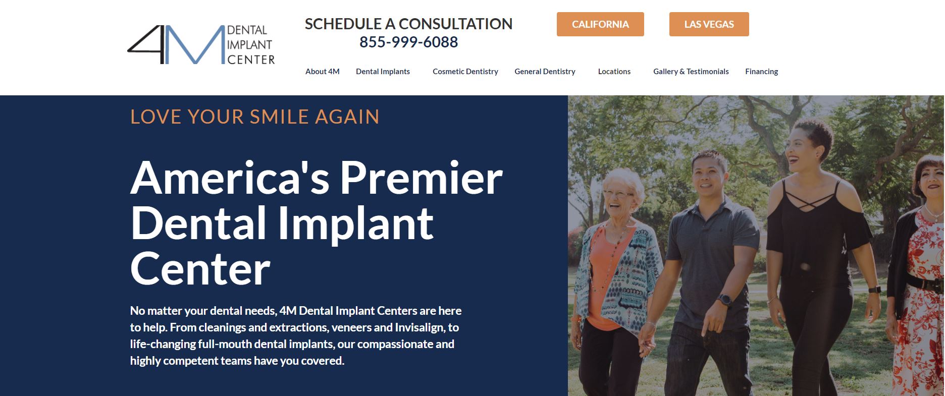
4M Dental Implant Center has a great website with a modern interface and efficient design to get the information across. All the information is well organized, explaining every detail about how they work. They have used a lot of pictures and videos on the website to make it more interactive. The color scheme utilizes solid colors, so it doesn’t take the focus away.
What We Like About It
The homepage header features a picture of previous patients and a banner encouraging you to love your smile again. There’s also a statement declaring that they can help you with any teeth troubles. Finally, there’s an accessibility button at the bottom-left corner. You can use this option to change the website’s language, choose a relevant interface profile, and adjust content, colors, or orientation.
The bottom right corner features a help button that you can use to chat with the staff. The navigation bar has the center’s contact details and other navigation options. The center has locations spread out over southern California and Las Vegas. You can access web pages specific to an area by clicking on links in the navigation bar.
Below the header, there is a welcoming statement from Dr. Sean Mohtashami. You can even apply for a free consultation here, just click on the location closest to you, and you will be redirected to the relevant page.
Next, there is a services section utilizing video testimonials from previous patients. Then there are thumbnails that you can click to get more info on a specific service. The following section highlights reasons why you should choose 4M for treatment.
At the very bottom of the website, there is another call-to-action button to book an appointment. In addition, the footer contains links to their social media handles and their policies.
3. The Dental Implant Clinic
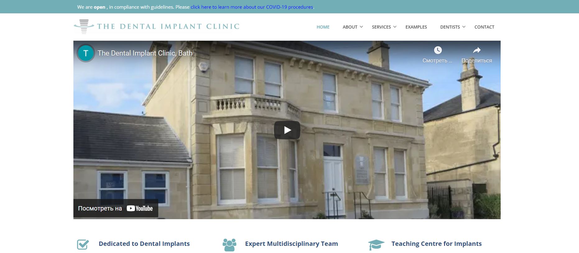
The Dental Implant Clinic has opted for a minimalistic style for its website. The website has all the information that potential patients could need. In terms of the color scheme, the website relies heavily on white. The website is easy to navigate, with a separate section dedicated to every aspect of the practice.
What We Like About It
As soon as you open the website, the embedded video draws your attention. The video introduces you to the center, including information on how things work and some words by the principal dentist, Jonathan Scofield.
There is a strip at the very top of the homepage indicating they are open and accepting patients. The navigation bar displays the name of the center on the left along with their logo. The right side has other options for navigating the website. The bar is sticky, so it saves the visitor from the headache of endless scrolling to get what they need.
Below the header, you will see an intro to the center and a statement from the center’s founder. The following section focuses on the services offered. There is a brief intro to each service, and you can get more information by clicking on the service.
The website also displays pictures of the entire team. You can get more info on them by clicking on the meet the team option. The last section in the body is for getting in touch with the center. You can fill out a brief form here to do so. There’s also a google add-in that you can use to get directions.
The footer has the center’s contact information. It also features the latest news from the center and provides its operating hours and job openings.
4. NuSet Dental Implant Centers
NuSet boasts that their dental implant technology has made treatment faster, so we expect their website to display the same innovation. The website is comprehensive and lures visitors in with its efficient and quality design. The website content is clearly defined and divided into sections. Thus, the information is easily understandable. In addition, the website features excellent explanations about the procedure to familiarize patients with the system.
What We Like About It
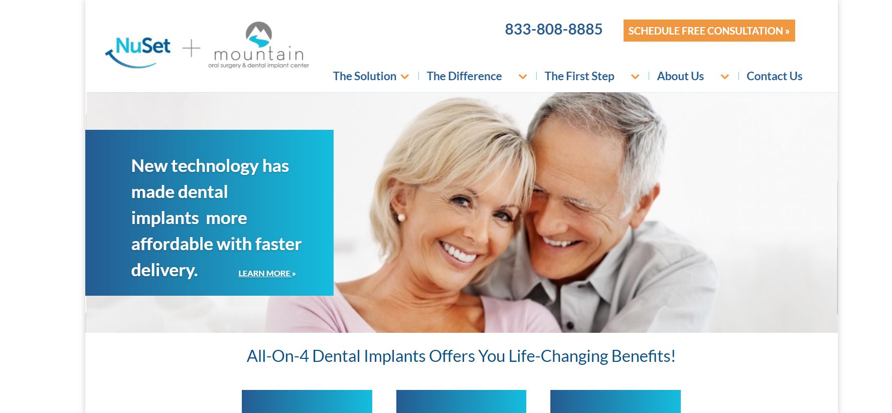
The header features a picture of a smiling elderly couple with a caption claiming new technological techniques have made implants more affordable with faster delivery. The navigation bar has the center’s contact number as well as a free consultation scheduling option. The right side contains the NuSet and mountain oral surgery & dental implants center logos. Most of the navigation options on the bar have dropdown menus for more detailed navigation options.
The following section highlights the benefits of dental implants. They also offer customized implants. There’s a form here that you can use to schedule a free consultation. Below is a brief introduction of their lead dentist, Dr. Robert Ryan. You can get even more information on the dentist via this section.
The website focuses on two dental solutions, with details about their advantages. They also describe the related costs and payment plans. The center also proudly displays its accreditations on the website.
Further down the page, a separate section details patient stories. The testimonials are presented in a video by the patients themselves. We loved that they went to the trouble of explaining the entire process starting from the first consultation to the permanent teeth. The footer has links to information like what dental implants are. You can navigate the whole website using the footer.
5. ClearChoice Dental Implant Centers
ClearChoice Dental Implant Center had a clear objective when designing its website, to make ClearChoice the clear choice for patients getting implants. As a result, the website has a clean interface that is easy to navigate and offers excellent functionality when scheduling visits or finding a location near you. The website’s color scheme is dominated by white and blue.
What We Like About It
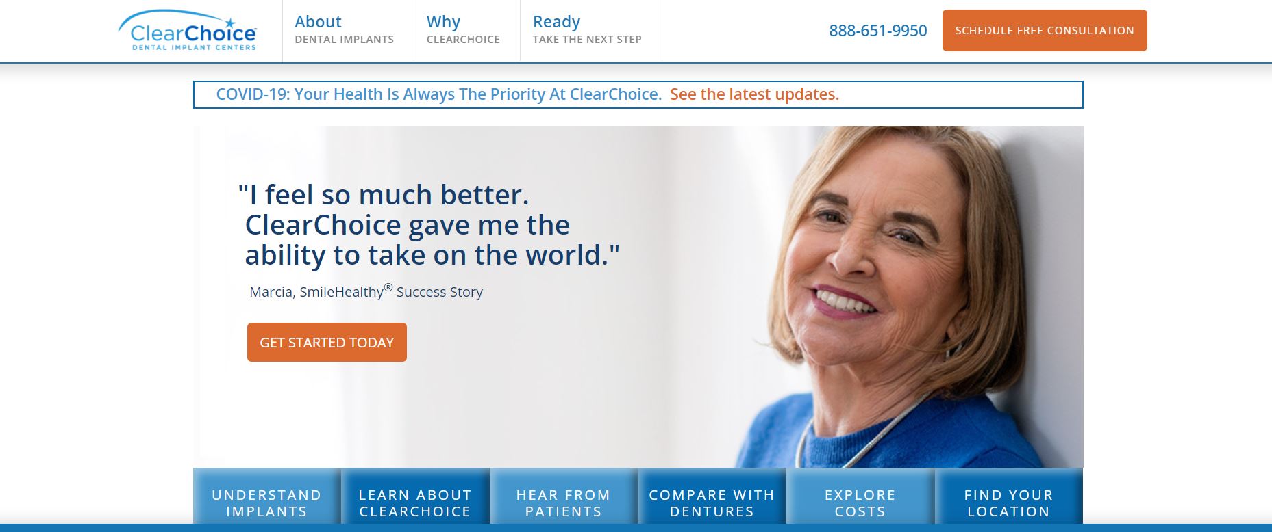
The navigation bar for the ClearChoice website is minimalistic, with the basic options displayed. The left side has the contact number and a consultation option that you can use to schedule a free consultation.
The website header features a success story with a patient’s picture, along with a ‘get started today’ button as a call to action. Below the header picture, you will see thumbnails labeled with options like understanding implants, learning about ClearChoice, hearing from patients, comparing dentures, exploring costs, and finding a location. These redirect the visitor to the relevant pages.
The next section covers online appointments, why people choose ClearChoice, what dental implants are, and their affordability. You can also see links to their social media, including Facebook, Twitter, Youtube, and LinkedIn.
The footer has quick links for navigating the website. These links have been categorized into Learn More, Company Information, and ClearChoice.com. You can use these links to access services, learn more about implants, and learn about ClearChoice’s policies.
6. Thailand Dental Implant Center
The Thailand Dental Implant center has gone global with its website. The website has one of the most professional interfaces we have seen in this category. They have a simple light color scheme that’s pleasing to look at. The content on the website is pretty comprehensive and easy to understand. The website serves to familiarize the patients with the center and the doctors that will be treating them.
What We Like About It
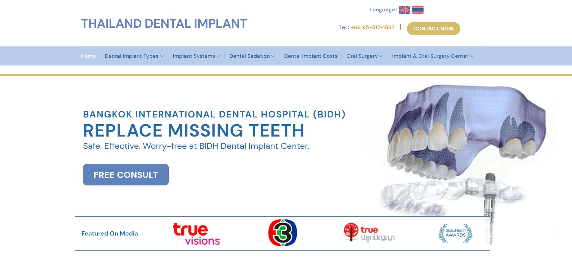
The header features a 3-D upper jaw model with a caption offering safe, worry-free teeth replacement at the center. In addition, there is a free consult option that you can use to secure a free consultation. The website also displays the media articles featuring the center.
The navigation bar at the top has the center’s contact number and a ‘Contact Now’ option. It also has options for navigating the website to learn more about the services. You can hover your pointer over some of these services to access more options.
The following section introduces the center, including the solutions they offer. You will also see a youtube video embedded here. The video gives you a virtual tour of the facility. Finally, the following section lists the reasons to choose Thailand Dental Implant Center.
The next section lists out the centers at the hospital based on the services they offer. You can click on any one of these, and the website will redirect you to the relevant page. They also offer flexible payment plans and accept dental insurance. There is a slide show showing their doctors with over ten years of experience. You can click on the images for more details about them.
The website also explains the center in detail, along with their research lab and the technology they utilize. You can access introductory videos and patient reviews here. The footer has their contact information as well as links to other dental specializations.
7. Fusion Implant Center
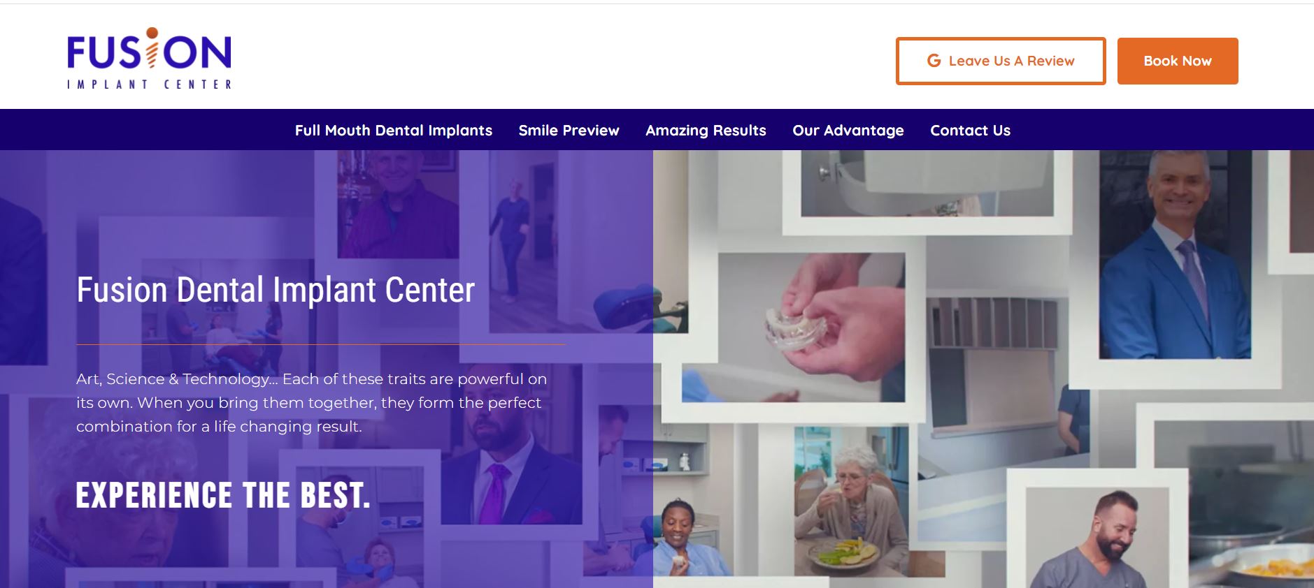
Fusion Implant Center is unique in that it specializes in dental implants. This is reflected in the website design, which is solely based on dental implants. The website has a bold color scheme that catches the visitor’s attention. Overall, the website design is easy to navigate and incorporates a touch of modern design.
What We Like About It
As soon as you enter the website, the looped video header catches your attention. The video is a collage of scenes from the center. The caption overlaid on the footage declares their mission to give their patients the best experience.
As for the navigation bar, it is at the top. You can use it to get around the website. You can also use it to review them on google or book an appointment for yourself. There are some options right below the header that you can use to get information on their operating procedure and payments.
Fusion Implant Center utilizes The Fusion Smile System to install the implants in as little as one day. They briefly introduce the system on their website, but you can get more information by clicking on the learn more option. The homepage also includes a video that briefs about the center and the staff.
The testimonial section features video testimonials from previous patients. The footer has links to the center’s social media accounts. They also have links to their services and doctor profiles. You will also find their contact information and working hours in the footer.
8. Austin Dental Implant Center
Austin Dental Implant Center is on a crusade to provide everyone with the perfect smile. At least, that is what they claim on their website. The website is elegant, and comfortable to use, and all the information has been presented clearly. You get to see their work in the pictures displayed on the website, which assures patients about the quality of care they will receive.
What We Like About It
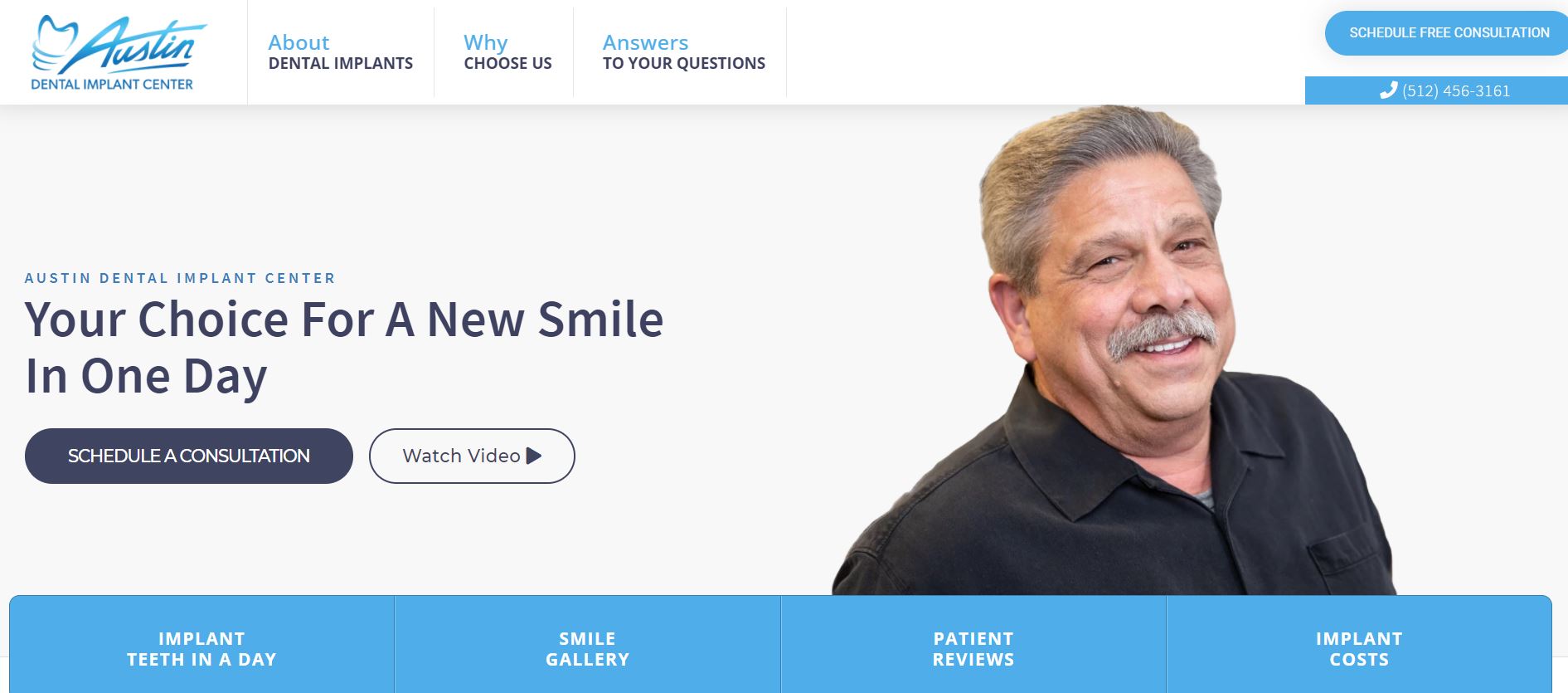
The first thing that pops up when you get to the website is a pop-up message showing how low the monthly payment system can be, along with their contact number and a free consultation offer. After you close that, you will see the picture of a smiling older man and a caption calling Austin Dental Implant Center your choice for a new smile in one day. You can use the call to action option to schedule an appointment immediately, or you can watch the introductory video.
The navigation bar is comprehensive, with options for getting answers to the common questions regarding about, why, and more. There are navigation options below the header as well. They include links to the smile gallery, implant costs, and patient reviews. You can also learn about the center’s experience in the section below.
The rest of the website covers why you should choose The Austin Dental Implant Center, and there are plenty of videos to accompany that reasoning. They also have a buying guide and promotional offers. The homepage features a separate testimonial section. However, in this case, the unique thing is how the patients hold their pictures from before.
The footer has options for getting a free consultation. It also has their address and contact information. The footer also has disclaimers and social media links.
Conclusion
That concludes our detailed review of the best dental implants website design. There are a few common elements that have been incorporated into all these websites. In our opinion, though, it would do you a great deal of good to add testimonials, picture galleries, and videos. Office tours are also great, and displaying staff profiles adds another layer of trust.
Make sure to include information to familiarize patients with your office even before they visit you. You can get rid of patients’ usual apprehension through your website. Hopefully, the list and our advice will inspire you to come up with something great!

