The transition from high school to college is a defining moment in a student’s life. A significant decision, such as selecting a college, warrants a great deal of research. Since it’s not possible to visit every college, students tend to do that research online. A great website can showcase your institution’s best features.
The more information you provide on your college website, the easier it will be for students to determine whether you are a suitable fit for them. A college website should be simple to navigate and include enough information about college life to entice students.
All of this may seem overwhelming. So, to make your job easier, we’ve reviewed the website designs of some of the most prestigious colleges in the country.
Top 6 College Website Designs
1. Harvard University
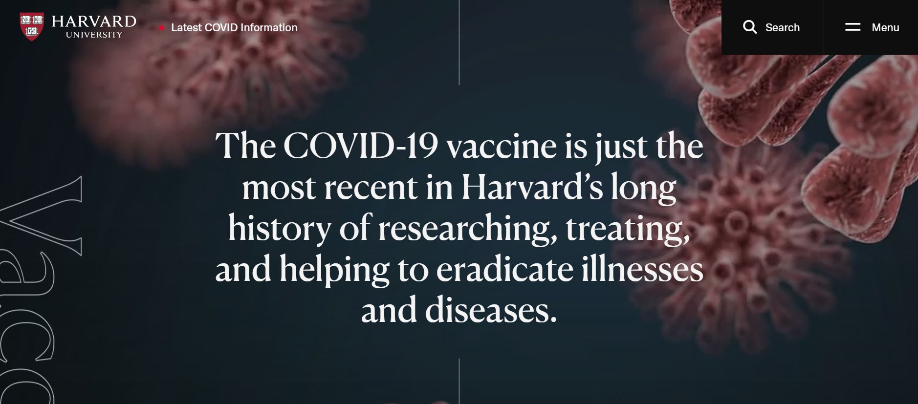
Given Harvard’s illustrious history, it’s only logical that they have a well-designed website. It just goes to show you can’t slack off even after establishing your name. Harvard’s website follows a modern theme and a compact design.
What We Like About It
The website’s background color is a simple white, which only serves to highlight the high-definition images. The header has the standard Harvard logo as well as a dropdown menu option. For added convenience, they have integrated a search button.
The homepage features profiles of prominent university students and professors so that you may learn from their experiences and get a sense of what life is like at Harvard. Additionally, there are sections for updates about admissions, on-campus classes, etc. Because the day of move-in might be particularly confusing for students, the website includes thorough information and images about the event.
Explore university life by clicking on links to various schools, programs offered, sports teams, and communities on the website.
The “Harvard at a Glance” section is probably the best part of the website. It has links to read about the university’s history as well as a summary of the statistics. These include the year Harvard was founded, the number of students, alumni numbers, scholarship grant information, etc.
2. Princeton University
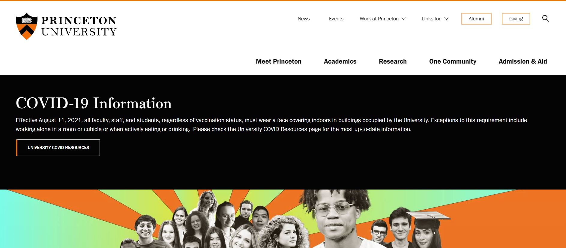
Princeton University, another prestigious institution, has a comprehensive website. Visitors can access any information they might need regarding the university, academics, research, admissions, and much more. Again, the simple navigation options are a plus.
What We Like About It
The Princeton logo appears in the header, along with navigation buttons. There is also a search feature on the website. The menu stays at the top of the page in a more compact version as you scroll down, allowing you to access it even when reading up on a section further down the page.
Next, we have the news sections containing updates from the university. Finally, there is a section dedicated to upcoming events with the date and time. You can also click on those for more details.
The following two sections are designed to assist anyone interested in working or studying at Princeton. The study section has links to undergraduate and graduate admissions as well as areas of study. The work column provides links to staff and academic positions.
The footer contains navigation options as well as links to further relevant information. This section also includes their contact information and links to their social media handles. Moreover, it showcases Princeton’s Equal Opportunity and Nondiscrimination policy for visitors to read.
3. Cornell University
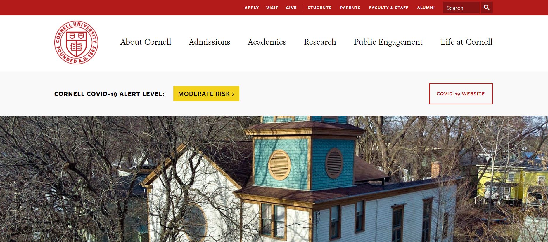
Cornell University is a huge university with several colleges, and the design of its website reflects this range. The website’s core colors are black, red, and white, and pictures in these colors are used throughout. The minimalist style and efficacy give the website a classy look.
What We Like About It
The header contains the Cornell University logo, along with the menu for navigating the site. In addition, there are separate menu options for students, parents, alumni, and faculty. You can even check out the on-campus life by clicking on the “life at Cornell” option.
The homepage has an official bulletin board, where the latest campus updates and notices are uploaded. Furthermore, they have a COVID alert system in place to deal with the changes brought on by the pandemic. Further down the page, there is a section dedicated to news articles and media features. They also have an important dates section that mentions any upcoming holidays.
You can also use the social media directory and the video to explore life at Cornell. The footer again has navigation links for different web pages. You can also access campus tours and such. They also show the live view and weather of Ithaca, where the university is located.
4. John Hopkins University
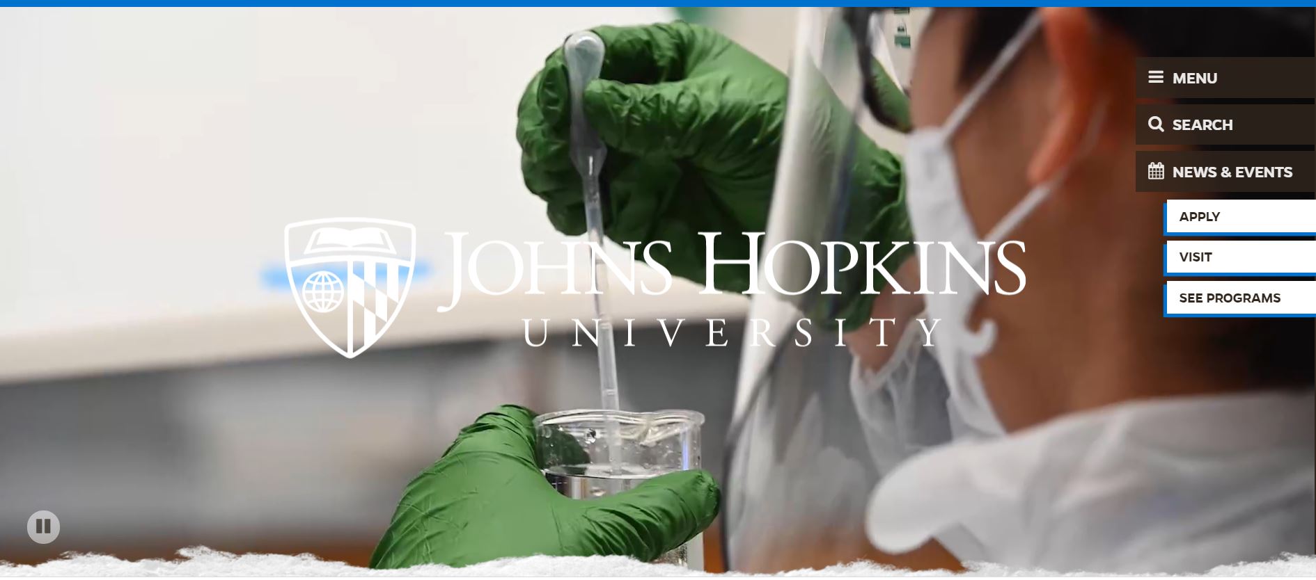
John Hopkins is one of the top-rated universities in the world. It is reasonable to expect a polished, well-maintained website from an institution of their stature, and the John Hopkins website sure doesn’t disappoint. The website takes a more contemporary approach to website design. As a result, the John Hopkins website is one of the sleekest yet information-packed websites we have seen so far.
What We Like About It
The website gets a promising start as the designer has decided to ditch the traditional top menu. Instead, the thumbnails are displayed on the side of the website. When you click the thumbnails, the accompanying menu slides into view. This approach saves space and gives the website a more chic look. This has been done for the navigation menu, the search feature, and the news and events sections. You can go to the relevant pages by clicking on the application and program options.
There is an introductory video at the top of the homepage showing scenes from campus life. Just below are the COVID information resources. You can explore the website to get a deeper view of how things are done at John Hopkins University. You can do so by clicking on the campus tour and other options in the explore section.
The rest of the website is dedicated to glimpses of the John Hopkins community, its rankings, and other information. You can access their contact information through the footer.
5. Purdue University
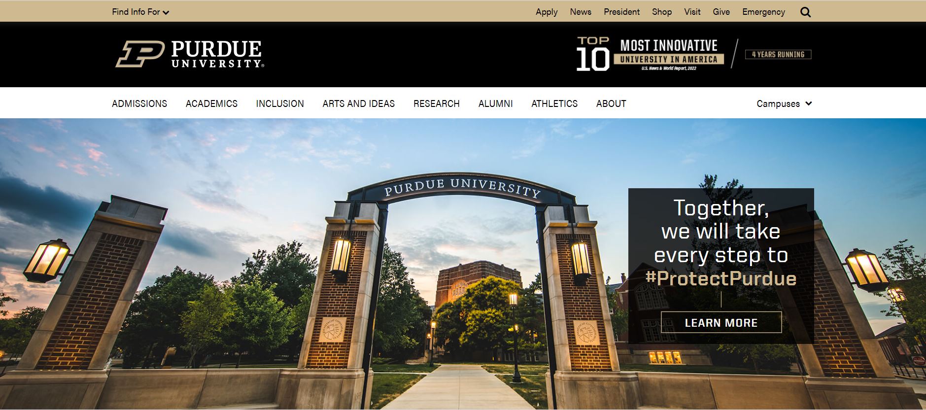
Purdue University’s website ticks all the boxes for an efficient website. It has all the functionality needed to make the website user-friendly yet efficient. They have chosen a more neutral color palette which gives the website an elegant look.
What We Like About It
The fact that you can access the entire website from the top menu is brilliant. The header has all the links for admissions, academics, inclusion, sports, news, and much more.
They even allow you to personalize your homepage. For example, you can select your status as a prospective student, a current student, an alumni, or a faculty member or staff member. You can also choose up to 4 resources from a list that appears for you. The users can also access university resources like Brightspace there.
The sections that follow are dedicated to university news and updates. There is a COVID-centric section with information on symptoms and vaccination. Additional information is available in the footer, along with the university’s contact information.
6. The Ohio State University
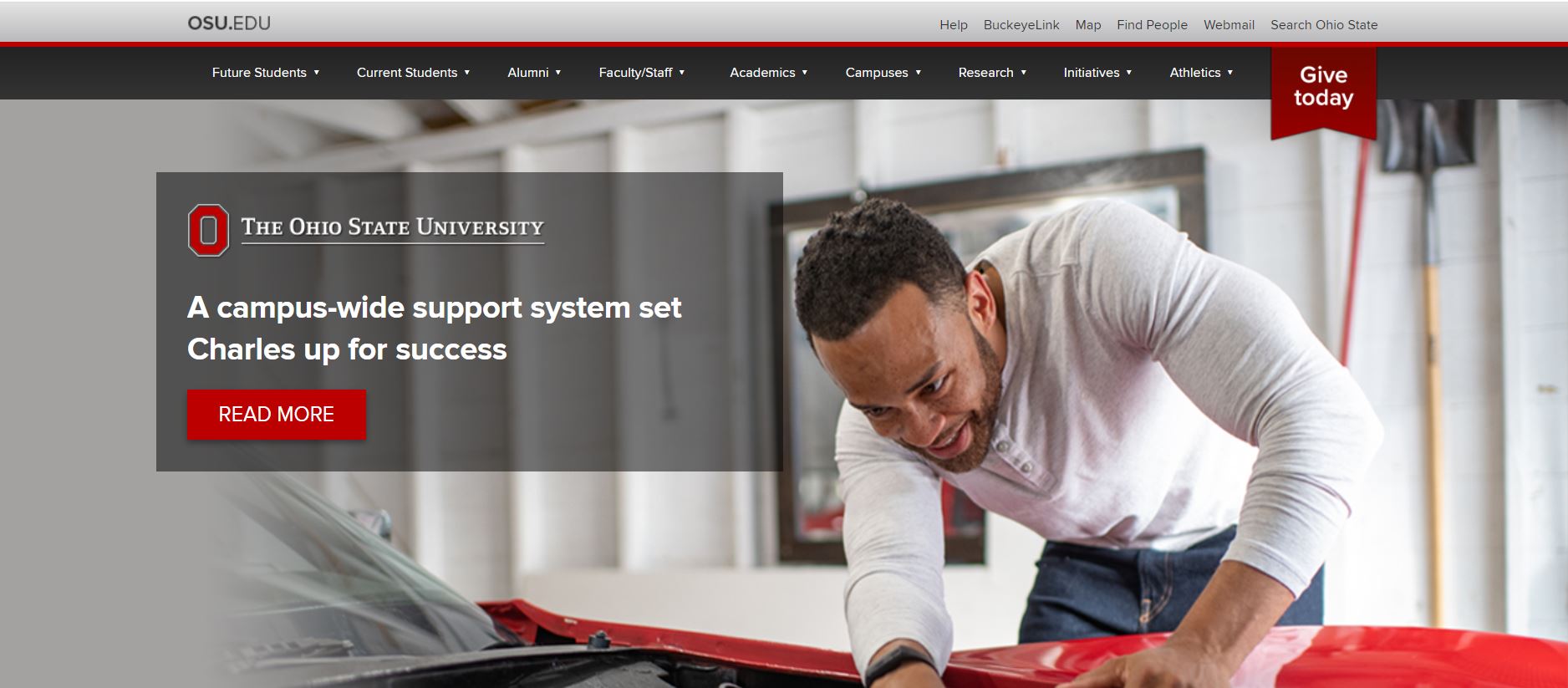
The Ohio State University website has been designed to meet the needs of everyone. They do so without using flashy graphics, instead opting for a simple and powerful design. In addition, they have split the material and delegated it across different web pages, which has resulted in a more minimalistic home page.
What We Like About It
As soon as you enter the website, you see a student’s picture linked to her profile. You can click on this link to see her journey through Ohio State University. Presenting a personal story at the very beginning is a brilliant way to draw visitors in. The top menu has all the options for navigating the website as well as an option to donate.
The next section has info on COVID vaccines and shot scheduling options. It also has the option to apply and gain access to extra resources. Next, there are sections dedicated to news about the university and links to apps.
The footer has information on the university, like their contact information. They also have their social media links and website navigation links there.
Conclusion
If you don’t have a well-developed website in today’s era, you are already out of the competition. Students rely on these websites to gain helpful information on the colleges they want to apply to. This is your opportunity to showcase everything you can offer prospective students.
You must concentrate not just on the appearance but also on the resources you provide to your visitors. Their ease of access has to be your priority. The rest is all about making your website more appealing. You can go through our list to get inspiration for your future website.


