Daycare & Childcare Website Design
People believe running a childcare center is easy and requires little work. However, as a child care center proprietor, you must know this is not the case. Child care is a huge responsibility, and you must win the parents’ trust before they can entrust you with their child.
Here are some features that could make your daycare website more attractive to potential parents:
- User-friendly design: Make sure the website is easy to navigate and provides all the necessary information about your daycare.
- Photo Gallery: Include high-quality photos of your facilities, classrooms, outdoor play areas, and other areas relevant to your daycare.
- Information about your daycare: Provide detailed information about your daycare services, policies, hours of operation, fees, and contact information.
- Testimonials: Include testimonials from current or past parents to give potential parents an idea of what it’s like to send their children to your daycare.
- Curriculum information: Highlight your daycare’s educational philosophy, the curriculum you use, and any additional educational programs you offer.
- Staff information: Provide information about your daycare staff, including their qualifications, experience, and biographies.
- Secure login for parents: Offer a secure login for parents to access information specific to their children, such as schedules, menus, and progress reports.
- Online enrollment forms: Provide online enrollment forms to make it easy for parents to sign up for their children.
- Blog or news section: Keep parents informed about your daycare’s events, activities, and updates with a blog or news section.
A well-built website that establishes you as a professional who can safely and efficiently care for a child is the first step in that direction. Take a look at the website designs we have discussed below to see exactly what your website needs.
1. Ebenezer Child Care
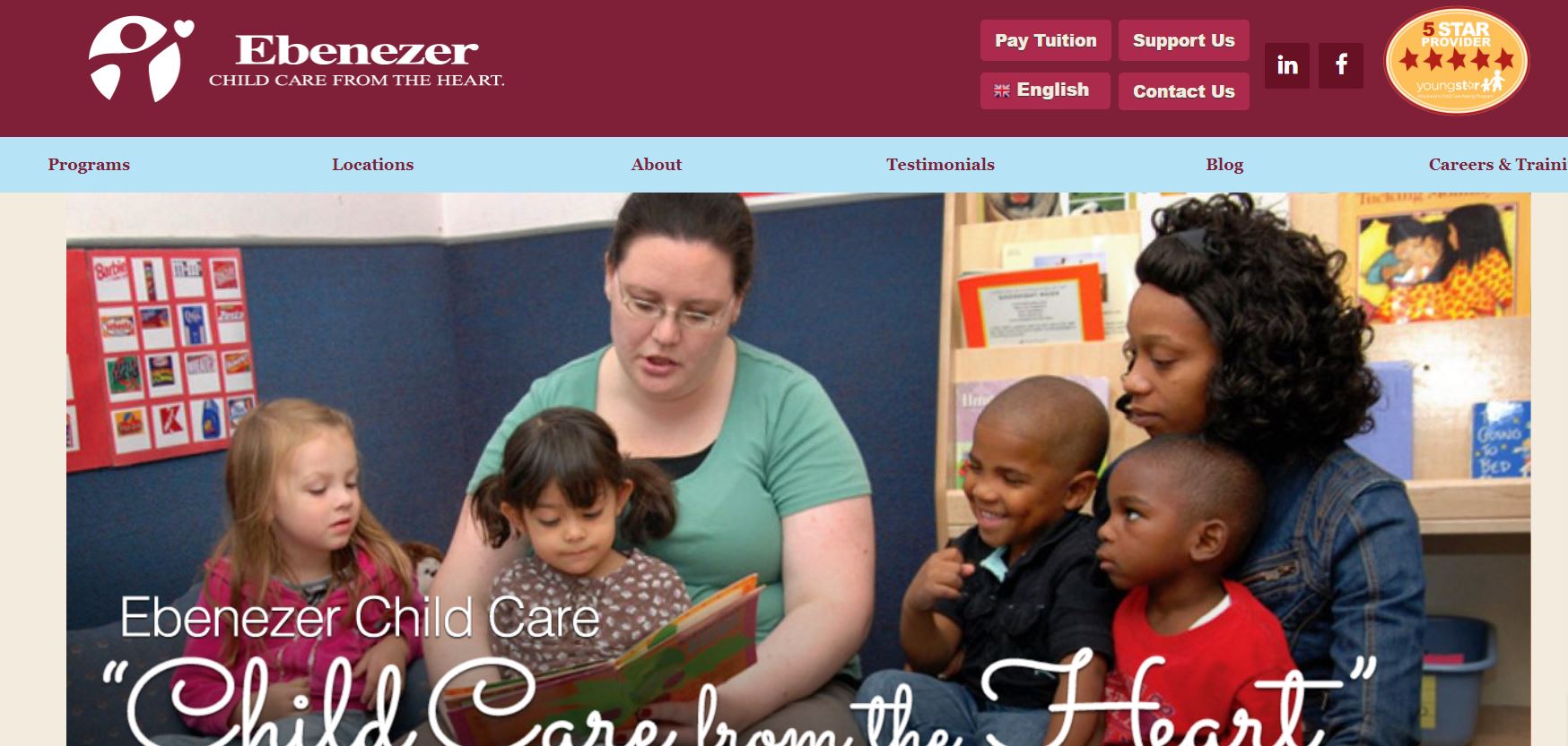
Ebenezer Child Care prides itself on providing care from the heart. We see their dedication reflected in the design of their website. The site is easy to navigate, with ample information on the admission system and the curriculum they follow.
Moreover, the website is available in multiple languages, making it accessible to more parents.
What We Like About It
The center’s logo and Youngstar rating are prominently displayed on the webpage. The website’s navigation menu sits below it, and it’s simple to use, with clear links to the Programs Offered, Locations, Testimonials, Blog, and Careers and Training pages. The homepage also has options for paying tuition, changing languages, supporting them, and contacting them.
The first slider displays images of children from the center and their tagline, “Child Care From The Heart.” They show a picture from each of their three locations and the option to book a visit immediately.
The website includes a video with parent testimonials, footage from the care facility, a student’s experience, and information about why parents should choose them. The Daycare Checklist, Signup, and Parent Testimonial sections can all be found here.
In addition, the footer contains all of the website’s navigational and social media links. You may also use the search option to find information quickly.
2. Bright Horizon
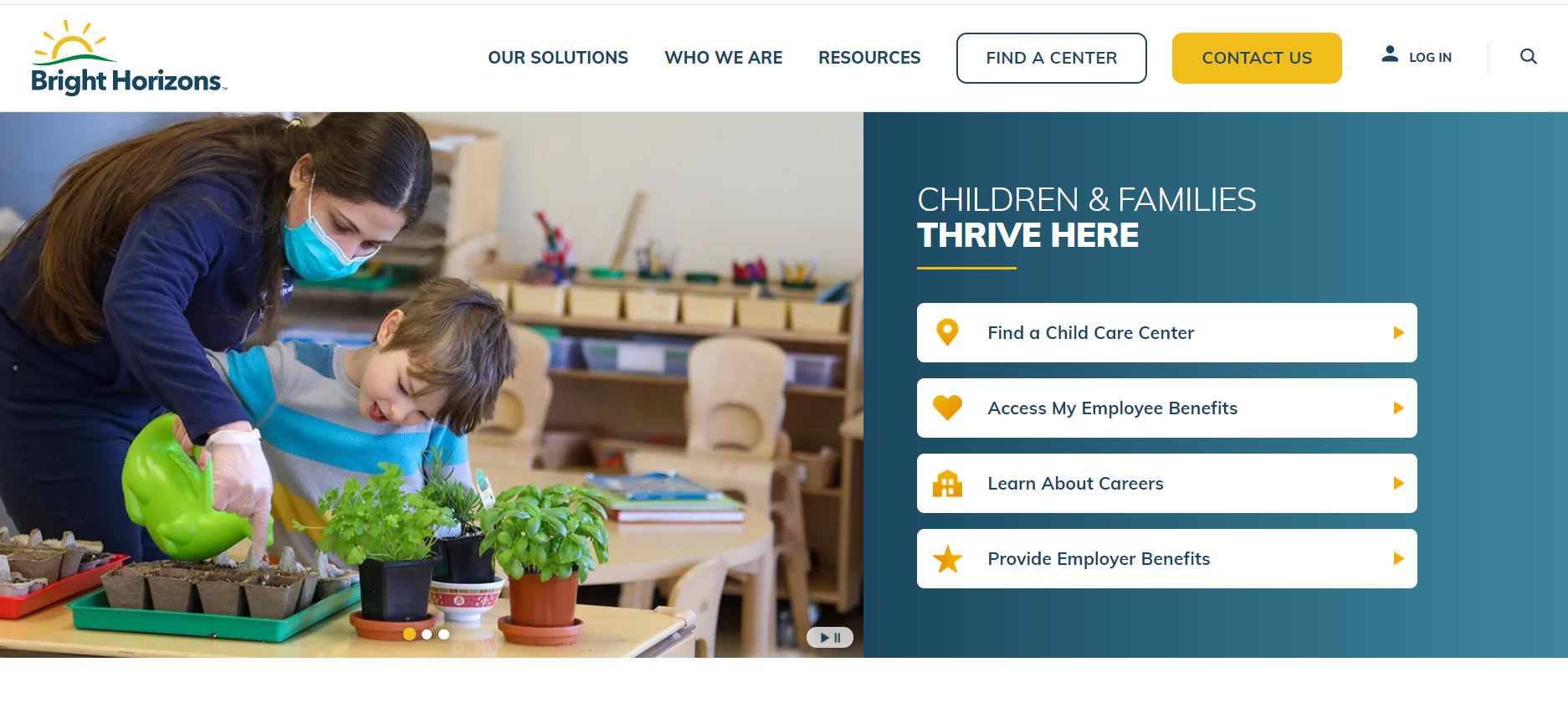
The Bright Horizon website has a bright layout and a simple user interface. They’ve made excellent use of white space to make the page look appealing. The website has plenty of information tactfully organized not to overwhelm visitors.
What We Like About It
The website’s sticky navigation menu links to the Homepage, Location, Curriculum, FAQs, Parent Testimonials, and Tuition & Opening pages. The header has pictures of a kid and artwork you can scroll through. It also displays a welcome message.
Furthermore, the website includes a thumbnail of the director’s face, which you may click to learn more about her. They also display their address, working hours, and contact numbers here. The website describes the measures that the center adopts to protect the kids. They provide four early education programs, the details of which can be found on their website.
You can access the teachers’ profiles and curriculum information through the website. They also have their NAEYC accreditation on display. The best part? The website mentions an app parents can use to track their child’s progress.
You can also visit their gallery or schedule a visit through the website. Plus, the bottom footer has quick navigation and social media links.
3. Goodstart Early Learning
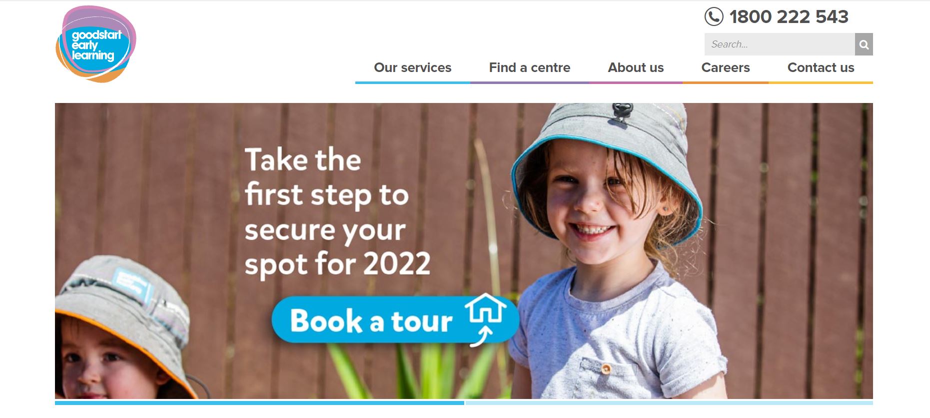
The content on Goodstart Early Learning’s website is divided into concise sections. The compactness keeps the information from appearing cluttered. Also, the website has a joyful vibe because of the pastel color choice.
What We Like About It
The website’s menu links the Services, Find A Center, About Us, Careers, And Contact Us pages. The section above the menu has their contact number and a search feature, which you can use to navigate the content swiftly.
The header is a lovely slideshow of smiling kids. It also features a link for booking a tour of the facility. You can search for a center near your home using the feature right below the header. Next, we have blocks for early learning & child care, kindergarten & preschool, and careers.
There is also a testimonial section with feedback from the parents. Moreover, they have included a new section for displaying the latest updates. You can even subscribe to their newsletter to keep up with the center.
The quick inquiry form is there so that you can get in contact with the center. Lastly, the footer links to their centers, policies, and social media.
4. KinderCare
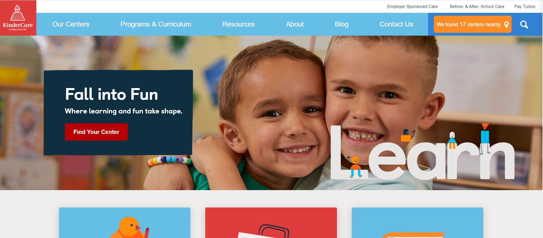
KinderCare offers a user-friendly layout with content that is organized into sections. The soothing blue-dominated theme adds to the appeal of the website. To give a more relaxed appearance, the website utilizes art and doodles.
What We Like About It
The sticky menu is an excellent feature because it simplifies scrolling across the long homepage. The menu has links for their Centers, Programs & Curriculum, Resources, Blog, About, and Contact Us pages. You can also access sections for employer-sponsored care, before and after-school care, & even pay the tuition fee directly from the website.
The header features a smiling kid with a link to find a center near your location. The rest of the content is divided into clear blocks: Enrollment Made Easy, Returning To Learning And Laughing, Summer Programs, Kindercare Cooks, Healthy And Safe Kids, and A Dose Of Care.
The footer has links divided into categories named Company, Resources, and Updates. The website also has a search feature you can use to get information in an instant.
5. Village Montessori School
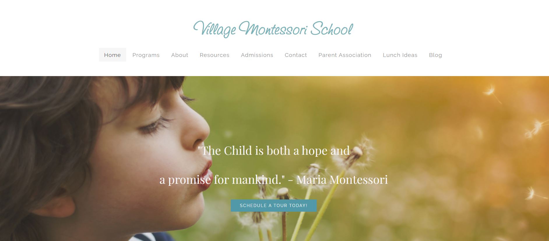
The Village Montessori School has chosen a calm and soothing style for its website. Green and blue hues have been used extensively to enhance their aesthetic value, and the information has been presented clearly.
Overall, the website is not the fanciest but easy to navigate.
What We Like About It
The sliding introduction header features pictures of kids with a caption pointing out the school’s experience. There is a clear call to action in the Inquire Now button. The sticky navigation menu has links for Home, About, Enrollment, Careers, and Contact. You can email them by clicking on the prominent green button there. In addition, there’s a strip above the menu with their contact information.
Below the header is a quote about early education’s importance for children. There’s a welcome message for visitors explaining how the information on the website will be helpful and how they can get more information through them.
The following section includes thumbnails with toddlers & preschool, transitional kindergarten, and enrichment programs written on them. You can click on these for more information. Lastly, the footer has their contact info, navigation, and social media links.
Winning Parents’ Trust in Your Daycare
Winning the trust of parents is crucial in the daycare industry. Here are some ways you can stand out from your competition and gain the trust of parents:
- Provide high-quality care: Make sure your daycare provides children with safe, nurturing, and educational care.
- Offer transparency: Be open and honest about your daycare policies, procedures, and staff qualifications. Provide regular updates and communicate with parents regularly.
- Focus on safety: Ensure the safety and well-being of the children in your care by implementing strict safety measures and procedures.
- Foster strong relationships with parents: Building solid relationships through open communication, responsive customer service, and a welcoming atmosphere can help build trust and foster loyalty.
- Provide excellent customer service: Respond promptly to parent inquiries, address concerns professionally, and make sure the parents feel heard and valued.
- Highlight your qualifications and experience: Share information about your experience, education, and qualifications to demonstrate your expertise and commitment to providing high-quality care.
- Provide a clean and well-maintained environment: A clean, well-maintained facility helps create a safe and welcoming environment for children and their parents.
By offering high-quality care, fostering strong relationships with parents, and providing excellent customer service, you can differentiate your daycare from the competition and win parents’ trust. Many of these can be reflected in your website.
Conclusion
Getting parents to trust you with their kids isn’t easy. A well-designed website is a worthwhile investment in that direction, so this is where you can truly show off your potential.
Your website should establish you as a professional service dedicated to children’s welfare. Client testimonials and photos would be an excellent addition to the website to demonstrate your trustworthiness. Remember that if your website isn’t up to par, people will assume your service isn’t either.
We hope you found some inspiration for making your childcare center’s website look professional and trustworthy. You don’t have to go overboard with the graphics. Instead, parents will be more focused on the content, so try to showcase all you stand for.


