If the cards are played right, a cafe business has a huge potential of becoming one of those eateries that immediately become popular with the locals. This is primarily due to a cafe’s laid-back atmosphere, low rates, and overall sense of serenity and warmth.
Getting people to come into your cafe is relatively easy if it’s in a prime location. If the area sees heavy foot traffic, you won’t have too many problems gaining new patrons. People who travel through the area regularly will, of course, stop in if they notice a new business opening.
However, if you are just starting out or are situated somewhere less prominent, you will need more to attract customers. Developing an online presence is an excellent way to go, but you’ll need a good website for that.
The first step is to create a visually appealing website to establish the public’s perception of your cafe. It should also present all necessary information to visitors, such as the shop’s location, the types of drinks and food it serves, its additional services, and business hours.
We found the best examples of cafe websites so you can find inspiration for your project.
Our Top Picks for Café Website Designs
1. The Bow Window Café & Tea Room
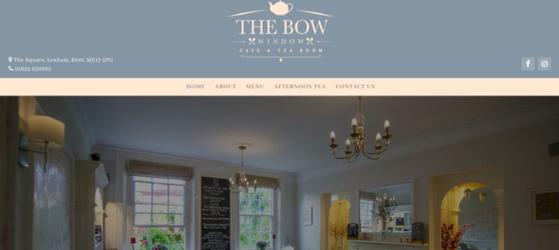
When it comes to food, presentation plays a huge part in why people enjoy it. The same is true for food-related websites. Visitors should be enticed to order from your cafe by the images on your website. For example, the website of The Bow did a fantastic job of displaying the food on their menu.
What We Like About It
The header is a carousel of images, including a breakfast plate, a tea tray, and a few pictures of the location. Because the website presents the food so enticingly, the visitors would automatically want to order it.
Right below the fold, the website showcases the images that appear on the cafe’s Instagram account. Highlighting your social media posts on your website increases the virality of the content. It becomes more accessible for people to find your other accounts. As a result, this will boost your brand reach and awareness.
In addition, since The Bow offers impressive pictures of its food on these platforms, people love sharing them on their social media accounts. Indeed, that’s publicity that you cannot buy.
2. Maman NYC
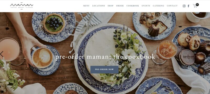
The cafe’s website should be an extension of the brick-and-mortar establishment. It should, therefore, showcase the same ambiance and theme as the cafe. The website of Maman NYC does a great job of sharing the cafe’s rustic and homey vibe.
What We Like About It
All of the branches of Maman NYC give off the same ambiance – comfortable, relaxed, and undeniably French. Its patrons love its white brick walls, blue ceramic plates, and wooden tables. Its website also features these elements.
First, the background image on the homepage’s header shows a wooden table laden with the cafe’s easily recognizable blue plates. Then, scattered here and there are white and green flowers. The rest of the pictures on the homepage feature the same elements.
The content below the fold features the new products and merchandise that you can buy from their establishment. Visually captivating photos accompany the title and description of these new offerings. Immediately after the 1-paragraph description, visitors would find a CTA button.
There is a Shop button for the new cookie & tea box that leads to the shop’s online store. The Catering button beside the party trays will prompt your computer to open its email app so that the visitor can send them an email regarding their catering services.
3. Mr. West Café Bar
Mr. West Cafe Bar is an ultramodern espresso bar and all-day cafe that is famous for its clean, sleek, and warm aesthetics. Its website embodies these characteristics as well.
What We Like About It
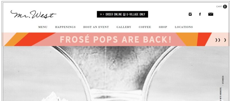
If you go inside the Mr. West Cafe Bar, you will immediately notice its sleek interior. It has warm lighting, white marble tabletops, and lots of greenery. The cafe’s website carries this aesthetics as well. For example, the background of the pages features a clean marble design that allows the pictures on the pages to pop.
The colors that you will find in this cafe are white, cream, and black. Similarly, the website sticks to the same color theme. The only pops of color come from the stunning photos the designer chose to feature on the pages.
The website shows the menu of the cafe so that people can order their food online. The posted menu is the same as what you will get if you go to the cafe.
The cafe is also a popular events place. If you click on the ‘Host an event’ link on the navbar, you will find a letter from Mr. West inviting people to have their events at his cafe. Appearing as if it is type-written, the letter makes visitors imagine the delectable food and drinks they can have as they celebrate there. Additionally, he writes about what fun the visitors will have with their guests. It is written to appeal to the reader’s emotions and compellingly have people book their venue.
4. Coffee Cava
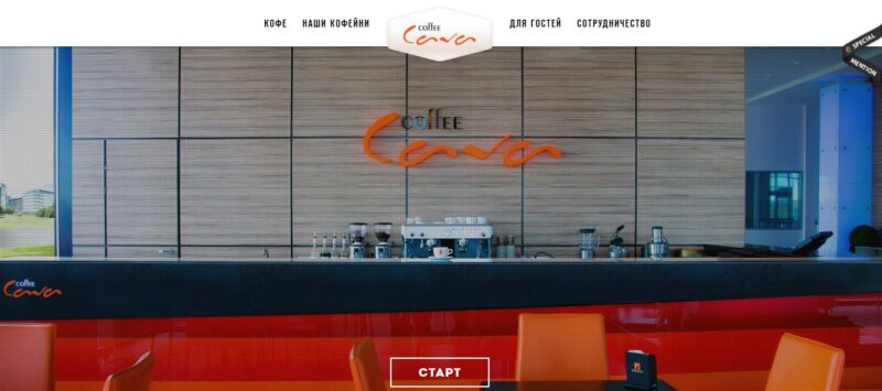
Since a cafe sells coffee, it is only fitting that its website allots a section to teach the visitors about the different types of coffee that they can buy there. Coffee Cava has a unique and marketing savvy way of doing this.
What We Like About It
Coffee Cava’s website opens with a one-screen page that contains only a picture of its coffee bar. If you scroll down or click on the red arrow at the bottom, the image will zoom in on a coffee cup. Then, animation of different coffee ingredients will appear from the sides, apparently on its way into the cup in the middle.
Each of them has a button that shows a short description of the ingredients that the cafe uses for their coffee. It states that they use the best beans, various kinds of milk, the purest water, and spices. It even says that real gourmets do not put sugar in their drinks, but you can if you want to.
Truly, this is an enjoyable way to hook your visitors into exploring your website even more. The website steers away from the typical white background and showcases a black and red theme. A blurred picture of the cafe serves as the pages’ background.
On one page, the website discusses the anatomy of the different coffees you can order from the cafe. It starts with the most straightforward espresso. Then it describes the Americano, cappuccino, Viennese Coffee, Melange, and Latte. When you click on the coffee icon, the image of the cup in the middle turns into that particular coffee. An animation of its different components also appears with an arrow pointing to where you can find it in the cup.
For example, the cappuccino image contains three layers: espresso, milk, and milk foam. At the bottom, there is a heart icon that you can click. It shows links to various social media platforms to share that you “prefer” this type of drink you can get at Coffee Cava. This is an ingenious way of getting people to market the cafe for free.
Conclusion
There are thousands of cafes out there, all seeming to offer the same thing – coffee and some food. To make your mark on the virtual world, you must stand out. A run-of-the-mill website will only tell potential customers that generic is what they can expect from your establishment. Nobody goes out for a so-so experience anymore. So you must ensure that the website shows that going to the cafe is worth the effort.
