Best Practices for Brewery Websites
Updated for 2023. Beer has always been a popular drink all over the world. People everywhere enjoy hanging out with friends or chilling in front of the television with a cold bottle or two. As a result, the brewery industry has gotten highly competitive over the past few years. Having a great website is no longer just helpful but is now integral to getting your brand noticed.
Here are some unique features you could consider for your brewery website:
- Virtual Tour: Offer a virtual tour of your brewery, showcasing your brewing process, equipment, and tasting room.
- Beer Finder: Implement a beer finder tool to help customers locate your beers at nearby retailers or bars.
- Beer Recommendations: Offer personalized beer recommendations based on customer preferences and previous orders.
- Interactive Tasting Notes: Allow customers to leave comments and ratings on each of your beers and display them in a user-friendly format.
- Online Store: Implement an online store to allow customers to purchase merchandise, gift cards, and beer directly from your website.
- Beer Releases Calendar: Offer a calendar highlighting upcoming beer releases, special events, and taproom hours.
- Social Media Integration: Integrate your brewery’s social media accounts (Facebook, Instagram, Twitter, etc.) into your website to make it easy for customers to follow you.
- Virtual Tasting Room: Offer a virtual tasting room experience, allowing customers to order beer online and participate in live tastings and tours.
- Customer Loyalty Program: Implement a loyalty program that rewards customers for their purchases and loyalty to your brand.
- Recipe Database: Offer a searchable database of beer recipes and food pairing suggestions, with the option to filter by style, ingredient, and more.
These are just a few suggestions, but the specific features you choose will depend on your specific needs and goals for your brewery website.
Top 5 Brewery Websites And Why We Like Them
Here are some brewery websites that know how to catch people’s attention and sell their beers online.
1. Against the Grain
As we mentioned, brand recognition is crucial in a highly competitive industry. You want people to notice your product and remember it.
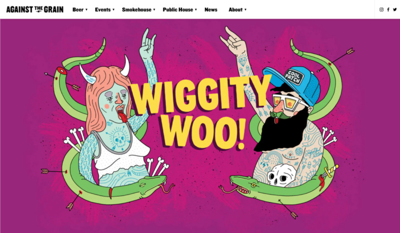
Against the Grain prides itself on crafting beers that are never boring. In addition, they want beer drinkers to have fun, which is why they used a rowdy vibe on their beers, packaging, and website.
What We Like About It
This company’s product is fun and exciting, with colorful and edgy packaging. The person who designed the website ensured those qualities come across on the brewery’s website. The artwork that welcomes visitors is funny and irreverent, immediately capturing the viewer’s attention.
The pictures accompanying the brewery’s story and the ATG team’s introduction are also funny and compelling. When you first look at the grid of photos, you see people in friendly smiling poses. But when you hover over the image, it turns into a wacky picture of the person. This is a great way to stay with the theme and introduce many elements to keep the viewer on your website.
When you scroll down, you can see a link to their store. Each product comes in colorful packaging with the same quirky artwork. For example, click on a beer can or bottle, which will lead you to the product description page.
The description of every beer is short, witty, yet informative. You won’t get bored since the captions are exciting, so you’ll want to click on the other beers to see what they wrote about it.
Another small yet impressive element that only sharp-eyed visitors notice is the products’ background image. Whatever beer you click on, a monochromatic version of the artwork on the packaging will appear as the background image.
2. Oskar Blues Breweries
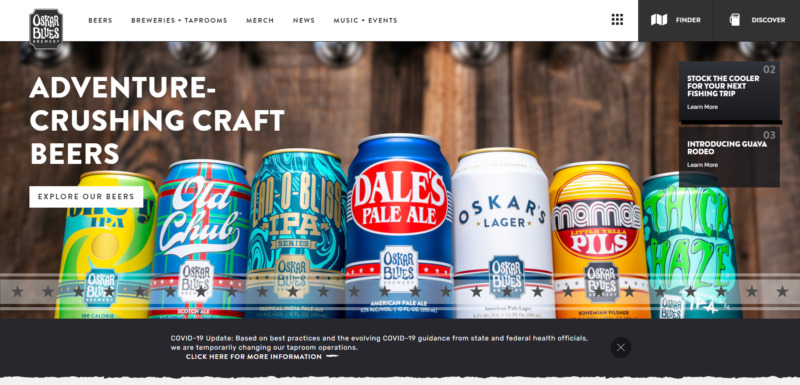
When you go to Oskar Blues Breweries’ website, you immediately know what the company wanted its site to do. Promote their beers, advertise the taprooms that carry their product, and keep the fans appraised about any new product they have.
Everything from the well-organized pages to the numerous call-to-action buttons points to those objectives.
What We Like About It
Just like most websites, the Oskar Blues Breweries homepage has a carousel of colorful pictures on its main page. One promotes their beers, another promotes the breweries and taprooms, and yet another image showcases which brew they recently crafted.
In addition, the company pairs its products with fly fishing, so there is a page dedicated to festivals and other events related to that activity. It even links its fish recipe page with beer-pairing suggestions.
Another great thing about this website is that it pushes brand recognition. Instead of a regular loading icon that some websites use to present the page only when all the elements on the page have fully loaded, this website’s loading screen is the Oskar Blues Logo, which appears to be getting filled with beer. This unusual feature would help the company make its brand memorable.
3. Lord Hobo Brewery
If you only look at Lord Hobo Brewing’s name and logo, you will think it has something to do with royalty. But when you head to the company’s website, you will discover a fun and dynamic design that’s far from stiff or fussy that is often associated with that term.
What We Like About It
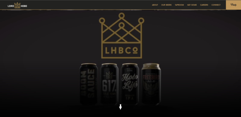
As soon as you get to the company’s website, you will immediately be drawn in by the one-of-a-kind header video. Of course, it doesn’t say much about the brand’s history or products, but it effectively catches one’s attention.
Scrolling down, you will see a line-up of the brewery’s beers. Unlike the other websites where the cans or bottles are placed on a white background, this website uses maroon. To help direct your eyes to the product you are mousing over, all the other cans fade into black, and the product appears as if it is under a spotlight.
There are quite a few words on the site’s home page. The main goal of this website is to entice visitors with their pictures and then sell their products. You can observe this from the five call-to-action buttons on the page. The website makes it considerably easy to find the products.
For example, clicking on “Get Some” will lead you to a page with four search options. You can search via the product name or type, business type, distance you are willing to travel, or the zip code of your location. Once you’ve entered the search coordinates, it presents a map with pins on locations where you buy the selected beer. This is an excellent feature, especially for people interested in trying new places.
4. Fate Brewing
Fate Brewing knows how to attract customers. Its website features all the correct elements: a visually striking introductory video, a compelling story, an opt-in form, and relatively visible contact information.
What We Like About It
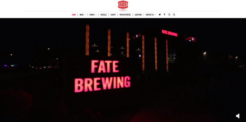
This website uses a fantastic introductory video. When you hit its homepage, you will find a crisp brewery video. The video’s style makes it feel like you are entering the place and heading inside the brewhouse. And then, it turns into a montage of delicious food and beer before showing the brewery’s signage. The video is optimized since it loads amazingly fast and does not slow the site.
Another great thing about it is that the video plays smoothly even if you view it on a handheld device. This is an excellent feature to include in a website, especially since most people enjoy watching videos overviewing images.
Below is a well-written story about why the owners established the place and a description of their brewhouse. They used only a few paragraphs to cover this information and arranged the text neatly in grids interspersed with great pictures. This is an effective way to present content. While it may not contain too much information, it is enough to get people interested in checking out the place and buying the products.
When you get to the site, an opt-in form to sign up for their newsletter pops up. Even if you ignore this one, there is another newsletter sign-up form at the bottom of the homepage. This way, they would connect easily if the visitor wanted an update about the brewery’s small-batch beers or new menu offerings.
5. Stone Brewing
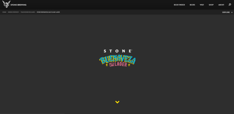
The Stone Brewing site is surprisingly easy to navigate and well-organized for a brewery website with tons of content. This is all thanks to the effective use of the menu.
What We Like About It
When you get to the Stone Brewing website’s homepage, you would not think it features much content. Instead, all you see is the introduction video under the branding and a grid of pictures of the brewery’s products and merchandise.
However, when you mouse over the images, you will get more information about the featured item. And if the one-paragraph information is not enough, you can click on the arrow button to get to the content pages.
The product page contains tons of information, but it doesn’t seem all crowded into space. You get the name of the product, the different ways that the taprooms serve it, four or five images of the beer bottle or can, a couple of paragraphs detailing when the brewer crafted it and what inspired them, tasting notes, and Instagram photos of the product posted by customers.
There is even a search box to help you find a store or bar near your location that carries it. Plus, there is an “Order Online” button in grids with lots of negative spaces. That way, you don’t feel like you’re being fed too much information all at once.
Online Marketing for Breweries
Marketing your brewery online can be a challenging but rewarding process. Here are some unique ways you can market your brewery online:
- Social Media Marketing: Use social media platforms such as Facebook, Instagram, and Twitter to reach potential customers and engage with your audience. Share interesting content about your brewery, including behind-the-scenes looks, new beer releases, and upcoming events.
- Influencer Marketing: Partner with food and beverage influencers to promote your beers and taproom. You could offer them a free beer or compensation in exchange for a review or shoutout on their social media platforms.
- Email Marketing: Build an email list of customers and fans and send regular newsletters to keep them updated on new releases, events, and promotions.
- Video Marketing: Create engaging and informative videos that showcase your brewery and beers, such as virtual tours, beer tastings, and behind-the-scenes looks. Share these videos on social media and your website.
- Customer Reviews: Encourage customers to leave positive reviews on your brewery’s social media pages and popular review websites like Yelp, Google, and TripAdvisor. Respond to positive and negative reviews to show that you value customer feedback.
- Content Marketing: Create and share valuable content related to beer, such as blog posts, articles, and infographics. Use keywords related to your brewery and beer to increase visibility on search engines.
- Digital Ad Campaigns: Use digital advertising platforms such as Google Ads, Facebook Ads, and Instagram Ads to target potential customers and promote your brewery and beers.
- Collaborations and Partnerships: Partner with other breweries, bars, restaurants, and retailers to cross-promote each other’s products and events.
- Virtual Tastings and Events: Host virtual tastings and events, such as beer releases, live beer tastings, and virtual tours, and promote them through social media and email marketing.
These are just a few of the many ways you can market your brewery online, but your specific strategies will depend on your target audience, budget, and goals.
Conclusion
When making a website for a company in a competitive industry, you want to give it as much personality as possible. It has to be eye-catching and memorable not to get lost in the sea of other websites offering the same things. In addition, brand recognition should be a significant factor.
Nevertheless, do not let that get in the way of providing the visitor with a good viewing experience. It is still the primary goal to make it easy for them to find and purchase the beers and merchandise or contact the company. These are essential factors you must keep in mind when designing a website for a craft brewery.


