You might be wondering why musicians require a website in the first place. It’s not like bar and concert venue owners search the internet for the next artist to book. In addition, the majority of musicians and bands are already quite active on social media.
Regardless, the most structured approach for any musician to exhibit their body of work is through a website. Also, owning one is an efficient means of promoting your name. So if you’re a musician looking to book more gigs, you’ll need a great website.
What components should a band or musician’s website contain? Is it only a storefront where fans can purchase the artist’s most recent album? To get some ideas for your website, have a look at these excellent web designs.
Top 6 Bands and Musicians Website
1. Meet Me @ the Altar
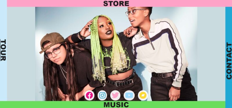
Above the fold on most band websites is a huge photo of the band. However, the site for Meet Me @ The Altar is simply a photo of the band. Talk about minimalism.

What We Like About It
The band’s website is incredibly unique. Typically, you would find a wealth of information and images of the musicians on their homepage. But, the MM@TA page only has one photo framed by various colored borders. You can find a link to the Store, Contact, Tour, and Music on each border.
When you click on the links, it’ll take you to content pages that are relatively simple in appearance. For example, the Tour button takes you to the band’s schedule of forthcoming shows. The perk of this content is that you don’t have to go looking for each venue’s website to purchase tickets. Instead, fans can get the tickets using the links on the information page.
2. Spiritbox
A musician’s website should keep fans up to date on the latest releases, tour dates, and other information. If you’re working with a prolific musician, you’ll want to be able to easily update the website since you’ll be doing it frequently.
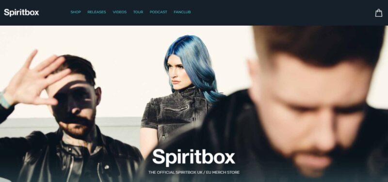
For example, to make Spiritbox’s website more dynamic, the designer incorporated the band’s most recent music video.

What We Like About It
The website of the Canadian metal band has a silent video as their hero backdrop. However, you have to click on the “Watch Video” link to listen to the music. Muting the background video is ideal since it adds interaction to the website when you need to click to listen to the music.
Many bands find that having their fans buy and wear their merchandise is a fantastic way to get their name out there. On Spiritbox’s website, all of the latest products are shown on the homepage for fans to purchase easily. Selling goods with a copy of the band’s music in vinyl LP format is also a smart marketing strategy.
3. The Decemberists
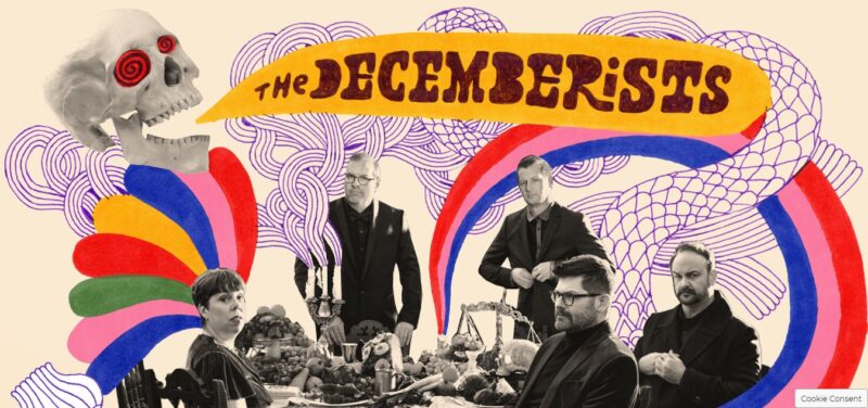
Musicians are incredibly creative people. You want to bring the same level of originality to their websites. The Decemberists, for example, are a well-known indie band with a reputation for putting on eclectic live shows. They like to engage their audience in their whimsical performances. Likewise, the band’s website showcases a similar vibe.

What We Like About It
The Decemberists have a distinct sound that is reflected in the website’s design. It’s bright and colorful, with a lot of quirky hand-drawn embellishments. The website appears to be a bit crowded, yet the colors blend to create a striking aesthetic. Moreover, the designer used parallax scrolling to create a multi-layered appearance for the website.
The latest news stories regarding the band are the first thing fans will notice underneath the entertaining hero image of the band. In addition, each news panel has a brief excerpt from the article, along with Facebook and Twitter sharing buttons. This is an excellent feature to provide since it effectively serves as free advertising for the group.
4. The Fray
Of course, the primary purpose of a musician’s website is to showcase their work effectively. After all, you want your visitors to like and listen to the music. Take a look at how The Fray’s website achieves this.

What We Like About It
Following the group’s hero image, the visitor can discover a section on the website to listen to their music. Moreover, the band’s best tracks are featured on the music player.
Below the player, you can find links to the band’s albums. When you click on the cover, the link will direct you to the album’s page on a popular streaming app. You can now decide whether you want to preview the music for free or buy the album.
This link makes it convenient for fans to purchase the music, as they do not have to click out of the website, open the app, and then search for the album to buy it.
5. Justin Ward
Justin Ward is a well-known street performer who has gone viral to become a YouTube sensation. At first glance at the website, you can see that he recognizes the importance of social media.

What We Like About It
Like many musicians’ websites, Jonathan Ward’s homepage is dominated by a big image of him. But, despite being a skilled violinist and pianist, he is clutching a saxophone, which is his preferred instrument.
A selection of photos from his Instagram account can be seen below. This website entry is popular with fans since it allows them to look into the artist’s everyday life. For example, he’s sporting a goofy wig in one photo and riding his bike in San Francisco in another. Many fans look forward to seeing these personalization features.
Furthermore, because it is linked to his Instagram account, the section is updated whenever he makes a new post. New content is one of the factors that keeps fans coming back to his website.
6. Gary Tallent
For a musician with a career spanning decades, you would expect Gary Tallent’s website to be full of static photos and text. Instead, however, his website has surprisingly dynamic elements to it.

What We Like About It
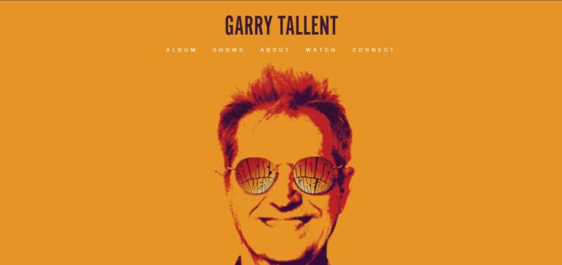
The eye-catching banner for his website is made out of a bold orange backdrop and a fun-styled portrait of the artist. The first impression can seem a bit empty because there’s only a photo of his head and five navigation links. However, you’ll be amazed by all of the unusual aspects of his website as you scroll down.
First off, there is a section for pre-ordering his next album. Next, visitors can listen to a sample of his song using a music player. This is essentially a link to a music streaming service where you can listen to the entire piece.
The following section is a black-and-white gallery with images dating back to 1959. It’s a slideshow of the artist’s photos taken while performing. You can browse the collage by clicking on the left or right side of the screen, and it runs up to 2016.
Finally, there’s a feed of Gary Tallent’s social media posts. It’s one of the best ways to keep up with the latest news and see what his fans are saying about him. If you’re working for a musician or band with a large fan base, you’ll want to include this on the website so the artist can interact with their audience easily.
Conclusion
When making a website for a band or a musician, you must clearly understand the site’s purpose. Is it going to be a showcase of the artist’s best songs? Is it to keep the fans updated on the musician’s latest work? For example, you can embed a YouTube video for their latest release or add a music player link on the homepage.
Once you’ve defined the primary function, you can select the elements you want to highlight. After that, you may incorporate other features like the band’s tour dates, a link where fans can buy gig tickets, a discography, and links to the musician’s social media accounts. Additionally, you can consider the artist’s music style and develop a theme from it.


