Best Practices for Bakery Website Design
A good website design helps sell a product or service, but a great website design does much more. The design of a bakery’s website should tie in with its mission-a visitor should be able to see and feel the company’s “personality” when they view the website.
Here are some considerations that bakeries should keep in mind when building their website:
- Showcase your products: Your bakery’s website should showcase your products in an attractive and appetizing manner. Include high-quality images of your baked goods and provide detailed descriptions to help potential customers understand what they can expect when they visit your bakery.
- Offer online ordering and delivery: Many customers prefer the convenience of ordering online and having their baked goods delivered directly to them. By offering online ordering and delivery options, you can reach a wider audience and make it easier for customers to purchase your products.
- Provide nutrition information: For customers with dietary restrictions or allergies, it’s essential to provide detailed information about the ingredients in your baked goods. Consider including a complete ingredients list, as well as any allergen warnings, on your website.
- Highlight your unique selling points: Whether using locally sourced ingredients, offering unique flavor combinations, or having a commitment to sustainability, your bakery likely has unique selling points that set it apart from other bakeries. Make sure to highlight these unique features on your website.
- Include customer reviews: Customer reviews can effectively build trust and credibility with potential customers. Consider including a section on your website where customers can leave reviews and share their experiences with others.
- Make it easy to find your bakery: Include your bakery’s location, hours of operation, and contact information prominently on your website. Consider including a map or directions to help customers easily find your bakery.
By keeping these ideas in mind, you can create a website that effectively showcases your bakery and helps to attract new customers – putting you miles ahead of your competition.
Best Bakery Websites
A great website accomplishes this and is also user-friendly and visually pleasing. Take a few moments to check out the top 10 bakery web designs -you may even make a few purchases while browsing!
1. Macrina Bakery
Seattle, WA
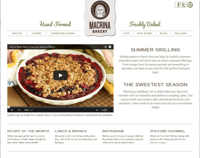
The Macrina Bakery website is simple, fresh, and uncluttered. The use of muted colors and clean fonts ties in with the company’s use of fresh and natural foods. The site includes social networking buttons, so it is easy to share. Two seasonal articles are on the home page, so they are constantly updated with news relevant to the current season. The best part of this website is the YouTube video on the home page featuring the owner. The video is an excellent way to introduce visitors to the company and show them the quality of food used at Macrina .
2. Gracene’s Cupcake Boutique
Maple Valley, WA
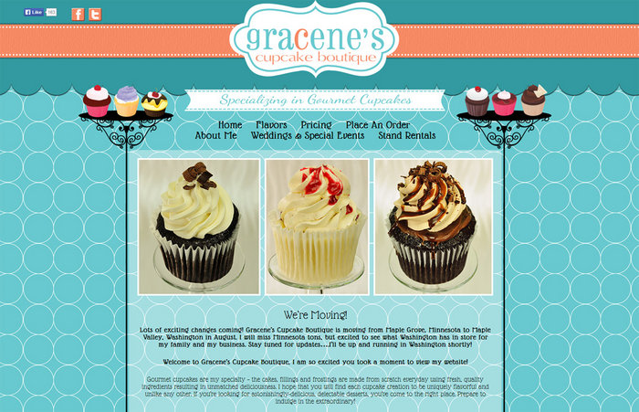
Gracene’s Cupcake Boutique uses bright colors and cute designs to appeal to visitors. Photos of gourmet cupcakes are displayed in the center of the home page. The lengthy list of cupcake flavors is divided into categories under the “flavors” link so that customers can quickly find what they’d like. The highlight of this site is a link to the company’s “pricing” -a lot of food sites do not include their pricing on the website.
3. The Gingerbread Construction Co.
Winchester, MA and Wakefield, MA
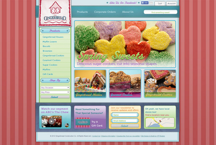
The Gingerbread Construction Co . website offers a complete online shopping option, which is unique for a small bakery. They also provide directions to two brick-and-mortar stores. The bright, eye-catching design pairs well with the gingerbread logo, creating nostalgia that will make visitors feel like kids in a candy shop. The product list is divided into a few main categories, and easy shopping buttons are included that allow visitors to shop by occasion or price. Photos are included of all the mouth-watering treats, making shopping a breeze.
4. Cake Creations
Pembroke Pines, FL
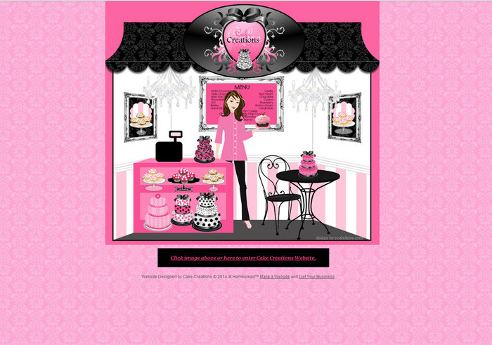
Cake Creations uses a unique “cover” page that users can click to enter the website. This cover page features a cute, cartoonish design using the company’s color scheme of pink, black, and white. The website itself is straightforward and uses an easy-to-navigate basic layout. A few main pages are listed across the top, and information is short and organized in bulleted lists that are easy to follow.
5. Tree House Pastry Shop & Cafe
Santa Fe, NM
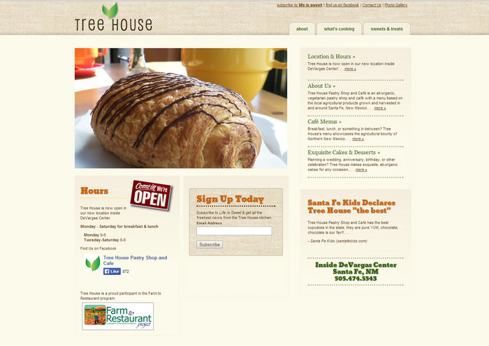
The Tree House website design ties in with the company’s mission. The use of organic foods from local farms is essential to this company, and that is displayed throughout the website. The “Farm to Restaurant” stamp is proudly displayed on the home page, as is a recommendation from National Geographic. Beautiful photos of fresh, organic meals are enticing to visitors, and even the colors and textures used give the feel of raw simplicity. Visitors are also given the option to subscribe to the company’s newsletter for updates on special events.
6. Floriole Cafe & Bakery
Chicago, IL
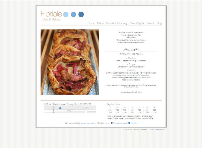
Floriole Cafe & Bakery started as a simple stand in the Green City Market, and they have carried this simplicity into their restaurant. They are a very community-based company, which is evident in the website’s design. The simple design is beautified with elegant photos of rustic meals, and many of their pages boast of current community events, such as pizza nights and the Sunday Supper Series.
7. Levain Bakery
New York, NY
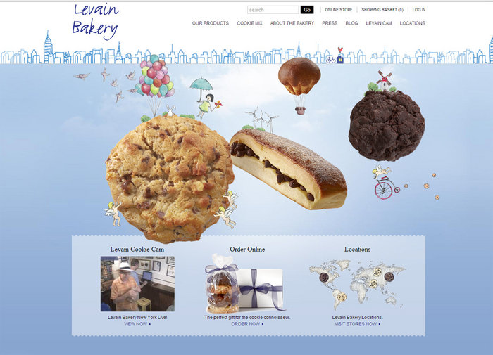
The website for Levain Bakery has a creative design, and the pages are chock full of funny and exciting tidbits about baking. The site includes videos and also a page full of articles from local newspapers and magazines. The unique part of this website is that the live Cookie Cam visitors can check out what is happening in the New York bakery!
8. Salty Tart Bakery
South Minneapolis, MN
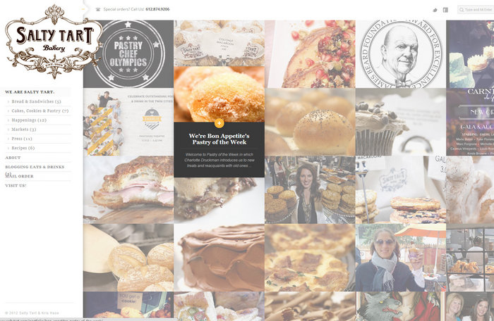
The Salty Tart Bakery’s website is very uniquely designed. The main menu is located on the left side of the site and is easy to use. The really interesting thing about this site is how they’ve set up the pages-visitors scroll over the large images, and the image expands to show part of the information. Visitors can then decide whether to continue and open this window or simply scroll on to get the next sneak peek.
9. Bakery Lorraine
San Antonio, TX
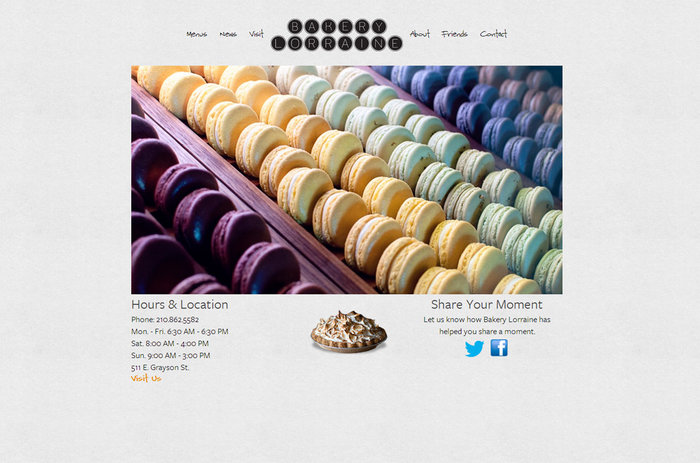
Bakery Lorraine is another company that is proud to be involved with the community. The website is simple and nostalgic, especially in the news section (the announcements have a retro design reminiscent of ads from the 1950s or 1960s). The large, full-color images show a variety of sweet treats and rustic bread. The coolest part of this site is the “friends” section. Bakery Lorraine shows potential customers how much community means by introducing the farmers who supply their eggs and the wood artists who constructed pieces for the bakery.
10. Pretty Cakes of London
London, England
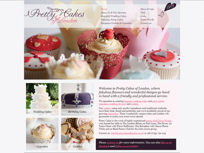
Pretty Cakes of London bases much of its website design on photographs. The design offers enough white space to keep it from being overcrowded, but most usable space is filled with photographs of different sizes. Product information and descriptions are restricted to smaller blocks of text, creating a visually stunning website.
Website design is vital for selling your product or service, drawing in potential customers, and making your company memorable. Customers who understand your company’s mission and what makes you tick are much more likely to come back for more. A great website design can help connect with visitors, which is the key to success. Please contact us for more information about creating a great website.


