Nowadays, owning a car is no longer considered a luxury. Despite the availability of various modes of transportation, owning an automobile is still the most convenient way to get from one place to another. As a result, experts in the car sales sector estimate that around 77 million automobiles will be sold this year alone.
If you or a client owns or operates a vehicle dealership, designing a website that displays the company’s best goods is essential. You also want the website to appeal to the target demographic visually. What other features should you include in a well-designed automotive website? Let’s have a look at this list of the best auto dealer website designs to find out.
Top 5 Auto Dealership Web Design
When customers visit a used vehicle dealership, they often feel overwhelmed. It isn’t only due to the abundance of choices. When you add in loud music, bright sales posters, and a pushy salesperson, it’s easy for the customer to become agitated.
There are dealership websites that provide a similar experience. It groups all of its vehicles on one page, labels them with brightly colored price tags, and advertises them aggressively. The visitor will most likely leave without clicking on such websites.
However, the following websites have succeeded in giving their potential consumers a better, more relaxed experience.
1. AutoSavvy
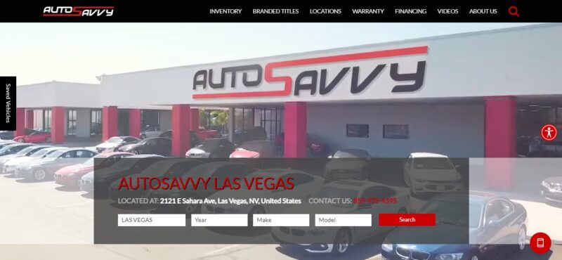
Website visitors do not have a lot of time to decide whether they want to continue browsing your website or not. That is why the hero shot could be the most essential aspect of the car dealer’s website. In addition, AutoSavvy’s site makes excellent use of space to establish its value to the visitor.
What We Like About It
The video header on AutoSavvy’s website immediately tells the visitor where the company is based, what they offer, and what kind of service they can expect. The short video features aesthetic shots of Las Vegas, then an aerial shot of the dealership itself. This easily lets the visitor know where the dealership is based or what location they service.
The video then transitions to shots of some of the company’s best cars. So, if the visitor is looking for a particular car and it is included in the montage, they will already be compelled to use the search box imposed on the video header. Or the visitor can use the inventory link on the navigation bar.
Finally, the video ends with an AutoSavvy agent handing the car keys to a happy customer. If a potential buyer is looking for a car in this location, they will be motivated to check out what this company offers based on that video alone.
The video turns into a static image when viewed using a mobile phone. However, this is passable since the main details about the dealership are still front and center.
2. Sunrise Auto Outlet
Everybody loves a good deal. And if the deal is advertised prominently on the website, the visitors will likely stay and explore what the dealership offers. This is what draws potential clients to Sunrise Auto Outlet’s website.
What We Like About It
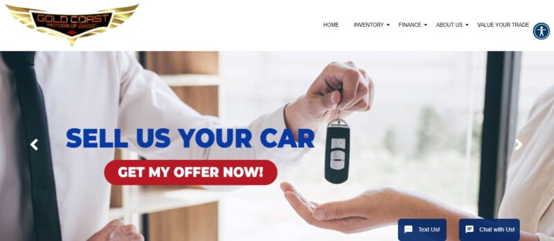
This website immediately lets the visitor know what the company is and what it can do for you. It informs the visitor of all its unique selling points within seconds of getting to the homepage.
The first thing you will see is a pop-up voucher for a considerable discount. The visitor can instantly receive a $500 discount coupon from the dealership by using the voucher.
The header, which is a carousel of the dealership’s best-selling items, comes next. One picture depicts the company’s most recent award. The following claim asserts that any visitor will be pre-qualified in seconds. Another claims that if the customer is unable to visit the dealership, the agents will deliver the vehicle to them.
There is also a link for selling automobiles on that carousel. Finally, another graphic proclaims that everyone qualifies for a vehicle loan. As a result, each potential buyer having an issue with their credit will be drawn to this website.
Another great feature of the website is that the homepage is not cluttered with images and details about the dealership’s inventory. Instead, it only features three cars at a time. To see more, you can click on the navigation arrow. This section makes it easier for visitors to look at the vehicle and consider their options more carefully.
The only information you will see per product is the price (including the monthly payment), the model, and mileage. If you want to know more, you can hover over the image to see the available color, type of transmission, and interior. If you are interested in the car, you can click the button in the information window, and a pop-up contact form will appear.
3. Royal Car Center
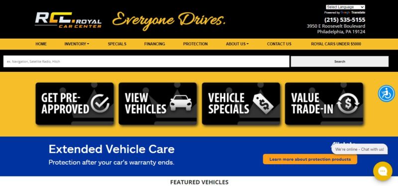
Most car buyers already know what vehicle model they want by the time they start looking for a car dealership. The Royal Car Center knows this, so their website got rid of all the bells and whistles and immediately provided visitors with their options.
What We Like About It
Four primary call-to-action buttons can be seen in the website’s header. The visitor is compelled to apply for pre-approval using one of the buttons. Another option allows the visitor to view the inventory of the dealership. The next one comes with a special discount, while the last large icon offers to calculate the trade-in value of the visitor’s current vehicle.
There are two additional buttons besides the four already listed. One links to further information about vehicle care and other protective items, while the other goes to contact the dealership. On the top fold, you’ll find all the information you need.
If you scroll down, you will find a slider of 5-star customer reviews for the dealership’s service. The testimonials are essential since they establish the company’s credibility.
Below that, visitors may read the personalizing description of the Royal Car Center. It emphasizes the Royal Automobile Center’s desire to make purchasing a high-quality secondhand car simple. This is a wonderful way for a firm to develop trust since it demonstrates how much it values its customers over making a sale.
4. First Class Auto Land Inc.
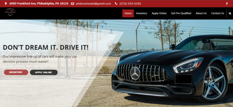
Sometimes, a sleek website is enough to catch a visitor’s attention. A bold color theme combined with the website essentials is the perfect design for First Class Auto Land Inc.
What We Like About It
When you get to First Class Auto Land’s website, a picture of a luxury car and two call-to-action links are what you see. The first link leads to the dealership’s inventory, while the other takes you to the online application form.
Below is a grid of large, evenly spaced icons for getting to know the dealership (including their operation hours and location), browsing the inventory, and information on financing. This is an excellent way to separate the web page into neat sections to give the site a professional look.
Another great feature is the search function to look for a particular car in the dealership’s inventory. There are blank fields to specify the year, model, and body type. This feature enables the visitor to look for a car that will suit their requirements without going over all the options in the inventory.
When you go to the inventory page, there is also a drop-down menu to filter the cars shown to you. Besides the usual fields, you can choose only to see the options based on your price range, mileage, exterior color, and transmission type. This filter is an effective way to make the search more convenient for the visitor.
5. Bumble Auto
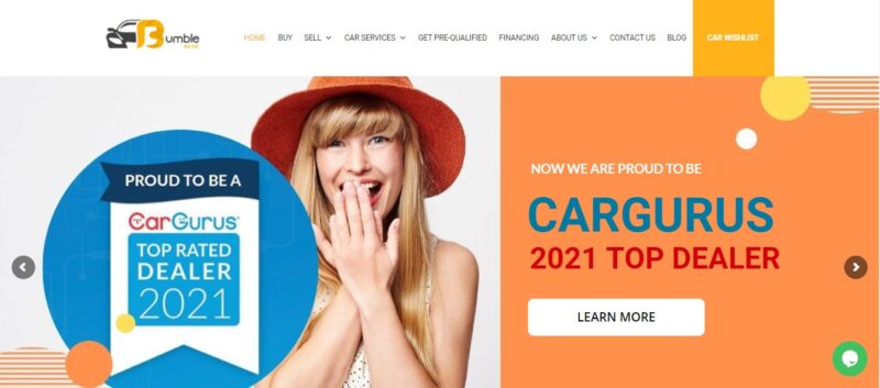
Since Bumble Auto’s homepage offers so much content, you’ll have to scroll a lot to view everything the site has to offer. As a result, the designer made certain that each scroll was significant.
What We Like About It
Despite a large amount of material on the website, the colored backgrounds and white spaces keep it from becoming overpowering.
Every time you scroll down, you’ll see something new. The homepage has a carousel that presents the new automobile arrivals. Some cars have a Fair Deal stamp on them, so you’ll know which ones to select for a good deal.
The following section provides information on how you can sell your car to the dealership. After that, there is a large section detailing why customers prefer doing business with Bumble Auto. An icon accompanies each selling point to make the copy more engaging. There is also a small stat board to show how many cars the company has in stock, its positive reviews, and the number of happy customers they’ve provided service to.
One unique feature that this website offers is the Car Wishlist. Upon payment of the deposit, the company’s car experts will begin looking for the car you requested. If they do not carry the vehicle you want, you can fill out the pre-order form. They will notify you once the vehicle that matches your requirements becomes available and help you buy it from the seller. This type of service is excellent, especially for collectors and serious buyers.
Finally, there is a tiny detail that may go unnoticed by most. A small yellow car appears in the bottom right-side corner of the screen. It seems as if it is driving down the page as you scroll down. When you mouse over it, the headlights flash. And when you click on the car, you get whisked back to the top of the page.
Conclusion
You want the visitor to have a smooth, stress-free search experience on a car dealer website. Of course, you want to give them enough time to decide which automobile is best for them. But you may also want to persuade them to buy the car from your dealership.
Part of this is presenting customers with only the options that are relevant to their needs. It would also be helpful to provide them with the required information in an orderly manner so that they are not overwhelmed by the numbers. Finally, you want your website to allow potential consumers to contact you promptly so that you can seal the deal. You’d have a winning automobile website design if you can combine all those with a killer visual.


