Invisalign has revolutionized the field of cosmetic dentistry. As such, there is a lot of demand for it. If you search for options on the internet, you will most likely be overwhelmed by the number of choices. A potential client will pick the choice that sticks out from the rest and appears to be reliable.
So what steps can you take to ensure that you are that option? Well, you need to differentiate yourself from the crowd while keeping the quality of your services intact. Your website is the first step in that direction.
Website design is the most critical aspect of web development and the element you have the most creative control of. You can use this creative control to your advantage and incorporate elements that will make you look professional and make your patients comfortable.
Top 8 Invisalign Website Designs
Now, we know you need ideas to make your website. We have done all the work for you by diving into the depths of the internet and compiling a list of the best Invisalign websites out there.
1. Blacker Orthodontics
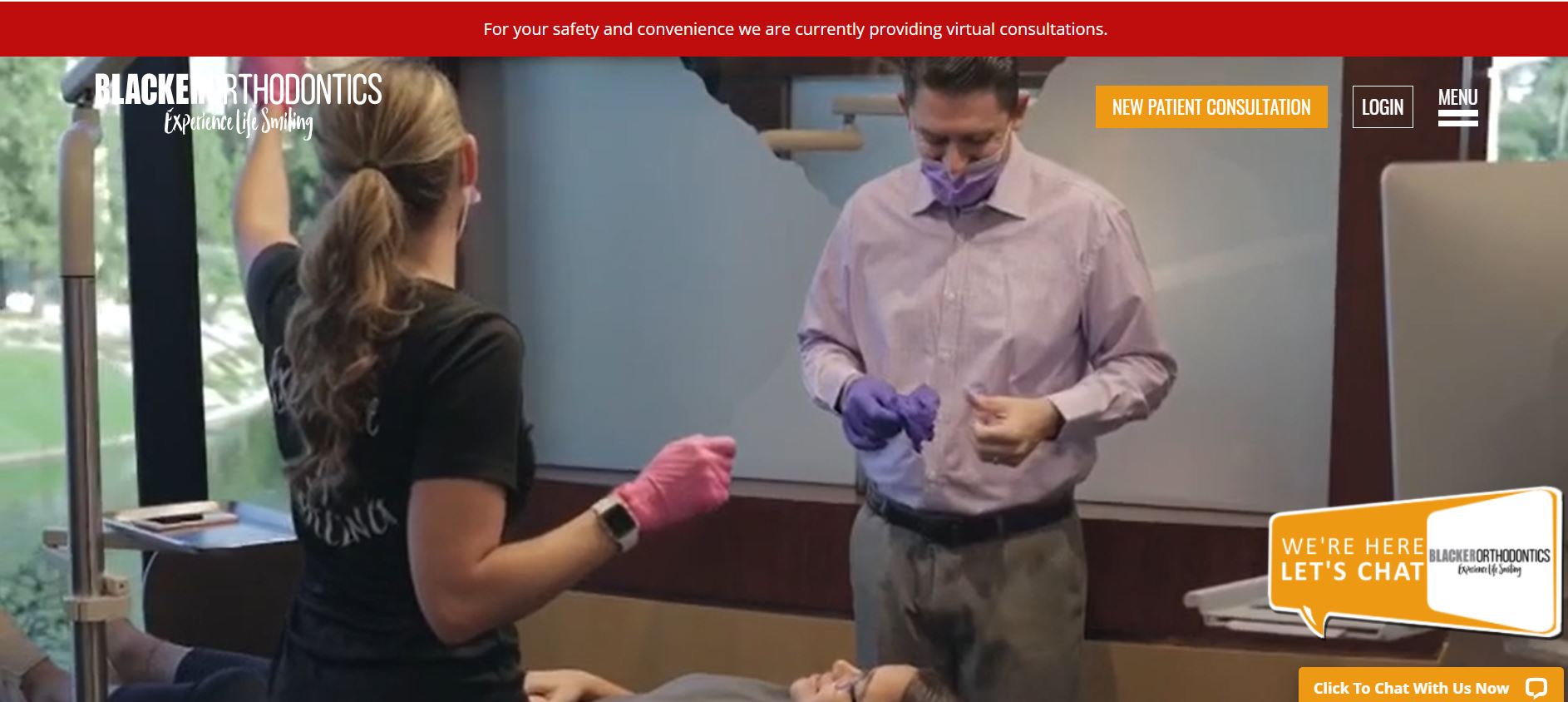
Blacker Orthodontics is an Arizona-based practice that is dedicated to letting you experience your life smiling. The website has been developed on a more modern pattern, and every section is filled with information. The website boasts a clean user interface that is easy to navigate. There are additional options for accessibility to accommodate a wide range of users.
What We Like About It
The homepage features a video header, including scenes from within the clinic. That is good because it familiarizes potential patients with the clinic’s interior and how the staff interacts with patients. For announcements, the website utilizes a ribbon that appears on top of the header. The bottom left corner has an instant chat option that you can use to contact them.
They have ditched the traditional navigation bar. Instead, they have opted for a more minimalistic aesthetic. The web design allows you to log in to your account or directly schedule an appointment. You can also see coordinates to their locations and links to their social media.
Below the header, you can see options for Invisalign, braces, and adult treatment. You can click on these for free consultations and more information. The following section is a welcoming screen that explains to new patients what sets them apart. They also explain the differences between orthodontic specialists and dentists and why you should opt for the former.
Next, we have a smile gallery and a testimonial section. There’s also a section that displays the center’s accreditations. Next, the footer contains addresses to their locations and office hours. You can also refer a friend using this section. Finally, the very bottom of the page includes social media links and quick accessibility options.
2. Premier Orthodontics
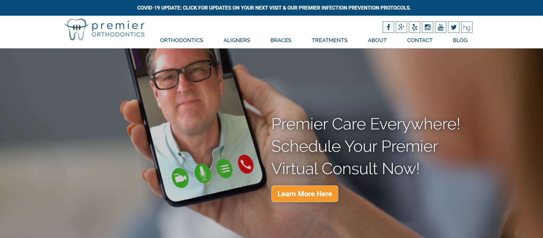
Premier Orthodontics prides itself on being able to provide premier orthodontic services like Invisalign to its patients. They have centered their website around great services at affordable rates. The website is filled with plenty of pictures that show the interior of the center.
What We Like About It
The website’s header has a picture of their leading team and an assurance that they provide quality Invisalign and braces at affordable rates. You can even schedule a free consultation from this section. The ribbon at the top is dedicated to announcements for the patients.
Their contact number and a free consultation option are posted on the navigation bar at the top. The website also supports the Spanish language. This opens them up to a more diverse audience. The navigation menu itself is sticky, which is again convenient for the users. There’s also an option to chat with the staff at the bottom right corner.
If you scroll further down, you’ll see reasons why Premier Orthodontics is the best option for you. They also display stats regarding the patients they have treated, the reviews they have received, and the number of appointments available. There’s even a video embedded that you can watch in this regard.
The website also makes a great effort to explain how they do things that other orthodontists tend to ignore. They also offer easy payment plans for patients. The next section displays the services they offer and the media outlets that have featured them. They have a parent’s guide to orthodontics that is provided to the visitors for free.
The testimonial section features patient testimonies, and you can access more detailed reviews by clicking on them. The google add-in is there for you to find the best location and get directions for that. The footer contains information like their locations and links to more resources. There are also social media links that you can use to check out their presence on Facebook, Instagram, and Youtube.
3. New You Dental Center
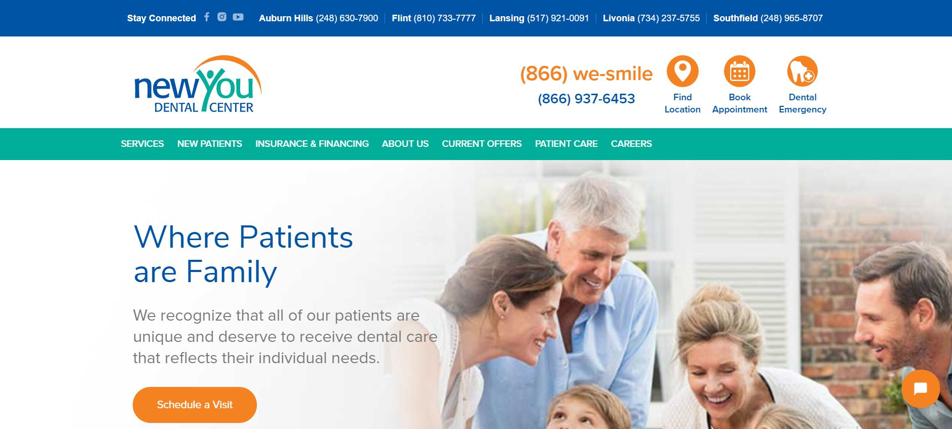
The New You Dental Center has opted for a more modern interface. They specialize in Invisalign and orthodontics. Based on that, they have used plenty of pictures to give the website a pleasant look. In addition, the website uses a fun color scheme that makes the navigation experience fun and easy.
What We Like About It
The website’s top ribbon contains links to their social media accounts. It also lists the contact numbers of their locations. The navigation bar has their contact number and options for locating their nearest office, booking appointments, and contacting them for dental emergencies. The navigation menu has options to traverse the entire website.
The header consists of a picture of smiling kids and a caption asking visitors to let the center make their smiles perfect. You can even schedule a visit from this section. The bottom right section is there for you to chat with the staff.
The next section offers visitors a free consultation. Further down, the sections explain different types of straightening systems like Invisalign. They also provide retainers of various types.
The next section is dedicated to reviews. Only one review has been featured on the homepage, but you can access more by clicking on the read more reviews option. The footer is divided into two sections. One of the sections is dedicated to their office locations and their addresses. The other part has the list of services and other links. You can also subscribe to their newsletters here.
4. Invisalign Center
The Invisalign Center is a Dubai-based dedicated Invisalign center that has opened itself up to the global audience by opting for English and Arabic interfaces. The website has a minimalistic design and a white-dominant color scheme. The website provides visitors with all the information, and it is readily available for use.
What We Like About It
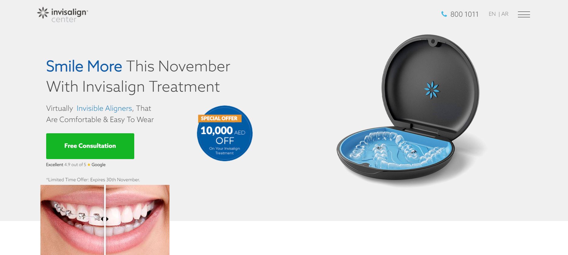
The website has done away with the usual top menu. Instead, you have to click on the menu option so that a full-screen menu opens up for you. This keeps the actual window from getting crowded. The menu has options for navigating the website. The rest of the bar is sparsely filled with just a contact number and an option to switch languages.
The header features a picture of the Invisalign braces and a limited offer for free consultations. There is also an image showing the difference between the usual braces and the more aesthetic Invisalign braces. The website also displays its Google rating here.
The website displays the team of expert doctors that the center has on hand. You can also see their pictures here. They utilize 3D scanning and modeling technology to give you an idea of how your smile will look. Plus, they offer easy payment plans to make the treatment more affordable.
The next section introduces the center and why you should choose it for your treatment. You can use links to look at previous success stories, learn more about the center, and get the latest news. The website features an explanation of what Invisalign is and how you can benefit from it. The website footer has a Google add-in displaying its location. It also includes a form for scheduling a free consultation and displays their working hours.
5. Invisalign Center For Invisible Orthodontics
This Invisalign center in Miami is working to provide its patients with magical smiles. The center’s website aims to draw people in with the extensive use of pictures and vivid colors. The website is pretty comprehensive and addresses any questions that a potential patient might have. In addition to that, it is fairly easy to navigate. Overall, the website interface is very friendly and gives users a great experience.
What We Like About It
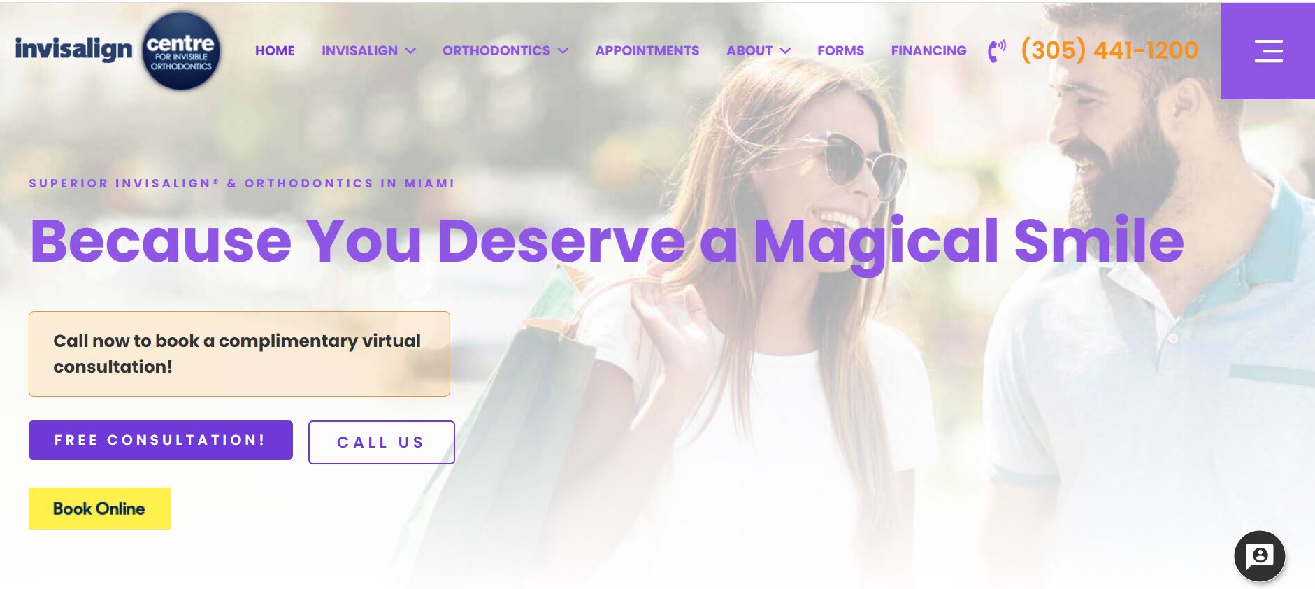
There is a lot to unpack in this one, so we’ll start from the beginning, which means the navigation bar. At first glance, the navigation bar is pretty standard with the center’s name, navigation links, and a contact number. However, there is an option for an additional menu in the right corner. If you click on this, you will see a slide-in menu with more navigation options. In addition, the bar is sticky so that you can access the menu anywhere on the page.
The header features a smiling couple as the background image. It also has options to call them or book an appointment online. The first consultation is offered at no cost to the patients. The next section covers the reasons why Dr. Grussmark can treat any case. You can get a more detailed profile of him by clicking on the option there.
The website also covers the advantages of using Invisalign as opposed to traditional braces. They also explain the process in three easy steps for your ease. If you still want more information, an FAQ section covers the most commonly asked questions.
If you want to see other patients’ experiences with the center, you can head on to the smile gallery and the testimonial video below that. The website also introduces you to the center’s team. Near the end, we have the center’s locations and their addresses. The footer contains links to their social media accounts. So you can check those out too.
6. Kunik Orthodontics
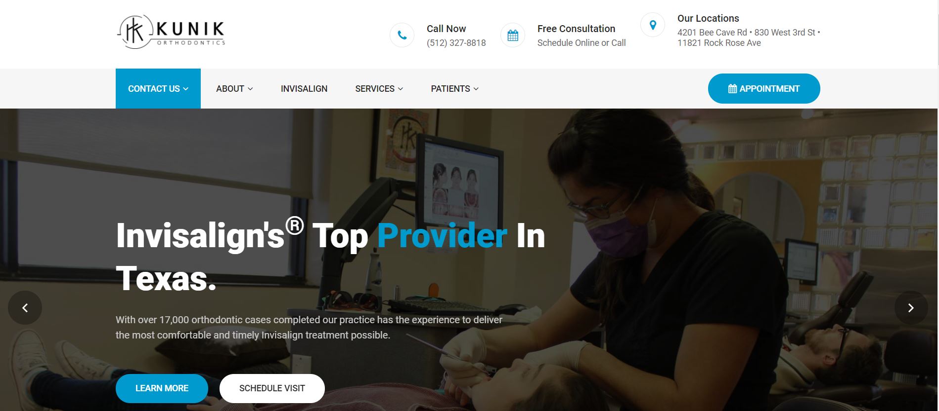
Kunik Orthodontics is a texas-based orthodontic center. It is run by Dr. Kunik, a Diamond Plus Invisalign provider, as its lead orthodontist. The website has expanded upon its high quality of service and used it to convince users that they are the best. In terms of design, the center’s website is very professional-looking and easy to navigate.
What We Like About It
Let’s start with the navigation bar at the top. It has the center’s contact number, locations, and social media links. You can also use it to call the center or book a free appointment. The navigation menu is sticky and can be used to navigate the entire website.
The website has a sliding header that depicts highlights of what they offer. The learn more and schedule visit options remain the same across the slide show. The next section emphasizes their ranking, presenting it as a reason to opt for them. They also introduce the center and look at how the process is going to go. The website has embedded videos that you can watch to familiarize yourself with the process.
The website displays a video message from Dr. Kunik. If you scroll further down, you can look at the testimonial section to see video testimonials as well as social media reviews. The footer has a lot of stuff. It starts with the center’s name and logo, along with a brief intro about the center. Then we have the quick links to location, appointment scheduling, and stuff like that. We also have links to youtube blogs. Finally, if you want to get to their social media accounts, you can access those by clicking on the links at the very bottom of the website.
7. Fredericksburg Orthodontics
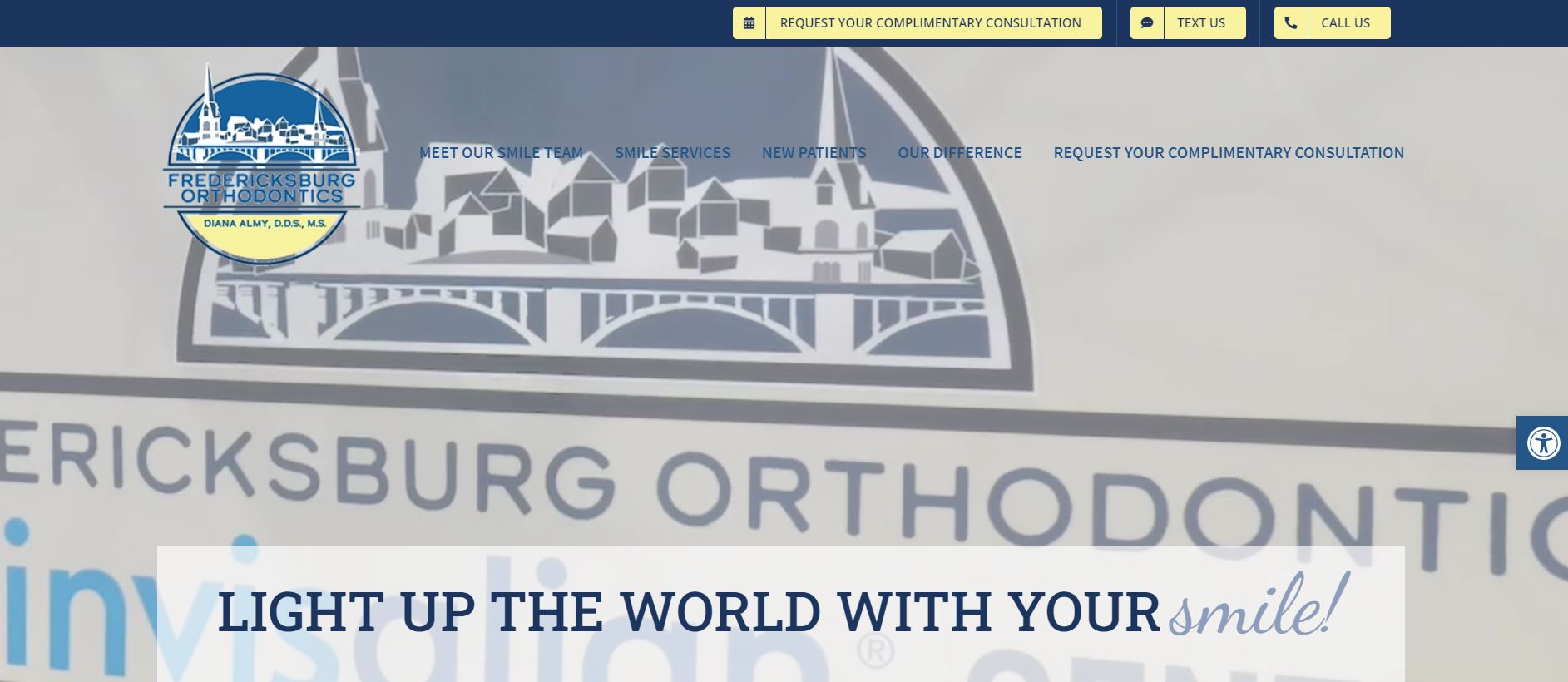
Fredericksburg Orthodontics is arguably one of the top Invisalign services in the USA. The orthodontics center has developed a very specialized website that provides visitors with all the information in an easily accessible manner. The website is very comprehensive, but at the same time, it was pretty easy to navigate. In addition, the accessibility options accommodate people who have trouble adapting to the usual user interfaces.
What We Like About It
The website has a video header that plays scenes from inside the dental center in a loop. The header has a caption encouraging visitors to light up the world with their smiles. There is an accessibility option on the right side of the screen that you can use to adjust things like font size. There is also an option to request a complimentary consultation.
The navigation bar at the top has options for requesting a consultation and contacting them. It also has links to other web pages that you can use to navigate the website. The menu is sticky so that you can access it anywhere.
The following section introduces Dr. Diana Almy. The website is peppered with mention of all the distinctions they have received, including the Invisalign Diamond Plus provider status. The website also describes the center in detail, including their approach to treatment and the services they offer.
The services have been divided according to age groups and the services like Invisalign, braces, and retainers. The website has a testimonial section that features past reviews. Near the bottom, there is a form that you can fill out to request an appointment. The footer has the center’s contact details and working hours.
8. Quick Smiles
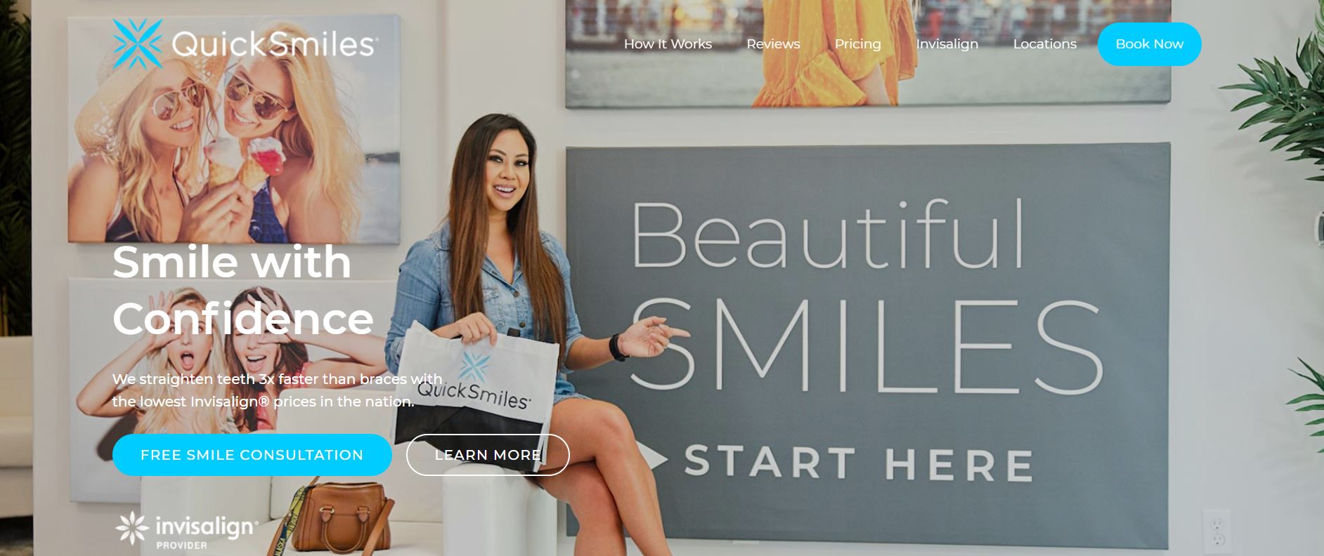
Quick Smiles claims to have dentists with a diamond status. The good thing is we already get a hint of that quality in their website design. The website is comprehensive and easily navigable. The best thing about the website is its color theme. It just makes usage so much more fun.
What We Like About It
You can call for a free consultation by dialing the number given at the very top of the website. The navigation bar happens to be sticky and has options for navigating the entire website. It also has an option for booking appointments online.
The website header features a smiling woman in front of what we can assume is a wall in the center. You can use this section to book a consultation or learn more about the center. The header also informs the audience that the center provides Invisalign services. In addition, they offer a free 3D smile scan that can show you the results you will get. Finally, the website further explains the process and how things work.
The next sections focus on who they are and what they can do for their patients. The website lays out the payment plans so you can check affordability beforehand. They also have a review section filled with video and text reviews. You can see all their memberships here and be sure of their credibility. Finally, the footer has location addresses and navigation links.
Conclusion
That ends our list of the best Invisalign websites on the internet. As you can see, there is a lot of competition in the market, and your website can help you stand out. Just be sure to pay attention to the information you are putting out. It’s a good idea to explain what the service is in detail. Testimonials and accreditations can go a long way in establishing your credibility.
You can see what you like in these websites and incorporate them into your website with a personal touch. You should also focus on the color scheme and go for a more soothing color palette to not distract the visitors. We hope you have a great time coming up with the perfect website design for your website.

