Although the lawn care business is lucrative, you’ll need some exposure to thrive. Sure, you could rely on good old word-of-mouth, but having a strong online presence can help you accomplish even more. Of course, the most efficient method is using a website to display the success of your previous projects. In this regard, a testimonial section does wonders for your credibility.
However, as beneficial as a website can be for your business, it can also be counterproductive. Since the lawn care business is centered on aesthetics, your clients would be turned off by a shoddy website. Therefore, you need to channel your creativity when creating your website.
1. Grassperson Lawn Care & Landscape
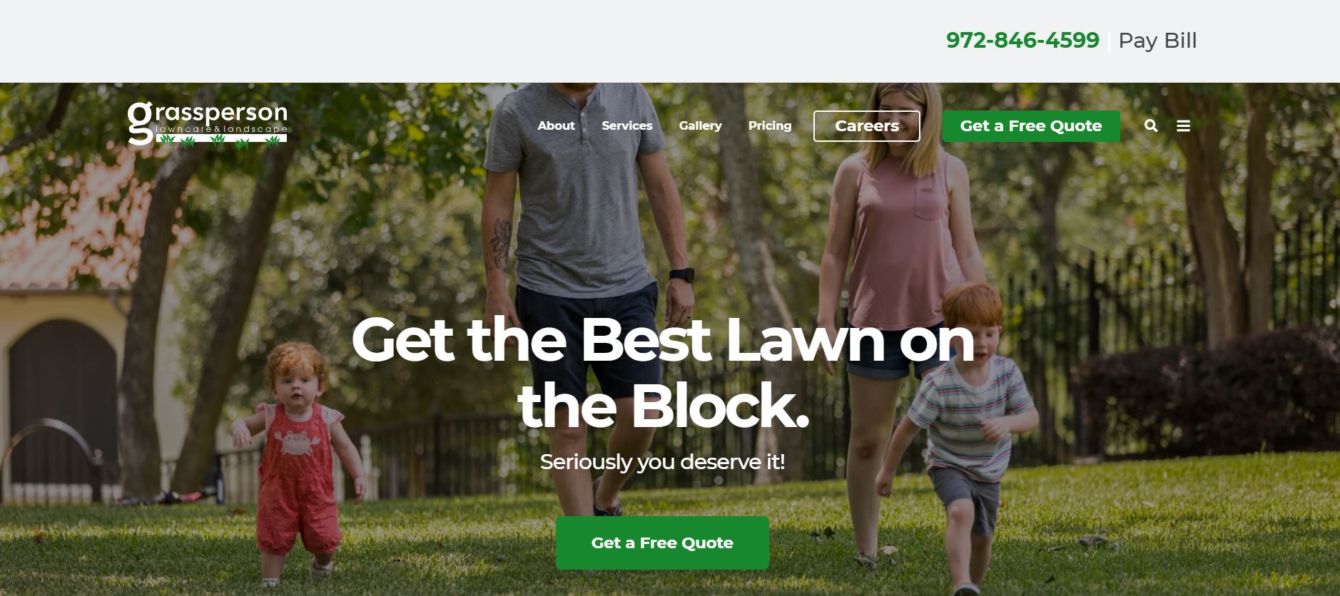
The owners of Grassperson Lawn Care & Landscape have put a lot of thought into the design of their website. Their interface is sleek and simple, with just enough intriguing features and functionality to keep navigation engaging. Of course, the aesthetic layout is a big help.
What We Like About It
The image in the header depicts a family having fun on a beautiful lawn. A clear call-to-action accompanies the picture for their option of “Get a free quotation.” For navigation, the website uses a sticky menu, which is a user-friendly alternative.
The section following that explains why visitors should hire Grassperson to take care of their lawns. You can see their lawn care packages on the home page, allowing users to estimate their budget. The testimonials demonstrating the quality of their service are the focus of the next section.
Following an offer for a free quote, there is a simplified illustration of the process after you choose Grassperson. All of their honors and memberships are listed at the bottom of the page and in the footer. In the end, you’ll find their contact information as well as quick links to several web pages.
2. Premier Lawn Services
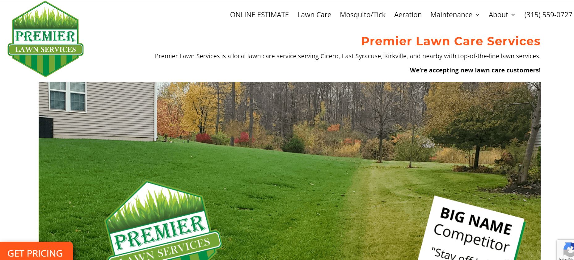
The second company on our list has a website just as impressive as their lawn services. They’ve added an unexpected but dramatic dash of orange to their green and white color scheme. Aside from that, the website is straightforward to navigate and has a simple layout.
What We Like About It
Premier Lawn Services takes a more humorous approach to its header. It features a lawn with a signboard from a competitor urging Premier Services to keep off the grass. The image also depicts the areas treated by Premier Lawn Services as well as those treated by their competitors. This is a creative marketing strategy, and we can’t say we don’t love it!
The large orange pricing call-to-action button at the bottom left of the webpage is the next thing you will notice. A sticky navigation menu is also present on this website, which transitions from white to orange as you scroll down.
The webpage explains your lawn’s full potential and what you can do to achieve it. You may also find the owner’s warranty, which states that you will receive a full refund if you aren’t satisfied with the service. If that doesn’t ensure the customer’s trust in the service, we don’t know what will.
The rest of the website features the standard forms for requesting a quote, as well as a footer with all of the contact information and links to services and service regions.
3. Ryan Lawn & Tree
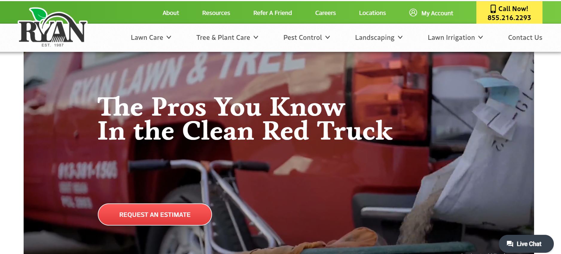
The website design of Ryan Lawn & Tree is in keeping with their business theme, with a lovely green and white color palette. Their website is simple to navigate and has a main navigation menu. They have organized their website to earn the customer’s trust, even if they only skim the homepage.
What We Like About It
A video header on the website introduces visitors to the company and its work ethic. You can also see a prominent call-to-action button for requesting a free quote in the header. Plus, customers can use the live chat feature to get immediate answers to their queries. The sticky navigation menu contains all of the options for exploring the website and using the services.
They have posted their Google ranking towards the top of the website to establish their credibility. Next is the testimonial section, which features previous customer feedback. They also have a section for lawn care, tree and plant care, pest management, landscaping, and lawn irrigation with large thumbnails. You can learn more about their services in each category by clicking on any of them.
The rest of the website provides additional information on the company, their service areas, and a section called “Ask A RYAN Pro.” The footer contains numerous choices for contacting them, making an account, using their services, and much more.
4. B ‘n B Lawn Mowing
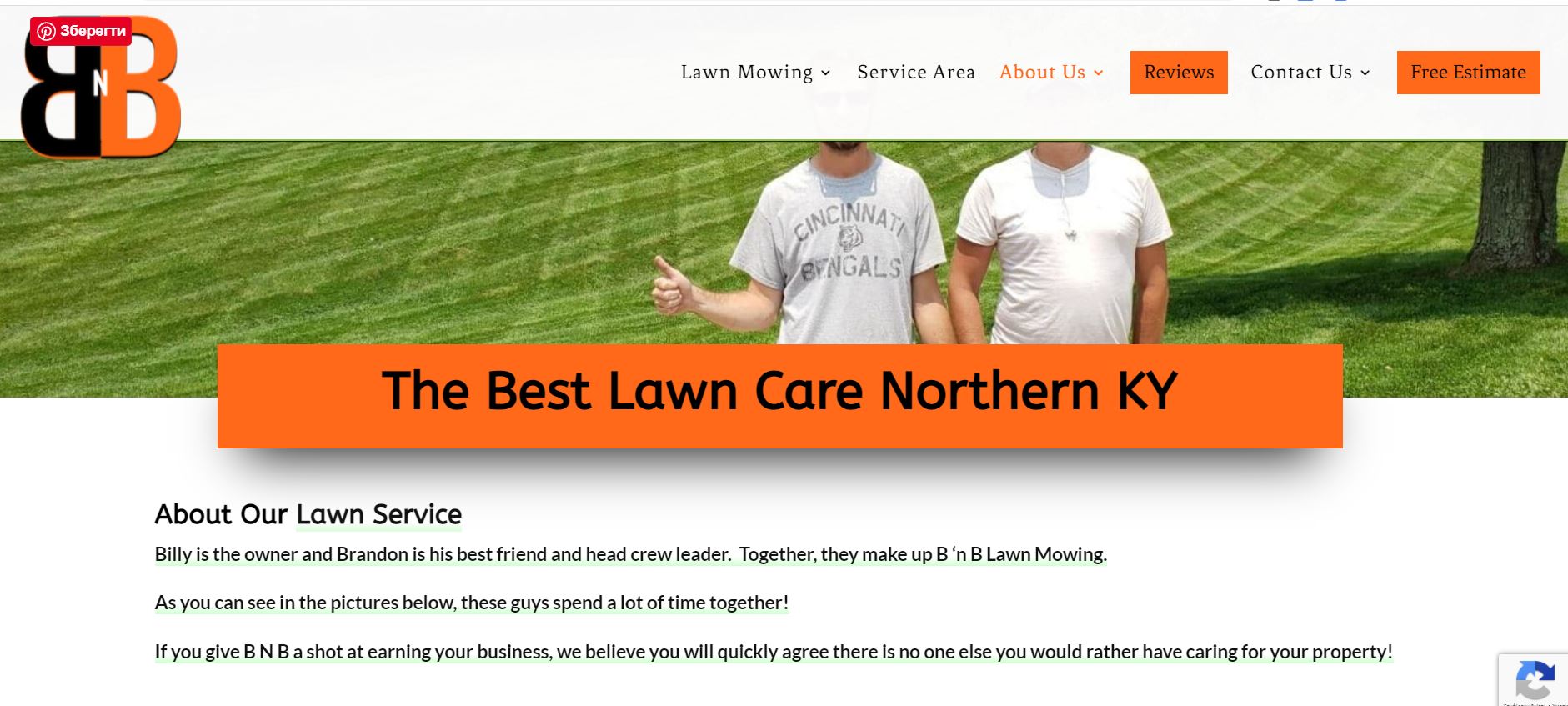
The B ‘n B Lawn Mowing website features a distinctive style that is sure to entice visitors. The website’s visitors will find it easy to navigate thanks to its clean design and prominent call-to-action. Users can go to the pages they want on the website thanks to quick links scattered throughout the text.
What We Like About It
The header features a banner image captioned with a claim to be Northern Kentucky’s top lawn care service, along with a prominent CTA for requesting a quote. The sticky navigation menu is quick and straightforward, with links organized by category, so you won’t have to worry about scrolling back up.
The reasons why people prefer B ‘n B Lawn Mowing to other providers are discussed in the next section. It also includes data on the company’s growth over time. To access all of the services, you can click on the “Talk to Me” CTA below the owner’s statement.
The company also offers a money-back guarantee to its users. So if you don’t like the service, you can get a complete refund. Lastly, their contact information and service area are given in the footer.
5. TruGreen
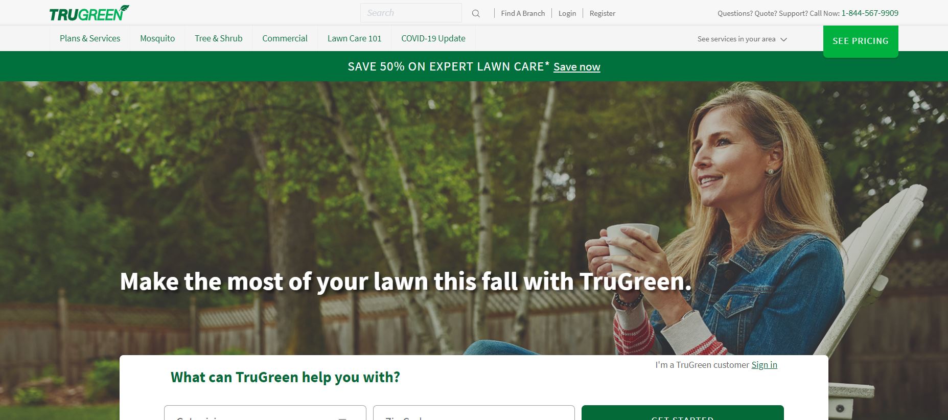
TruGreen is the most minimalistic website on this list. Yet, it manages to be impactful. The simple, consistent design lets people know how trustworthy the site is without shoving a mound of information in their faces.
What We Like About It
The header advertises a first-time application discount, which any customer would appreciate. Next, you can access a form by entering your zip code and the service you require. After that, you can use this form to request an estimate.
Following that section, they have included a gallery that compares the benefits of using the TruGreen plan vs. not using it. The website also displays their Trustpilot rating and certifications. Moreover, you can find their contact number at the top and bottom of the page.
They also include their privacy policy, along with other disclaimers and essential information, at the bottom of the page. Overall, the website is straightforward but effective.
Conclusion
In conclusion, you need your lawn care website to assist you in building a positive relationship with your clients. To accomplish so, you must first establish your credibility. Testimonial sections, galleries, certifications, and reliable ratings are some options to help you with that. In this line of business, you can’t afford to ignore the aesthetic standards of your work.
We hope that after going through the best lawn care website designs on our list, you will be able to make informed judgments on the design of your website.


