In today’s era, people are becoming more focused on leading a healthy and fit life. As such, more and more people have shifted their focus to physical fitness. That’s where you enter the picture. A well-designed website can help you attract clients.
A good personal trainer website design is sleek to look at and prominently displays your expertise. However, it should also be able to communicate with your customers. You are not just selling your services as a physical trainer. You’re selling yourself too. You are your brand, and as such, clients need to be able to connect with you.
It can be challenging to choose a website design that matches your particular style while also being functional. This is why we have compiled this list of the best personal trainer website designs.
Top 5 Personal Trainer Website Design
1. Matt Roberts Evolution
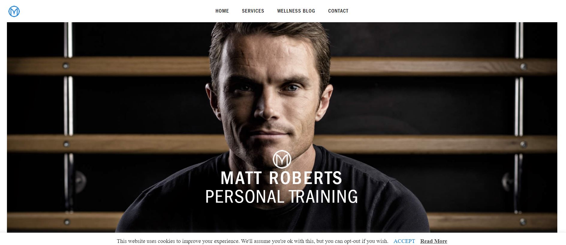
Matt Roberts is a huge success in the fitness industry, and he has a website to demonstrate it. His website offers a distinct look without relying on flashy graphics. He has used high-end photography to emulate how he works with his clients.
What We Like About It
As soon as you enter the website, you are greeted by professional photographs of Matt Roberts himself on a sliding header. The top menu is clear and easy to navigate, with quick links to the home page, services, wellness blog, and contact information.
The next section is divided into three parts. The first one is about Matt Roberts Evolution and the services offered. The next two are about virtual training and fitness resorts. Each is accompanied by relevant images. Moreover, a gallery with a collection of footage from their training centers is available.
The footer is pretty straightforward, with links to their services, retreats, media, and contacts. Potential trainers can use the career options to look for job opportunities. The website uses cookies, but the website informs users of this beforehand. Users are allowed to opt out if they wish. Overall, the website is simple and effective in conveying information while retaining a beautiful aesthetic.
2. The Body Coach
Joe Wicks is another big name in the fitness industry. He has adopted a different approach to designing his website, with a model that focuses on getting folks to buy the service. It just goes to show how versatile your website can be once you have built your brand.
What We Like About It
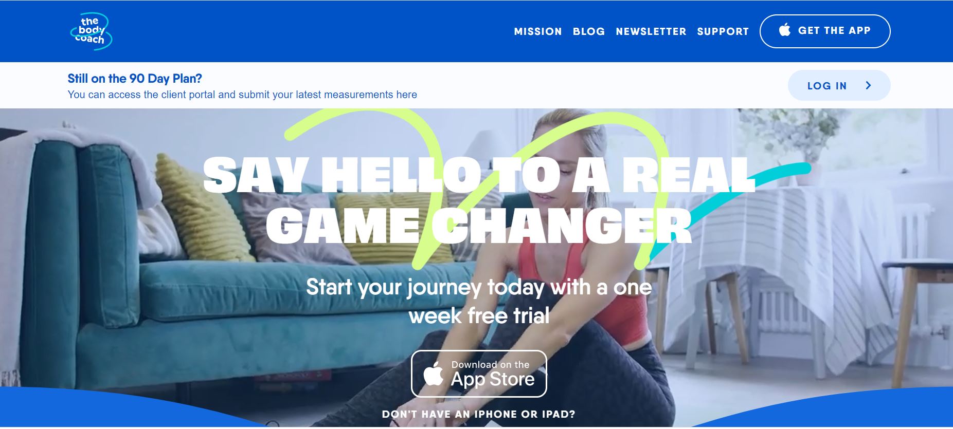
The Body Coach website also uses a video in their header to explain how they work with their users. Then, they ask you to download their app with a one-week free trial right at the top. For those on the 90-day plan, there is also a login option.
The app is the subject of the next section, which goes through all of its features in great detail. They also offer to customize a meal plan for you based on your goals and needs. The HIIT workouts are also tailored to the needs of each individual. Furthermore, you can track your progress by entering your measurements regularly. This section concludes with a discussion of testimonies and pricing.
The blog takes up the rest of the website, with excerpts displayed on the homepage. There is a newsletter that you can subscribe to for the latest updates. The footer has all the links for navigating the website.
3. Roman Fitness Systems
The website for Roman Fitness Systems is one of the most creative we’ve seen. The website has unique content that was created with a sense of humor sure to draw anyone in. Going through the Roman Fitness Systems website was a refreshing experience.
What We Like About It
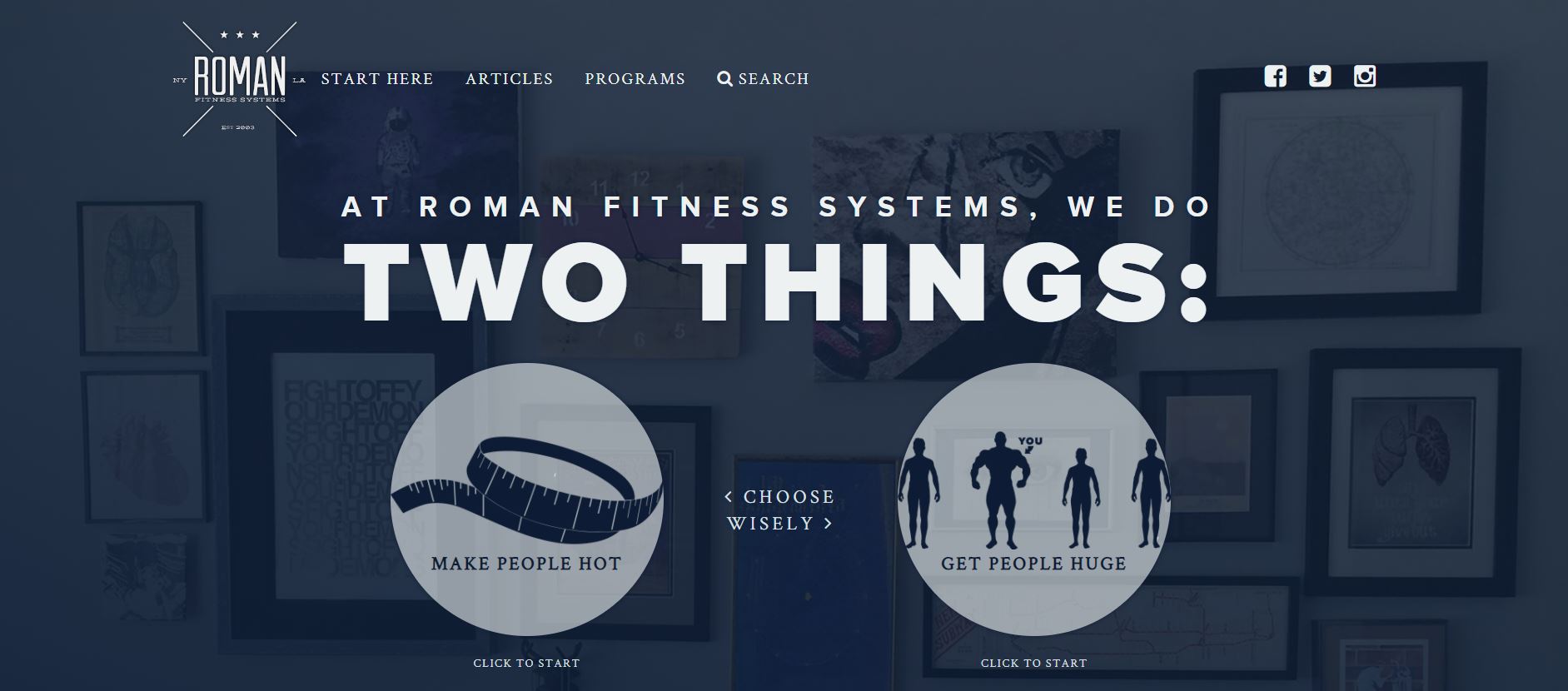
You are met with a choice as soon as the website loads. Roman Fitness System claims they can make people hot or huge. To begin, pick one of these two options. The light-hearted approach to fitness is a breath of fresh air and makes the process seem less daunting. It also gives the business owners a more approachable air.
The top menu contains navigation options for the website. You can immediately start the program by clicking on “start here.” You can also access articles, programs, and the search function. The links to their social media are at the top right corner.
The following section is about the business itself. You can also read a fictional account of John Romaniello’s founding of the Roman Fitness System. The footer is filled with options to navigate the website. For anyone interested in having their work published, there is an article submission option. You can also choose to receive updates by providing your email address.
4. Strength Coach
The Strength Coach website has a more traditional design. The website design is clean and easy to use. All the information is available in a clear, crisp format. In addition, the website prominently makes use of promotional offers to draw customers in.
What We Like About It
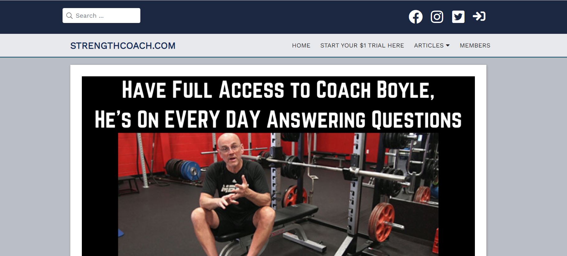
The website’s primary colors are black, blue, and white. The contrast is aesthetically pleasing. The header features a picture with options to start the process immediately or, if you prefer, get in touch first. Testimonials, programs, the blog, and contact information are all accessible from the top menu.
In the following section, they go into detail about what they do. They claim to help you gain more energy, boost your confidence, and improve your overall quality of life. Then, they offer a “No Sweat” introductory session, a video consultation between you and your trainer. It’s free of cost, and you can decide whether or not to continue after the first session.
On their homepage, you can see some of their most popular blog posts. They have also included a mission statement and a way to contact an expert on this page. Additionally, you can connect with them via their social media accounts. At the bottom of the page, you’ll find a list of all the accolades they’ve received.
5. Jill Brown Fitness
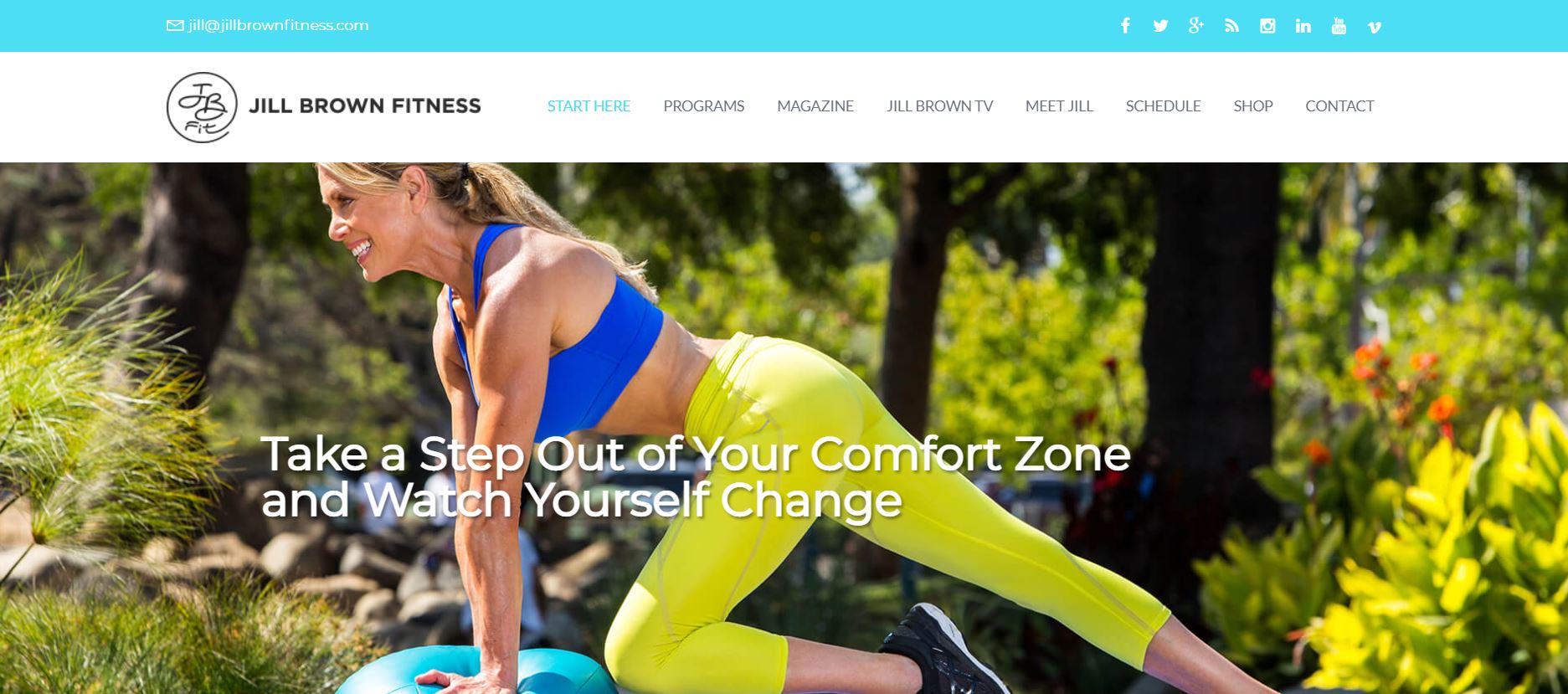
With a pastel color palette and bright pictures, the Jill Brown Fitness website is a cheerful sight. The site is easy to navigate and maintains a positive tone. The website is not only attractive, but it is also quite comprehensive in terms of the information it provides.
What We Like About It
The website has a sliding header with pictures of Jill Brown in the middle of workout sessions. Jill’s email address and social media handles are shown on the top strip. The menu has options for navigating the website. These include access to her magazine, the Jill Brown TV, programs, schedule, and more.
Following the header is a section dedicated to her Instagram account. This section has pictures from her Instagram handle. Next, the webpage features a few notable articles from her magazine. These include tips for staying fit, fitness-themed gifts for holidays, and things like that.
Moving on, the website displays Jill’s own introduction. You can read the detailed introduction by clicking on the button there. There is also a video that shows Jill instructing how to do several exercises. Lastly, you can subscribe to her newsletter. All you have to do is fill out the form given at the bottom of the website, and you’ll be able to receive updates on how things are going.
Conclusion
That concludes our list of the best physical trainer website designs. Hopefully, you found it useful and now have a better understanding of designing your website. Your website doesn’t have to be flawless. All it has to do is represent you. A good website is a reflection of your business and gives people an insight into how you work.
When designing your website, there are a few things to keep in mind. First, the website shouldn’t take an eternity to load. Second, increased functionality like weight tracking and other such features can significantly enhance the user experience. Finally, you can explain your training process by connecting the website to your social media handles or adding pictures and videos from your routines. Just keep these things in mind, and you’re good to go.


