Retro or vintage is a popular trend in web design these days, with websites using older color schemes, layouts, fonts, typographies, and images. Some websites even incorporate photos of vintage goods such as old televisions, posters, and neon signs. These themes are trendy because they evoke a timeless feeling. Furthermore, the novelty of seeing old things appeals to a wide range of visitors.
The eye-catching elements, however, are only the beginning. A good web designer should give visitors an immersive experience that encourages them to stay and learn about the product, service, or brand that the website promotes.
Check out our roster of the best retro design websites to see how the designers effectively used this aesthetic.
Top Retro Web Designs
1. The Dollar Dreadful Family Library
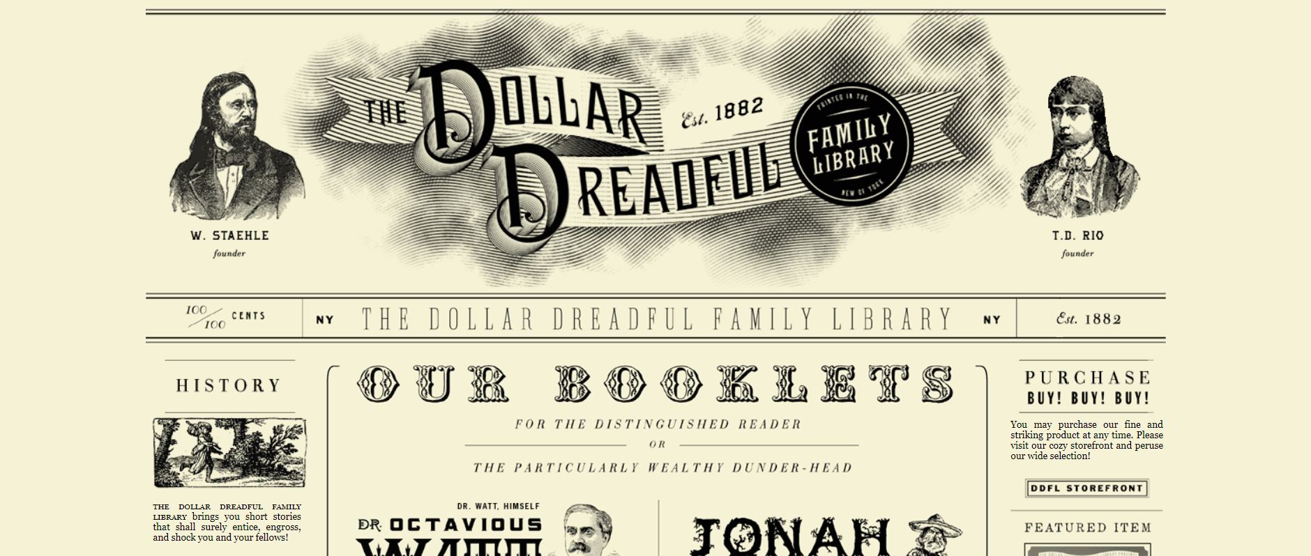
This website sells copies of curated short stories that will shock, engross, or entice readers. It is a play on the old horror film Penny Dreadful that came out in the 19th-century.
What We Like About It
The designer has made the website appear like an old newspaper. The single-screen webpage is composed of vintage-style news stories, complete with hand-drawn illustrations. Each article has a link that allows users to preview a particular story that the website sells.
These stories are primarily about occult adventures, mysterious crimes, bizarre domestic tales, and other oddities. The images that accompany the news article resemble those you would find in an old newspaper. When you hover your cursor over an article, a retro occult eye image displays.
What’s great about this website is that not only does it use themed images, but it also features vintage typography. And the language is highly reminiscent of the respective era. For example, the phrases “dandy pieces of art,” “his perennial beauty,” and “amusements for all ages” are just a few that you can find on the page.
2. The Virtual Gas Museum
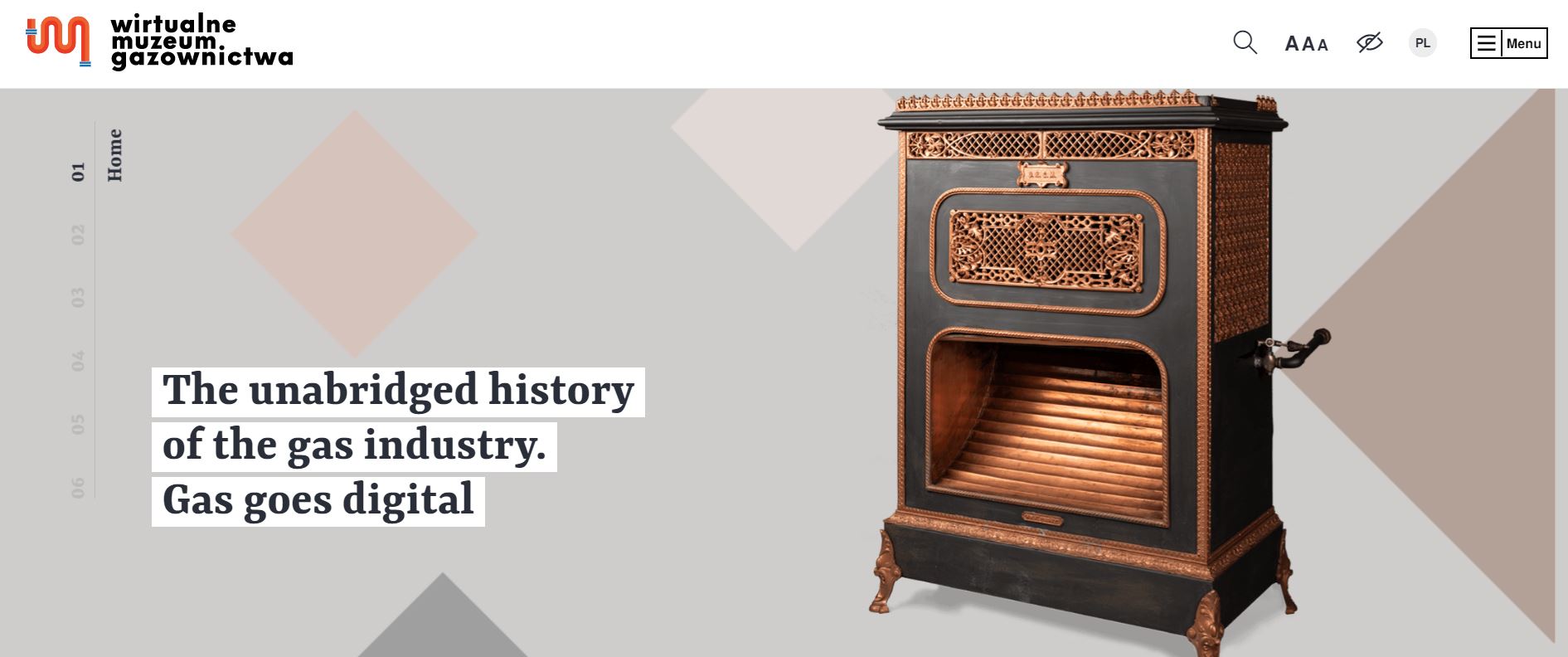
The Virtual Gas Museum website is a combined project of the Gasworks Museum and the Polska Spółka Gazownictwa. Since it talks about the history of the gas industry, it makes sense that the website appears vintage.
What We Like About It
The first thing any visitor would notice on the page is the picture of old gas appliances. There is the gas iron from the 1930s and the gas pipes you would see in the traditional gasworks. Additionally, geometric shapes accompany these pictures to add layers to the images.
The website uses unique slideshow navigation. When you scroll, the next page either slides in from the right or the bottom. Not only is this element attention-grabbing, but it also entices the visitors to keep on scrolling to see how the next slide will appear.
The website also uses animation to present a timeline creatively. For example, a curvy line connects an event to the next as if it were a gas line.
When you click on the link to the Museum Exhibits, you find yourself on a page filled with pictures of old gas-related items. Each object appears to be an actual part of an exhibit. The images are links to the description page of each item, with each using horizontal scrolling.
3. Soviet Taxi
Soviet Taxi is a company that collects unique items from the Soviet era. The website allows people to rent items from the collection, including a refurbished taxi. Since these are vintage items, the website’s designer chose to use retro elements.
What We Like About It
Everything on the full-screen layout website appears vintage. The entire thing screams retro, from the color palette to the graphic style. For instance, the designer has used grunge-style images as the background for the different pages. Additionally, there are random geometric figures that serve as links to other pages.
A play button can be found towards the bottom left corner of the screen. This button allows you to listen to Soviet-era music as you browse the various pages. Unfortunately, adding music to any website can be tricky. This is because some visitors find the music distracting. That is why having a play button on the side is a brilliant idea. Since the music does not play automatically, it will be up to the visitor to decide whether they want to hear music or not.
The unique transitions, hover effects, and animations give this retro-looking website a more modern vibe.
4. Magneti Marelli 100
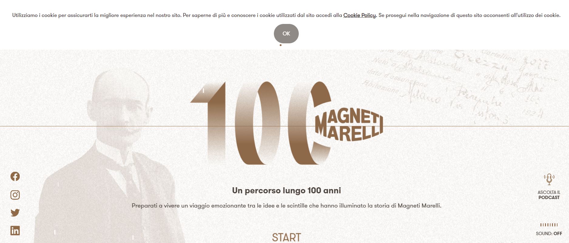
This website details the history of the Italian brand Magneti Marelli. It uses a combination of retro and modern elements to present visitors with an immersive visual and auditory experience.
What We Like About It
The website uses grainy, yellowed illustrations as the background for each page. Additionally, the typography and the color scheme have a distinctly retro vibe. The unique navigation, on the other hand, is relatively modern.
The text that tells the history is accompanied by grainy black and white photos and vintage-looking graphics. Most of the pictures are static, but some show-minute animation provides the pages with extra eye-catching elements.
Each page offers a listening or reading mode. The narration automatically loads but can be muted using the button in the bottom right corner of the screen. Unfortunately, each new chapter loads a different audio file, so you will have to switch it off on every page if you don’t want to hear the narration.
5. Dunderville
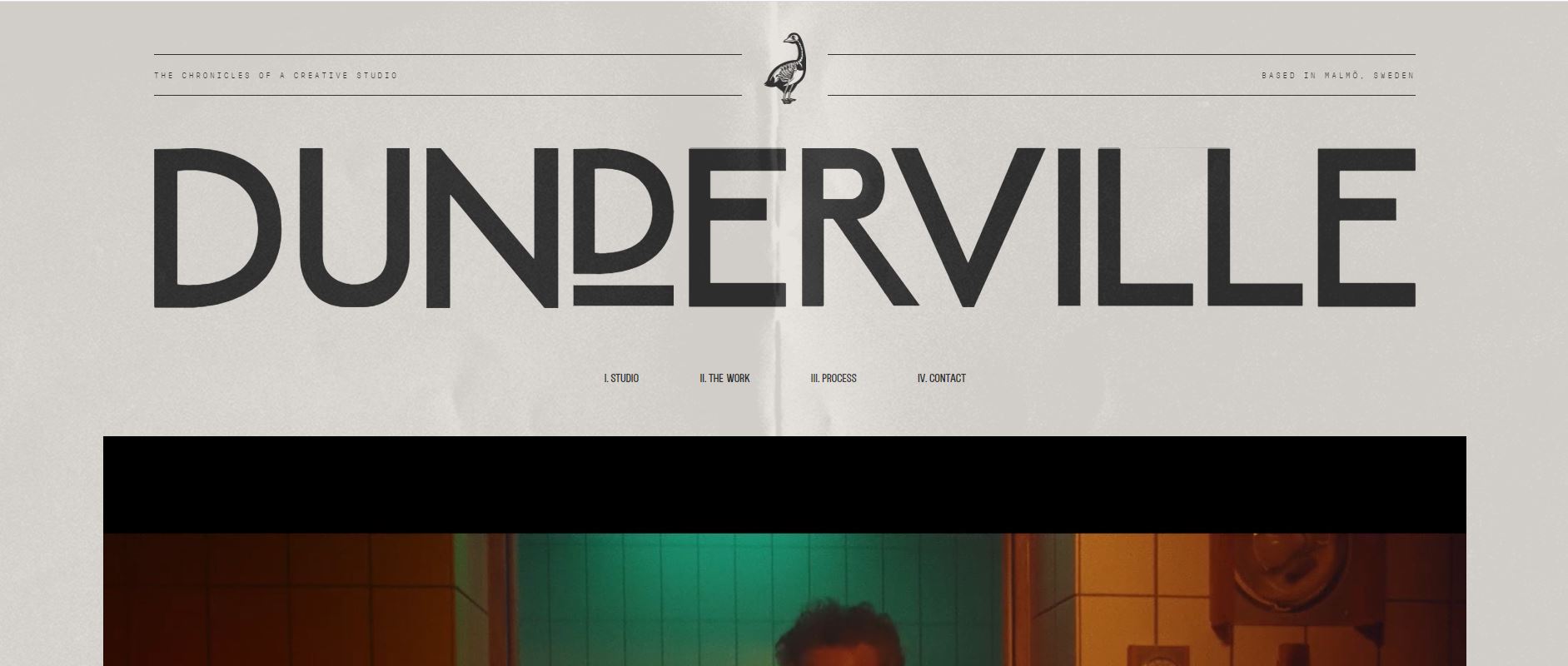
Dunderville’s website represents a creative design firm. Its portfolio is designed to look like an old book. Except for the hero video that showcases the company’s projects, everything about the website gives off a nostalgic feeling.
What We Like About It
The Dunderville website effectively combines retro graphics, typography, and color scheme with animation to give the entire page a modern retro design. The company name and case study titles are written in a bold, retro font on the homepage. The texts are extremely large or small to allow the visitor’s eyes to focus on the relevant content.
The image links are old-timey illustrations of an indeterminate machine and a rotary phone with a digital screen.
When you go to the content pages, you will notice that the designer uses various colored sheets of paper that have creases in them. The font used is still huge. The project titles scroll slowly horizontally. Each title goes a different way than the title before it, making the page appear very dynamic.
The process description page features numerous animated retro illustrations. Each illustration creatively depicts the company’s design process. At the end of the process description, a CTA button asks the visitors if they are ready to have a coffee. This is their way of inviting potential customers to chat with them regarding any design project.
6. New York Moon
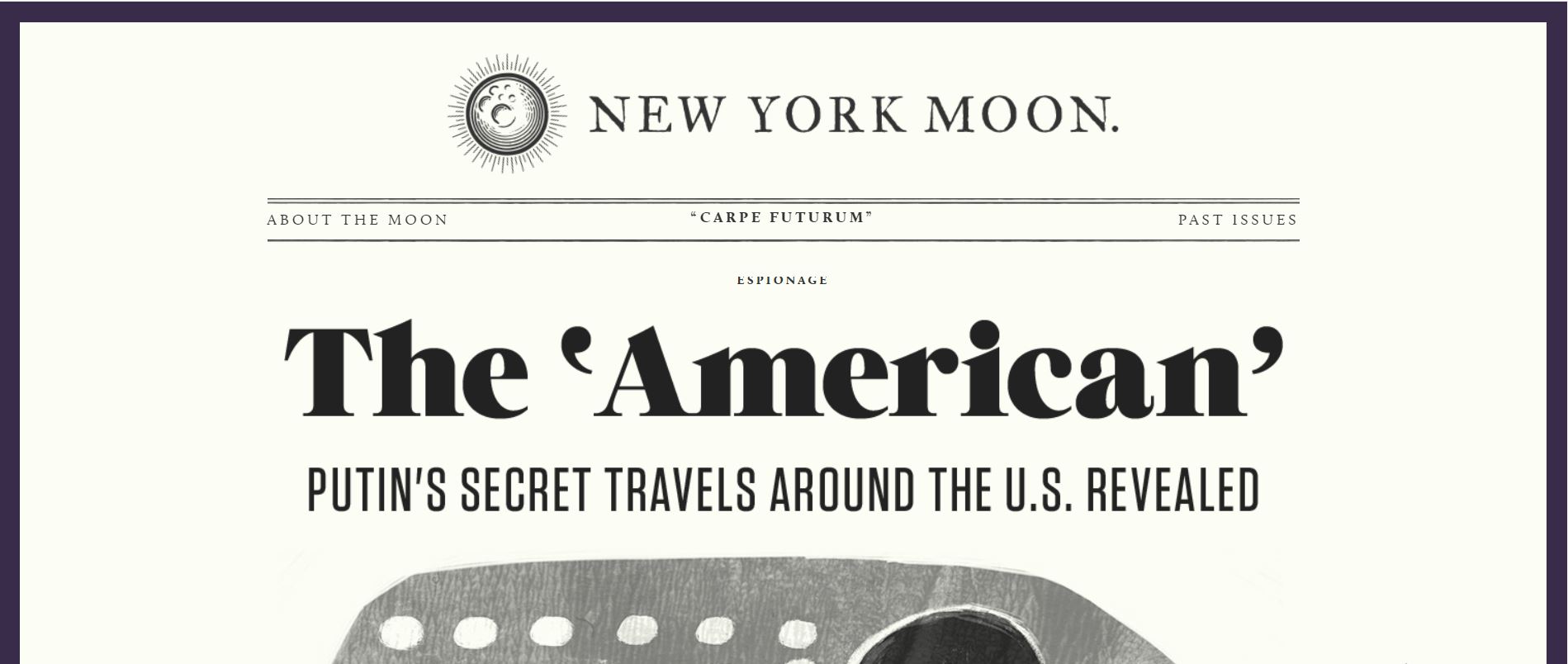
This is yet another website with a vintage newspaper feel. New York Moon is a moon-based publication. Its typography, color scheme, and other visual elements all work together to create a nostalgic feel.
What We Like About It
The website does look like an old newspaper. It uses the same fonts and layout as newspapers from decades ago. Even the background color is yellowish to give the page a more authentic feel.
The website features a lot of black and white hand-drawn illustrations accompanied by super short texts.
However, there are some modern elements on the pages too. One prominent addition is the animation on the company’s logo. The designer also chose to use modern-looking pictures on the subsequent pages.
Conclusion
If you want to evoke a feeling of nostalgia from your visitors, you should use retro elements on your website. Images of antique items and grainy black-and-white pictures effectively give any website a vintage feel. You also have to choose the appropriate fonts.
But just because the website looks old does not mean it should be slow and hard to navigate. On the contrary, the great thing about the featured websites is that they are simple to use and load pretty fast. Additionally, they incorporate modern components such as animations to give the websites a modern twist.


