Fashion is one of the most creative, fast-paced, and highly competitive industries worldwide. Statistics show that around 1.6 billion people shop for clothes online. As a result, the estimated sales for this industry have reached over $3 trillion in 2020.
Given these numbers, it is crucial for any business in fashion to have a killer website that captures the shoppers’ attention. You will be competing with big fashion brands to keep your existing clientele and reach new customers.
Learn what makes a compelling fashion website design by checking out our list of the top websites in the industry.
5 Top Fashion Website Designs
1. Verge Girl
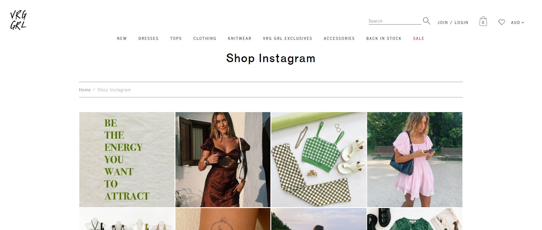
Since many online fashion websites feature hundreds of items, the website must make good use of the categories section and keep the products sorted accurately. This can be seen in the organization of the Verge Girl’s website.
What We Like About It
When you shop at a brick-and-mortar shop, there is a clear section for each item. Stores categorize the items they sell effectively. For example, shirts and blouses go together, while pants, shorts, and skirts go to a different section. This should be true for online shops as well. You can not lump all of your products into one page as it can confuse the client.
Verge Girl’s website categorizes their items under tops, clothing, knitwear, exclusives, accessories, new, and vintage to avoid overwhelming visitors. If you don’t have the time to browse their entire catalog, you can choose to filter your searches accordingly. If a visitor is looking for a more affordable item, there is also a “Sale” section.
The header uses bright and captivating photos of models wearing the store’s latest collection. There is a slogan stating, “Wear it your way” over the hero image. This appeals to the store’s target audience as they sell clothes and accessories that project a sassy or irreverent image.
On top of the header, the designer also printed some of the benefits of shopping at this store. They offer fast shipping plus easy returns or refunds. This is important to note at the top of the site since some stores do not accept returns. So, if you end up ordering the wrong size or color, you’ll be stuck with it. That’s the value that the store offers; shopping with no regrets.
One of the trends in fashion websites now is connecting their pages to their social media accounts. So, if they work with an influencer who then posts pictures or videos using the company’s hashtag, the content will appear on the homepage. As a result, those who follow those influencers get to see how they styled a particular outfit. On top of that, it also serves as a lookbook for the store’s products.
2. Rollie
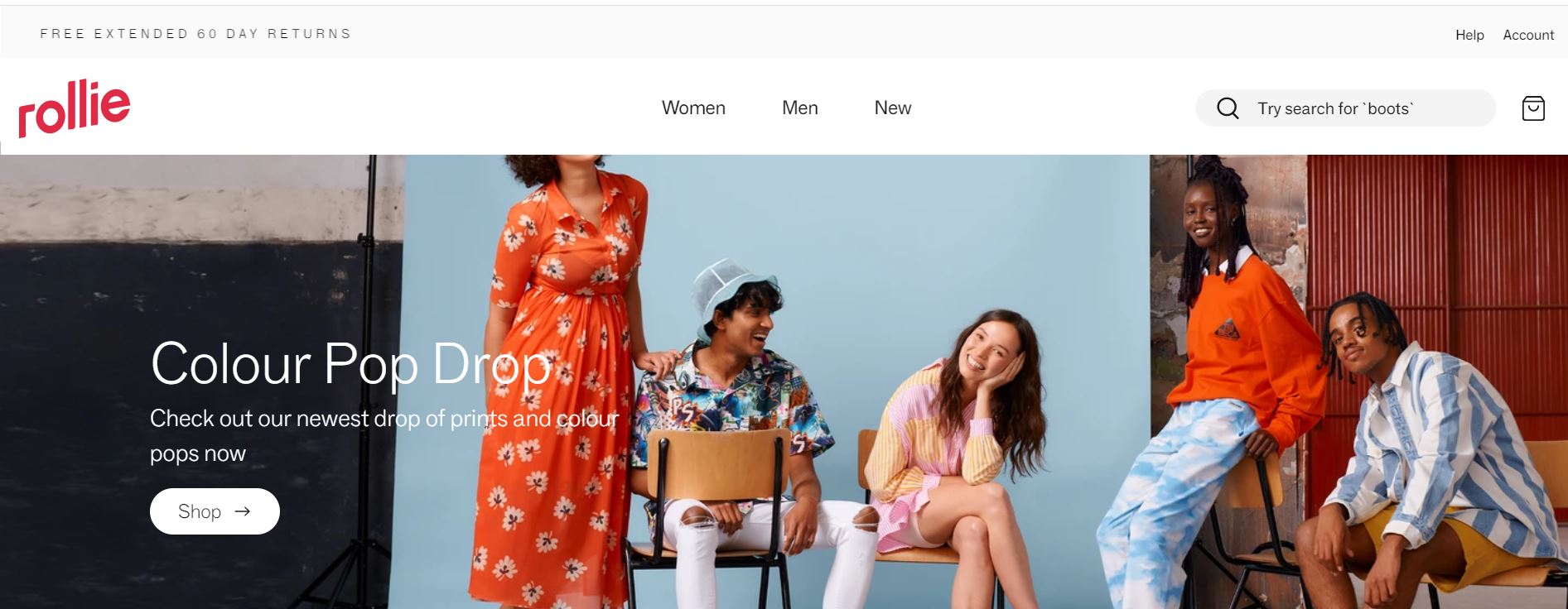
The use of a white background allows the designer to emphasize the colorful products of this shoe manufacturer. Its homepage combines videos and images to capture the audience’s attention and highlight the company’s vibe – hip and young.
What We Like About It
The hero video immediately lets the visitors know that this company produces shoes for the young and trendy audience. It shows people laughing, jumping, and skateboarding. The video focuses on the models and their shoes to show precisely what product you can find on this website.
The product pictures themselves are of high quality. They stand out on the page’s plain white background because of the color of the items or the background used in the picture. You may notice that the images of the products look uniform as they are all of the shoes in the plain background, but when you hover over each picture, it either shows the product from a different angle, or it is pictured when worn by a model. This is an excellent feature because some products look great on their own but appear weird when worn. Additionally, the additional pictures give the visitors an idea of how to style the look.
After the image links for the shoe categories, the website features the company’s story. A short text talks about what the company is and how it started, but it is better explained in the video. On the About Us page, the company’s description and history have been detailed using a combination of texts, fun images, and a video of the designer in the shoe studio. Anybody who wants to find out what the company is about will enjoy getting to know it from this page.
3. Ssense
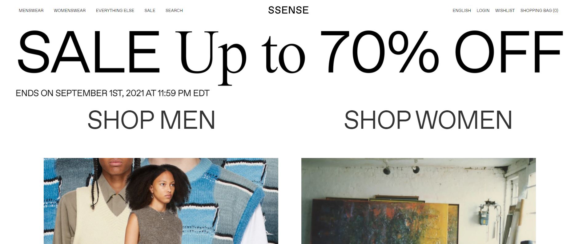
While most fashion websites serve as and look like an online store, Ssense appears to be more like a fashion magazine. Its homepage is filled with fashion-related content that talks about the latest trends and hottest fashion items. Only as you explore the deeper pages will you find the catalogs so you can start shopping.
What We Like About It
Instead of going straight to presenting its catalog, Ssense’s website offers its visitors high-quality content where they can read about what’s inside a fashion editor’s beach bag. This follows the current trend where companies sell a lifestyle rather than just a product.
As the visitor goes through the contents of the model’s bag, they discover that this person loves the color blue, so she packs a blue-colored swimsuit. This swimsuit is available at the store, and a link from the article will direct you to that item’s product page. This approach is less salesy and more organic than directly selling the items on the website.
Each item’s product page contains vital information, such as the material, type of cut, added features, and more. Regardless, the text is concise and easily scannable. The product itself is presented plainly on a model. It is shot from different angles so that the interested customer can see it from all sides and assess if it will fit their body type. You can also zoom in on the pictures for closer inspection. A link to the manufacturer’s size guide is placed near the ‘Add to Bag’ button so the visitor can easily spot it if needed.
4. ShopStyle
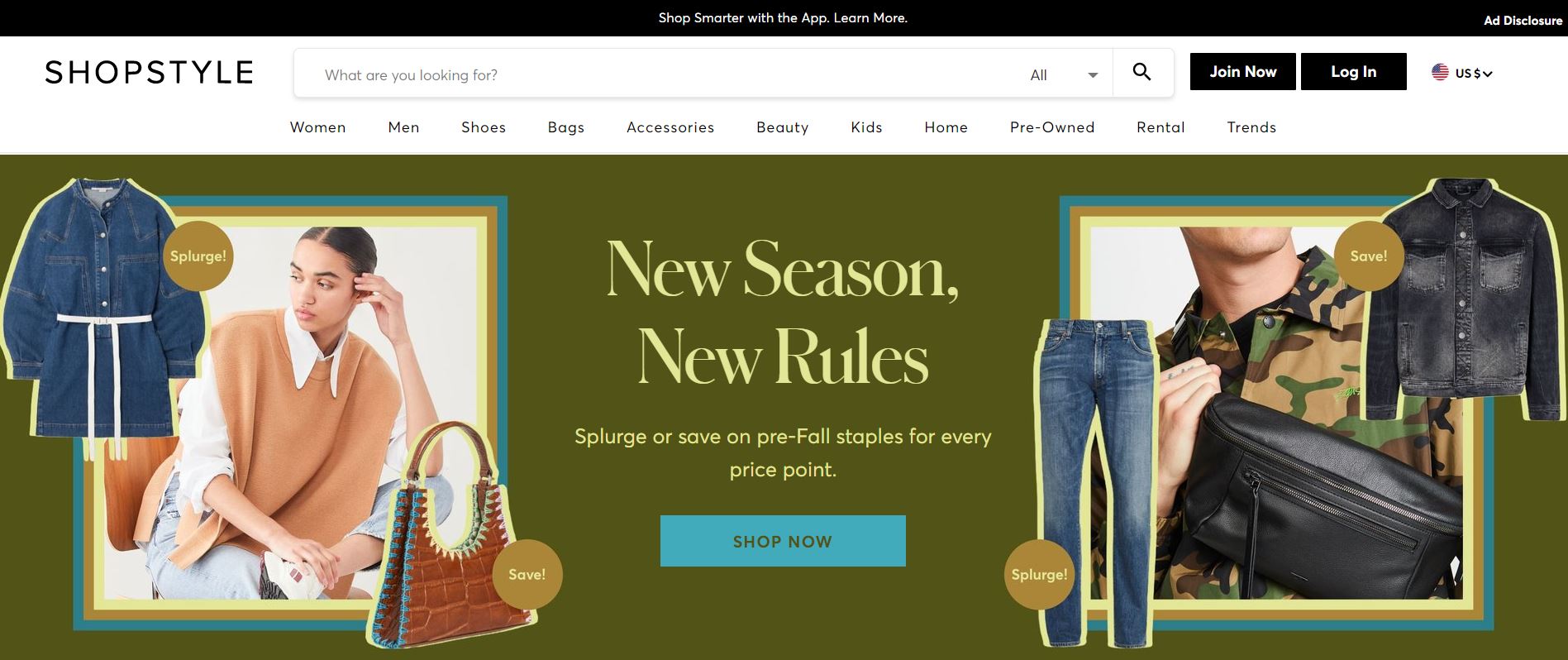
Buyers become excited whenever they see a sale or discount sign in the window of a shop. The same feeling is evoked when a fashion website announces a store sale. It instantly makes the casual visitor stay as they consider buying from the store. This is a strategy that ShopStyle uses on its website.
What We Like About It
The hero image features the different types of items that a customer can find at the ShopStyle store. With just one glance, you can see that it sells clothes, shoes, and accessories. A bold Call-to-action accompanies the hero image. Besides telling the visitors to Shop Now, it also informs them that the products they carry are things you will repeatedly be wearing.
Below the fold is the element that sets this website apart. It has a huge section of sales and offers. Since it contains many brand names and discount rates, it is good that the designer kept this section simple. Each entry states the brand name in its trademark font along with the promo it offers. For example, you will find that Net-A-Porter provides up to 80% off their regular price plus cashback options if you buy the item from ShopStyle.
A ‘What’s Trending’ section can be found underneath the promos. This contains links to pages of individual online stores that ShopStyle represents. You can hunt for your new outfit here or stick to the item category on the main navigation bar. The great thing about their featured brands’ sections is that you can buy your entire outfit from one brand and get a bigger discount. If you hunt for your top, bottom, shoes, and accessories separately, you may not get a better deal.
5. Natori
Josie Natori’s products are stylish and elegant, and the company’s website exudes the same kind of vibe. As an eCommerce site, it provides its customers a great shopping experience by including key features.
What We Like About It
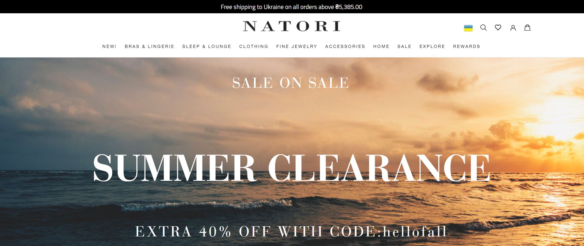
The Natori website is elegantly designed. Its homepage uses impressive photos, including that of the designer herself. The images and modeling photographs used exude a calm yet luxurious feel. Everything is minimalistic, from the branding to the product heading.
Specific products are easy to find since the website offers faceted search. There is a link for featured items like caftans or different pieces with zebra prints right on the homepage. There are also the traditional categories on the navigation bar.
After clicking on the main category, you can narrow down the search using the filters and sort feature. For example, if you click on ‘Clothing’ from the navigation bar, the drop-down menu will let you choose what type of clothing you are looking for. You can select from ready-to-wear, athleisure, or swimwear. You can also browse individual collections. If you click on ‘Dresses’ from the RTW category, you can filter the result by brand, size, color, and price. This way, if the visitor is looking for a particular item, they won’t have to go through the entire catalog.
Each product comes with detailed descriptions and customer reviews, if any. There is also a size guide if you don’t know which to choose. For any questions, the live chat option is there to answer immediately.
Conclusion
A website is a necessity for businesses in the fashion industry. Even if the company has an actual store, it would still need a website to promote the brand and allow the customers to buy products without leaving their homes.
Using amazing product photos is non-negotiable when it comes to building the best fashion website. Some stores use pictures of their products being modeled; others do not. However, the best stores use both. In addition, using categories to sort products is necessary, especially if the store carries multiple brands. Finally, adding content to turn the website into a lifestyle guide will make the visitors stick around and come back for more.
