In the virtual age, any user’s initial encounter with a business, such as a spa or a salon, is through the company’s website. As a result, you should plan the design of your website with as much thought as you did when you conceptualized your business.
Remember how you came up with the details, the facilities, the service menu, and even the uniforms for your personnel? The goal is to display all of these to your consumers virtually.
We looked at the finest spa websites to see what aspects they utilized to attract new customers and retain old ones. Take a look at their color palettes, typographies, galleries, and more in the list below.
Top Spa Website Designs
1. Kamalaya Wellness Resort
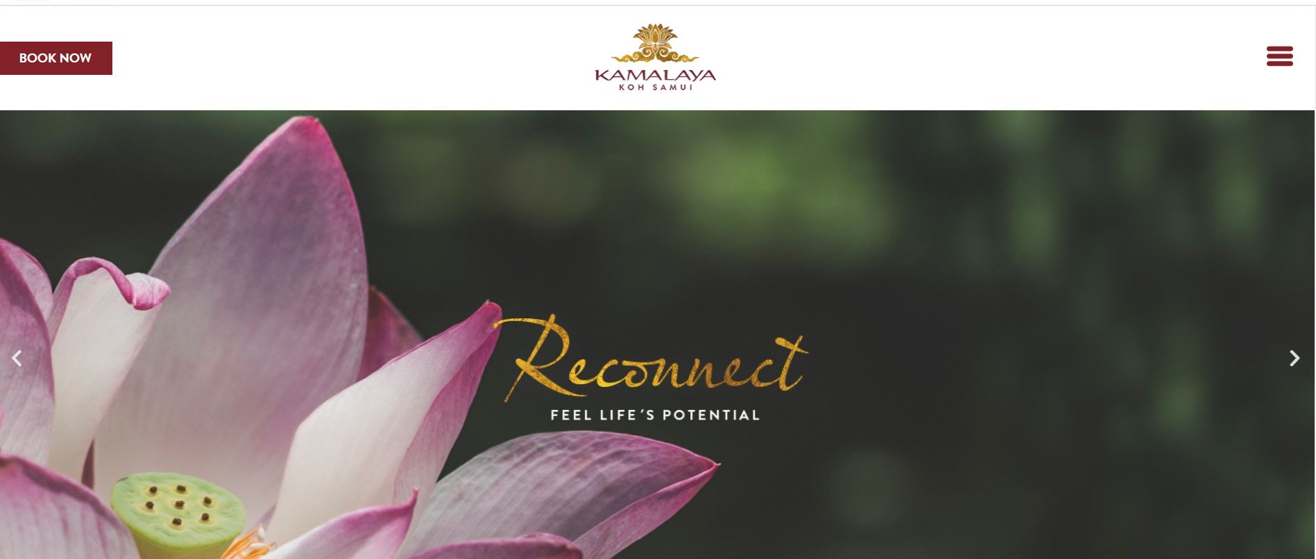
This Thai spa is a haven of relaxation, providing its customers with a relaxing environment to enjoy nature and let go of their worries. Therefore, the company’s website showcases elements of nature.
What We Like About It
When you present your spa, you want to highlight all of the places that your potential guests would enjoy. Having aesthetic photos of these places gives visitors a taste of what they can experience when visiting the site.
The Kamalaya spa uses high-quality pictures of their resort for this purpose. The images are of various spots where guests can relax, meditate, and participate in wellness programs.
The website opens with a carousel of photos. It features a stunning aerial photo of the resort, flowers, a woman meditating among plants, and a group meditating together. These are some of the things that you can see and do at the spa.
For these images, the designer posted keywords that appeal to visitors seeking a place of respite. You may be able to find words like “Healing,” “Breathe,” “Slow Down,” “Discover,” and “Reconnect.” This tells the visitors what they can expect to do at this establishment.
Moreover, Kamalaya offers a long list of wellness programs for its guests. This is featured on their homepage using a slider of images. Each image serves as a link to the corresponding program’s description page, with an eye-catching photo as its header.
Underneath, it lists the essentials of the program: its goals, who it is for, and the professionals you will be working with. Next, there is a concise description of the program itself.
Since each program is available for different durations, the menu presents its inclusions in tabular form. And, of course, there are several buttons to allow visitors to book the program.
2. Shibui Spa
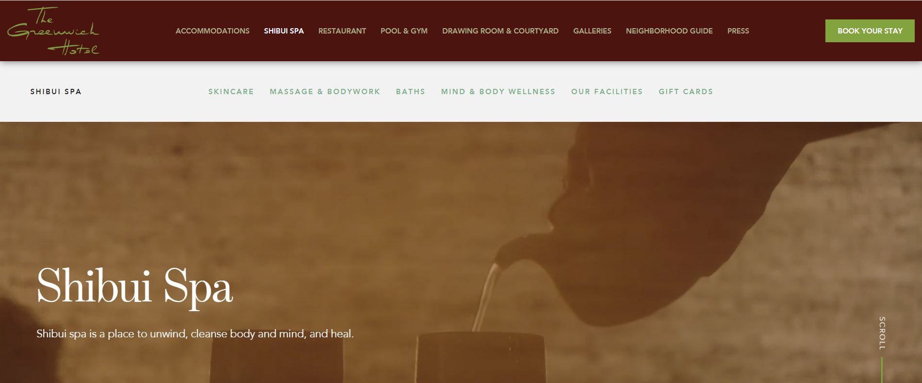
Shibui Spa’s philosophy is all about balance. The elements you find at the spa and on its website are a combination of traditional and modern, as they offer a balance between city life and nature. Here’s how their website reflects their business model.
What We Like About It
Shibui’s website has a video header that gives visitors a glimpse of what they can experience if they book a session there. The video opens with the pouring of tea, a practice in traditional Japanese spas. Then it transitions to a panorama of the spa amenities. Finally, the video ends with a glimpse of a man having tea and a woman being massaged. This highlights the feeling that the spa wishes to give its clients.
When you click on the image link for the spa’s facilities, you will see a grid of stunning photos of the treatment rooms, reception lounge, swimming pool, and soaking tub.
Shibui’s collection has numerous somber and soothing photographs, unlike the typical spa shots, which feature pinks and pastels, flowers, and festive scenes. In addition, the majority of the facilities are dark, which adds to the feeling of relaxation as you receive your treatments.
3. Ayana Resort and Spa
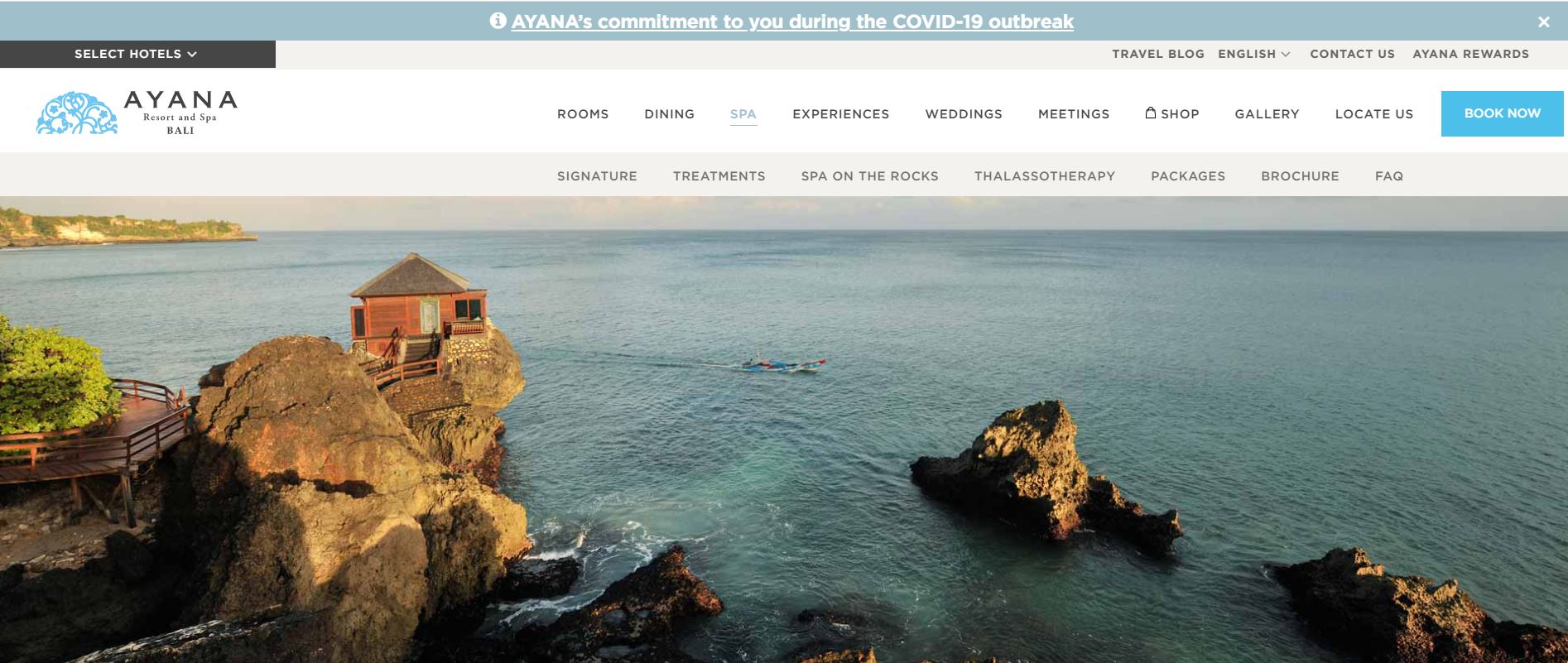
If your spa has a unique feature that no other business has, you should emphasize it on your website. For example, the Spa on the Rocks at Ayana Spa is quite well-known, so it is prominently shown on their homepage.
What We Like About It
The Ayana Spa in Bali is a destination tourists visit for its fantastic ambiance and 5-star treatments. However, it is best known for the ocean rituals guests can receive at their Spa on the Rocks villas. Since it is a unique feature, a large part of the homepage promotes the villas, and the corresponding treatments guests can enjoy there.
Glass encloses the villas’ treatment rooms. As they are surrounded almost entirely by the sea, the view is spectacular. The image the designer used to feature this is taken from the room’s entrance, looking out into the sea. The picture gives the visitor a chance to see what guests do when they visit the spa.
This website also includes one of the essential features for a spa website: a treatment menu. It incorporates a catchy title, a brief description of the procedures, their duration, and the pricing. Each description specifies which method is effective for which body component. It’s simple to comprehend and full of buzzwords like “relax,” “wellness,” “soothe,” and others.
Along with the description, you can find two call-to-action buttons. One is for booking a session, while the other allows you to contact the spa team. This leads to a contact form where visitors can leave their questions and contact details.
4. The Spa at the Equinox Hotel
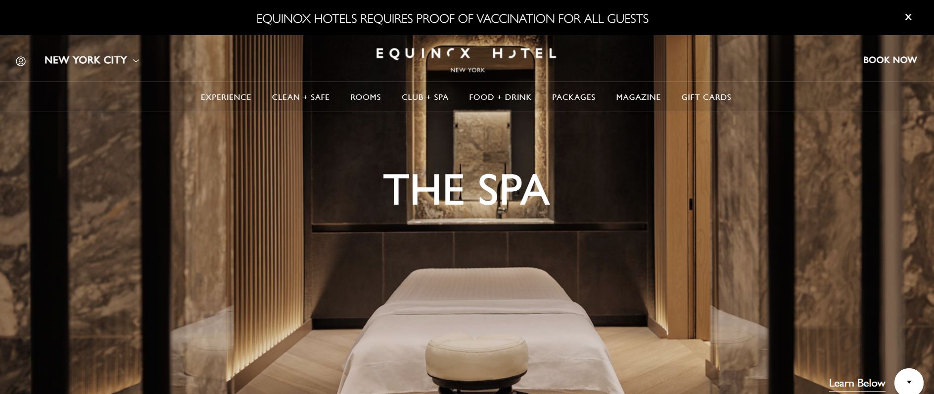
The Equinox hotel in New York houses a luxurious spa. It is an elegant spot, and the website effectively highlights its decadent facilities and technology-driven treatments.
What We Like About It
The website showcases its facility and treatments using gold and red-toned images to match the spa’s atmosphere of luxury and decadence. These pictures play off well against the stark white background of the pages. In addition, the entire website uses black Sans Serif fonts so as not to compete with the images.
Moreover, visitors can find the treatment menu on the homepage. However, since the spa offers various treatments, the homepage would look too cluttered if it showed all the treatment descriptions. To address this, the designer presented the descriptions in a click-to-open menu. Therefore, all the packages and individual treatments appear in a tabular form when clicking on a category. This makes it easier for the visitor to scan the various offerings.
5. Euphoria Retreat
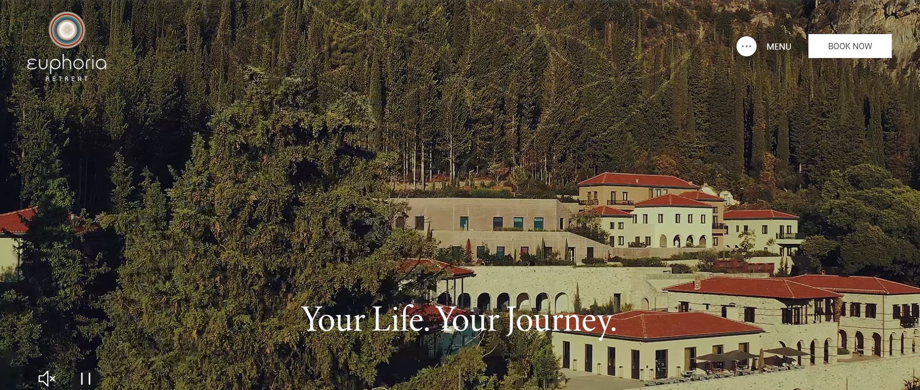
Euphoria Retreat is one of Europe’s leading destinations for the ultimate healthy holiday. Similarly, its website is a sight to behold. It effectively combines videos of the superb location, stunning pictures, and compelling copy to create an appealing website.
What We Like About It
The homepage opens with a video of all the activities and treatments guests enjoy at the Euphoria Retreat. Although the video focuses on showing what guests can do at the spa, it also prominently features a beautiful location.
As it is a wellness facility, Euphoria’s website effectively describes its healing philosophy. The copy explains how the owners view healing and describes the treatments available to support that. Even though the discussion is long, the text is broken down into short parts to make it skimmable. The page also uses stunning images to occupy the space.
Finally, at the end of every page, there is a link that offers personalized assistance. This leads to the spa’s contact information page and a contact form. It also has a map and directions for various transportation options. These features are incredibly helpful to guests, especially if the website features a destination spa.
Conclusion
A spa website needs to invoke the same feelings visitors would get if they walked into the actual space. While some retreat spas go for a nature-based theme, others opt for elements of luxury and elegance. No matter what the theme, stunning pictures or videos of the facilities are a must.
The website should also have a menu of services, contact information for additional queries, and an online booking system. These elements can help you turn casual visitors into permanent spa clients.


