Although podcasts are popular nowadays, many podcasters do not consider creating a website. Instead, they assume that simply having social media profiles is sufficient to promote their podcast.
It is essential to keep in mind that podcasts are also businesses. And every business can benefit from having a good website. First of all, it allows you to streamline your marketing channels. Second, it becomes the hub of all your marketing efforts. Third, the website is where you can get your fans to subscribe to your newsletter. It also becomes the venue where you can post all of your downloadable content. Finally, a website gives you endless opportunities to monetize your podcast.
If you are now convinced that a website is crucial in growing a podcast’s audience, let’s look at these top podcast website designs to see which elements you can use for your next website project.
5 Best Podcast Website Designs
1. The Friday Habit
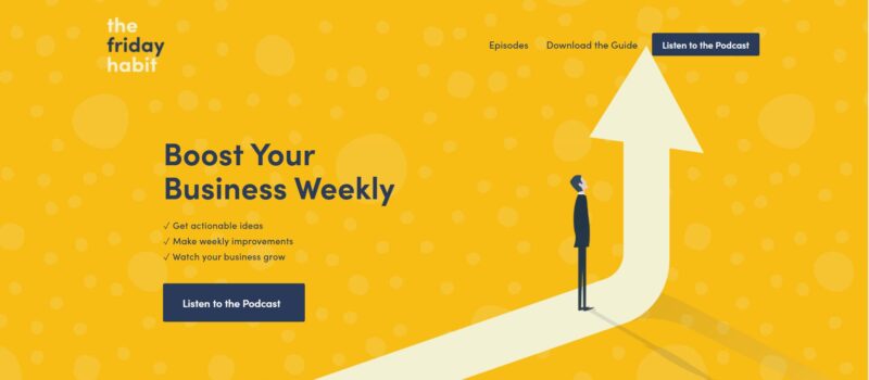
The Friday Habit’s website is a fun-looking website that aims to help businesses grow. It uses bright colors and illustrations to go with the podcast’s selling points. Everything is straight to the point. It’s just an immaculate website with excellent call-to-action statements.
What We Like About It
First of all, the yellow and navy-blue theme is attention-grabbing. The designer used this color scheme throughout the website as font color or background. Each section is neatly separated from the previous one with a change of background color.
Next, the use of illustrations makes the website’s messages stronger. Again, the illustration is nothing flashy. It is just a simple drawing of a man looking confused, working on his computer, or looking at an arrow pointing up. But these simple drawings emphasize the message.
If you are not yet a subscriber, you can play the latest episode of the podcast directly on the website. If you are intrigued and want to hear more, you can click on the ‘Listen to the Podcast’ button directly above the player. There are also links to the different platforms where you can stream the podcast.
Finally, as a bonus and a way to get emails for the group’s email campaign, the website offers a free eBook to its subscribers. This is a workbook that listeners can use to improve their businesses.
2. Twenty Thousand Hertz
Twenty Thousand Hertz is a podcast that talks about the stories behind the world’s most interesting and recognizable sounds. It has all the elements that are needed by a podcast website.
What We Like About It
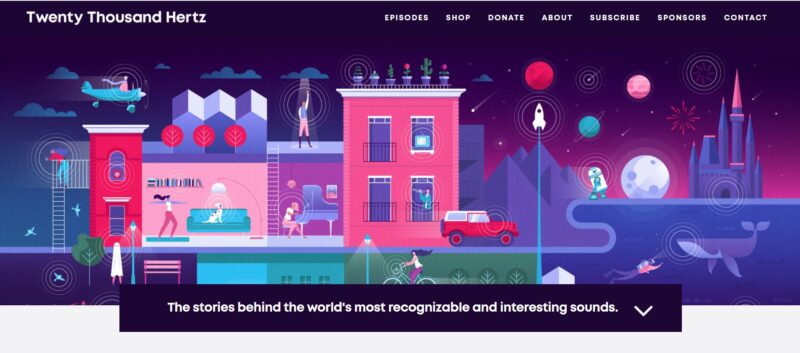
The hero image is an illustration of a city scene and highlights different sound sources. It effectively conveys what the podcast is all about – sounds and the stories behind them. It would have been more fun if the image was more interactive. Indeed, if the image produced sounds when you mouse over them, more people would stay on the site to play with it.
The homepage features a link to the podcast’s latest episode. People who have yet to subscribe can hear a sample of the work to decide if they want to hear more or not. There is a short description of the episode’s content. The description writing is very compelling.
If you are interested in the music used during the episode, the website provides a list of those on the episode’s information page. Subscribing is made easy through the website’s subscribe page. There is an image-based menu on the page to show the different platforms to listen to podcasts.
The website also houses the podcast’s online store. If the fans want to buy Twenty Thousand Hertz merchandise, they can easily click on the Store link. There is also a Sponsor and a Donate button for fans who want to send their love to the people behind this podcast.
3. Gameplay
Gameplay is a podcast that talks about video games and the virtual world. The website’s creator strategically made it to get podcast fans to interact with the hosts and the community. Plus, its visuals are notable too.
What we like about it
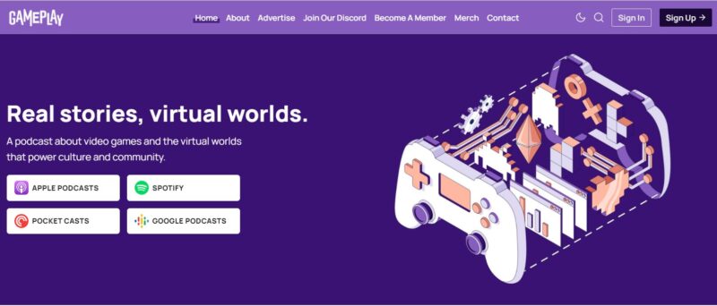
The hero image on Gameplay’s website illustrates a controller that has been opened up, and the parts are taken apart. That perfectly illustrates what this podcast does. The podcast takes apart video games and lets the listeners take a closer look at their elements. Aside from the illustration are links to the podcast’s episodes over four different platforms.
Below the fold, you will find the links to the podcast’s latest stories. The copy is concise yet highly informative. Each picture leads to a page where you can find an article about the topic. You can also listen to the episode about that article on the player embedded into the webpage.
Another good feature which the website uses is its related podcast section. Below the episode’s information, the website offers three more episodes that are related to the topic. This suggestion feature makes it more convenient for the listener to find more episodes that they could be interested in.
As mentioned earlier, the podcast’s creator wants people to talk about the topic covered in each episode. That is why they have a Discord server. You can find the link to that server on the main menu. When you log in, you’d be able to discuss the different episode topics with the hosts and other community members.
4. Vertical Farming Podcast
This podcast talks about vertical farming and indoor agricultural technology. It has strong call-to-action buttons and a unique audio player.
What We Like About It
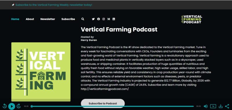
The first thing you will notice when you get to the Vertical Farming Podcast website is the call-to-action links above the fold. First off, you don’t have to click on the link on the menu to subscribe to the podcast’s newsletter.
Next, a bright white “Subscribe to Podcast” is right below the short description of the podcast. This description works as the header of the homepage. You can directly subscribe from the top header.
Below that subscription button, you will see a “Follow Us” button with links to the podcast’s social media accounts.
The website uses a unique audio player. Instead of embedding the player on the page, the designer chose a sticky audio player. As a result, not only will the podcast continue playing as you scroll down to view the list of episodes, but it also stays with you even when you switch pages. In short, you can work on something else on another window while listening to a podcast episode.
Since vertical farming and agriculture, in general, can be a complicated topic, it is nice to see that each episode information page contains extensive notes. There are even timestamps for the audio, as well as notable quotes. What makes the sections unique is that they are tweetable.
If you find a quote that you think is worth sharing, you need to click on it, and you can automatically retweet it. You don’t have to copy-paste the entire thing anymore. Truly, this is a great marketing strategy since people who get to read the tweets will find out that such a podcast exists.
5. The Newsworthy
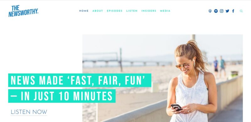
The Newsworthy is a podcast that presents daily news updates. Their slogan is “Fast, Fair, Fun,” which applies to the website as well. This website looks and feels like a magazine article because of the white background and eye-catching images.
What We Like About It
The hero image is a fun photo with the podcast’s slogan printed on it. There is also a “Listen now” button at the top, so you don’t waste any time.
The brief show description is presented in different colored fonts. The regular texts are in dark blue, while the significant words are in teal. That is why, even if the show description is already brief, the visitor’s eyes naturally gravitate to the essential concepts using colors. In short, they can scan the page for important texts and not miss much.
Below the fold are the buttons for the subscription links. The website offers different app options where the visitor can subscribe to the podcast. There is also an audio player embedded on the page, which sticks to the color scheme of the page.
An unusual feature of this website is the “Listener Reviews” section on the homepage. In fact, this is the only site on the list with this feature. Having your listeners’ reviews on the website can help convince new visitors to subscribe to the podcast, which is a valuable element.
There is more copy on the homepage for this website than on the other sites in this list. However, the pages look organized and neat because of the effective use of white space. The feel of the pages, especially the About page, resembles a magazine. A brightly lit photo always accompanies the text.
Conclusion
The main elements in a podcast website are pretty straightforward. Subscribe links are a must. You also need to have an audio player. Moreover, you will also need to make a page where the creator can add some notes for the show. That’s it.
But suppose you want people to stay on your website and keep coming back. In that case, you need to give them an incredible visual experience by making the navigation intuitive and adding relevant show notes. Don’t just type the episode’s transcript there. Instead, make sure that the notes add something to the conversation.
Finally, if you want to use your website to monetize your podcast, include links to your premium content, add a page for your sponsors, and don’t forget to include an online store for your merchandise.


