Best Travel Website Design for Tourism
All work and no play makes Jack dull. This is why it’s so important for the travel industry to have visually stimulating, informative, and well-thought out web designs. In order to be successful, they need to make you stop and check out their packages, rates, and etc. over the others. Here are the top 10 travel industry web designs that will make you stop and catch your breath:
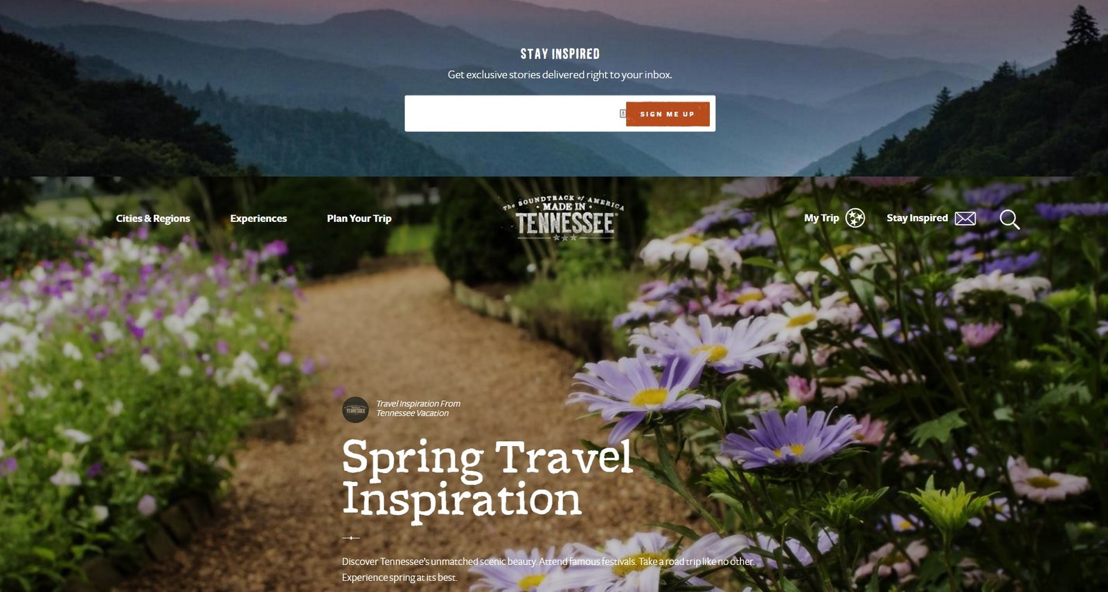
1. Fall for Tennessee
Fall for Tennessee has a unique look that focuses on the beauty of autumn in Tennessee. With a big header and vintage lettering in a gentle color scheme, scrolling offers more beautiful pictures, with attention to detail and vivid descriptions of what to expect and do in Tennessee in the Fall.
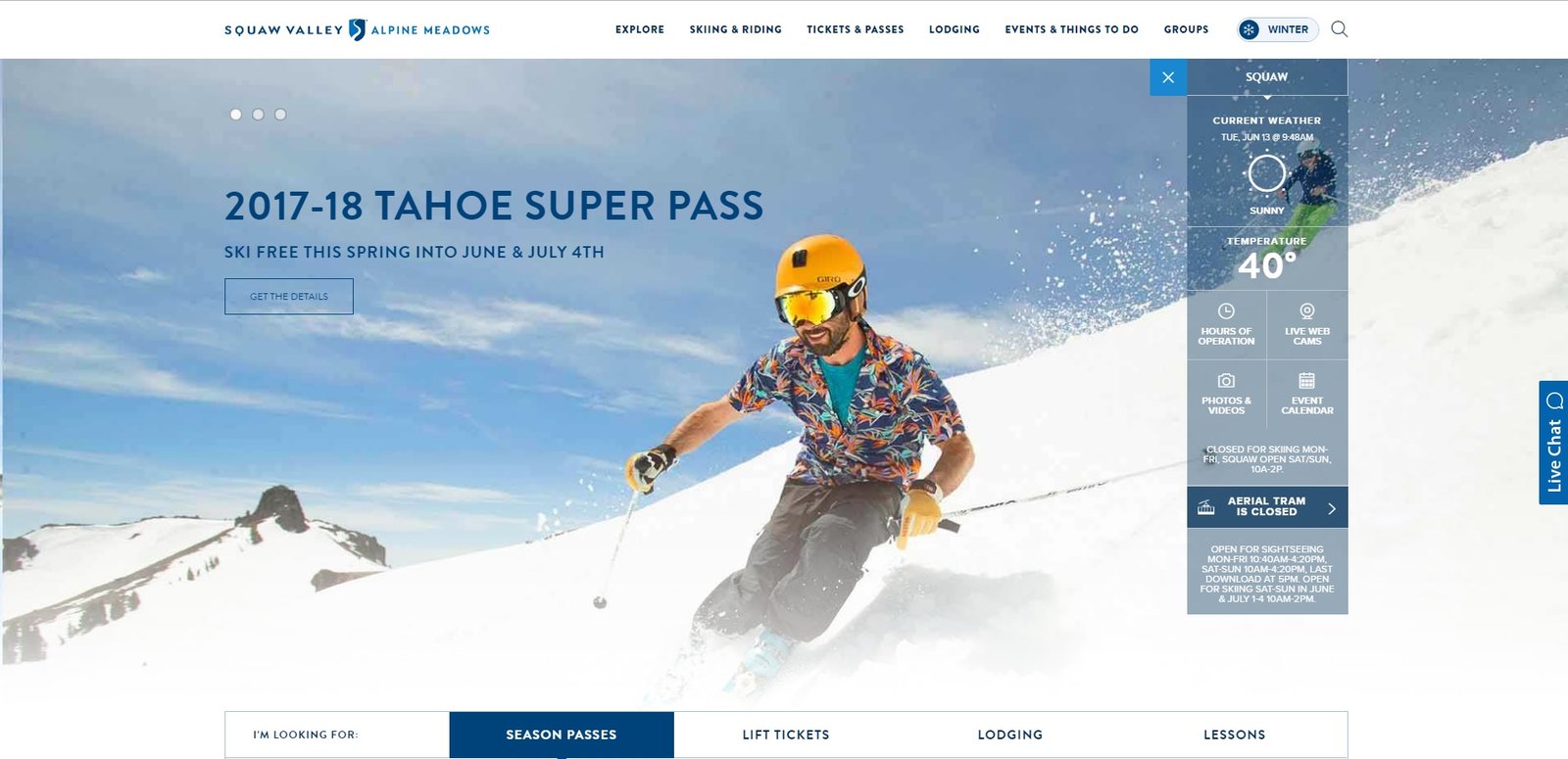
2. Alpine Meadows
Alpine Meadows uses big, bold pictures and incorporates textures into its design. With a clean layout that enables easy navigation, easy check in/out status, and full screen pictures, you’ll get drawn in and start visualizing your own vacation long before you ever click any tabs.
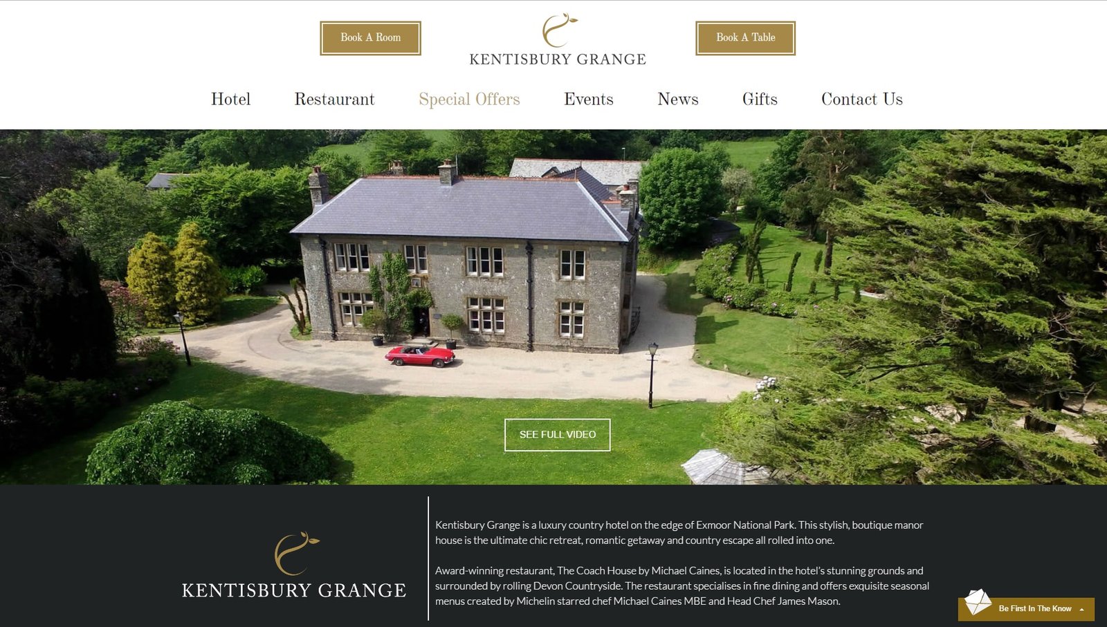
3. Kentisbury Grange
Kentisbury Grange uses a full screen slideshow to appeal to your sense of comfort. The carefully chosen pictures highlighted on the home screen lend no surprises to what you can expect from this travel venue. It basically sells itself. The fact that it opens with an offer to get 10% off your stay is only a bonus on this web page with high eye-candy appeal.
4. Z Ocean South Beach Hotel
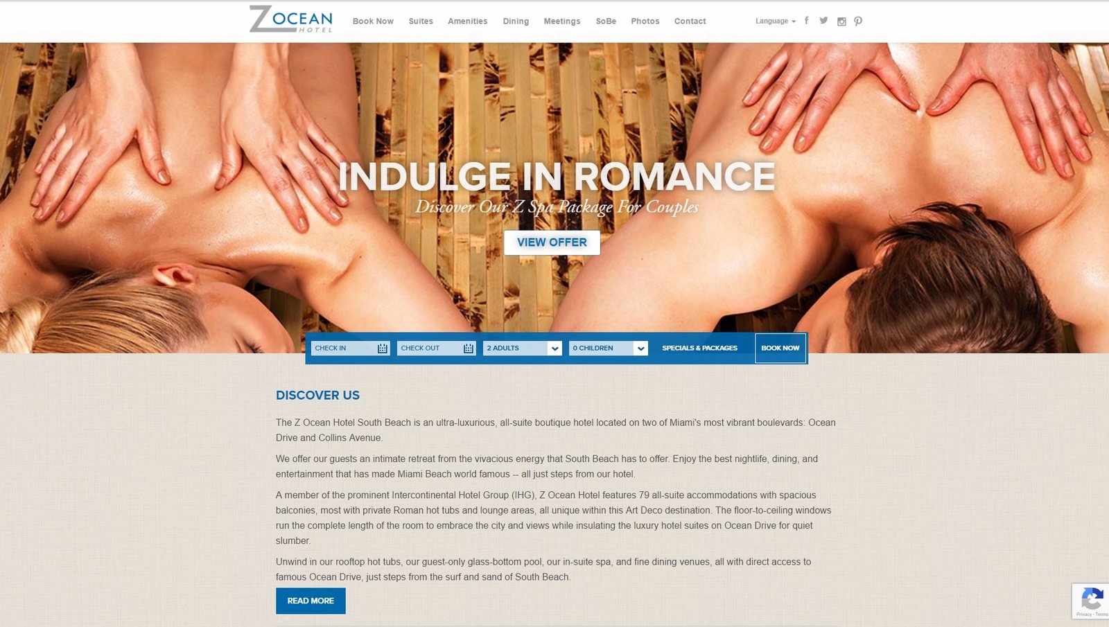
Z Ocean South Beach Hotel offers a modern, simplistic design that invites users to experience a taste of the high-end, yet intimate, beach atmosphere. Through the use of seductive imagery combined with an invitation to “Discover Us” the immediate impact of the website lends the visitor a sense of intimacy. Clickable content boxes featuring images of their suites along with a live-cam feed encourage users to delve deeper into their potential stay.
5. Travel Oregon
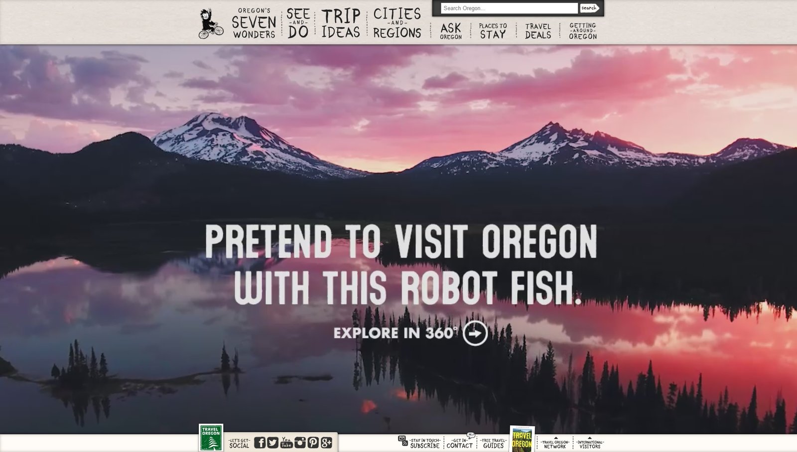
Travel Oregon’s visually appealing web page is helping increase the popularity of the western state. Everything from the drop-down menu to the font and color choices showcase the Travel Oregon brand. Hand drawn sketches throughout the site coupled with the rustic home-grown experience of Oregon, and the little “tips” it highlights, truly make this page stand out.
6. Spotted by Locals
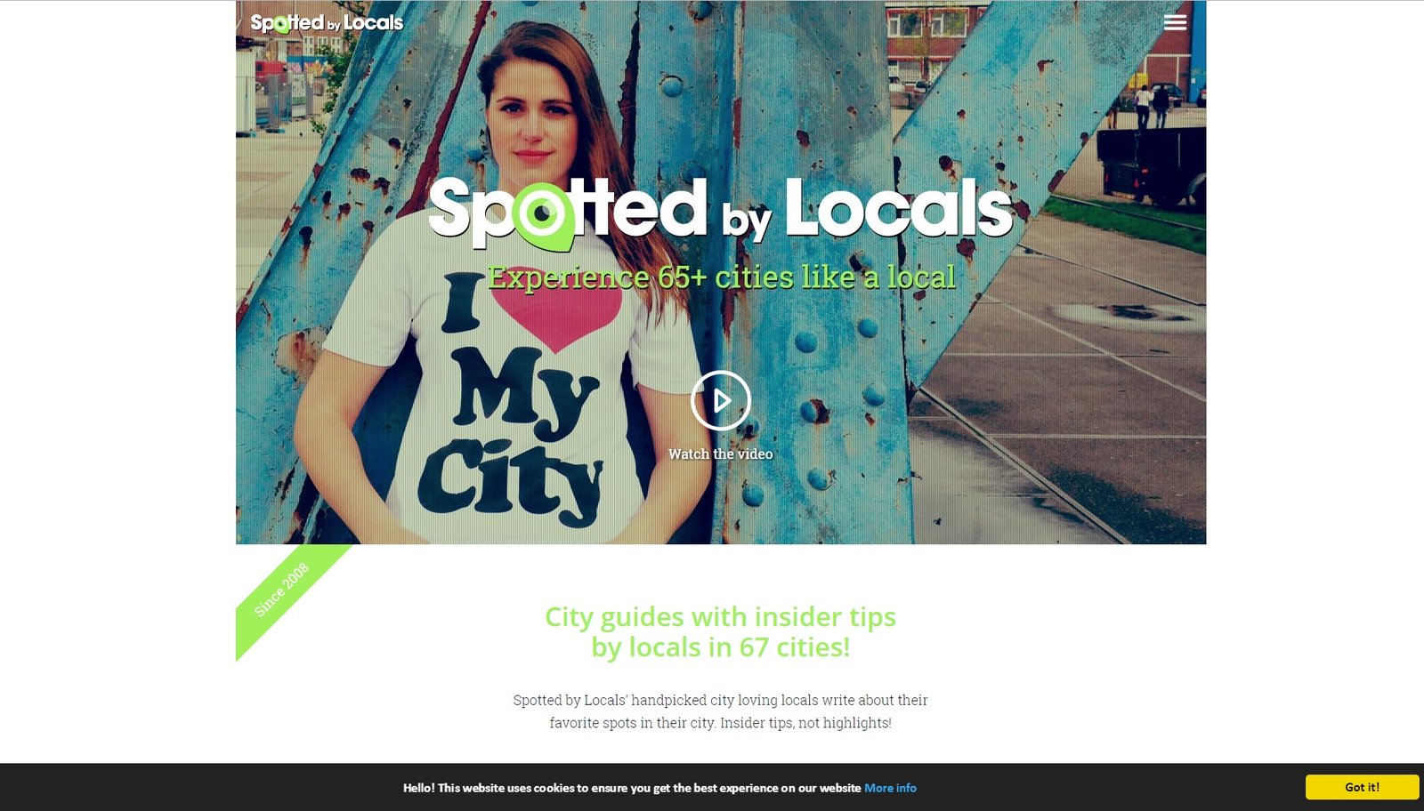
Spotted by Locals goes large with a unique blue/green/grey color scheme, interesting slideshow, and informative page. It incorporates large, clickable boxes to take you anywhere in Europe or North America featured on the site. The downloadable apps are big and bold to make it easier for you to visit this site as often as you need to.
7. Design Hotels
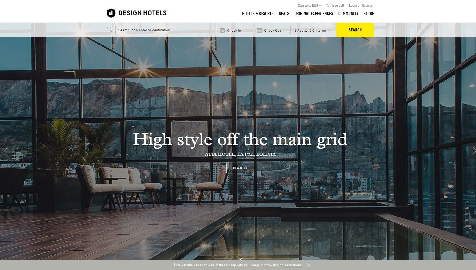
Design Hotels has a clean white background with big flashing pictures showcasing enticing shots of the hotels from all over the world the site sponsors. It’s simplistic design is navigation friendly, and the big world map on the bottom makes it easy for users to find accommodations for wherever they are planning to go.
8. Lets Travel Somewhere
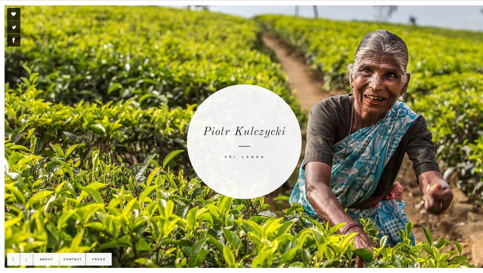
opens bold, with a large scenic picture that fills the screen and a huge clickable circle takes center stage. Once you click the circle, the home page has even more large, scenic pictures in a slideshow that will take your breath away. The purpose is to highlight scenes from Switzerland, and it does its job well. With clean navigation and easy to read content, you’ll find yourself dreaming of life on a snow-covered mountain or running through bright and colorful fields of wild-flowers.
9. Travel Tex
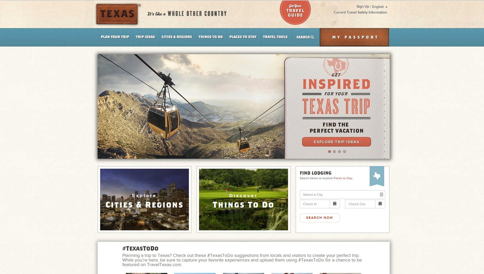
looks exactly as you’d expect it to look—Texas big and bold. Simple, clean, with a fun color scheme and all the tips you’d expect are showcased on this site. They even have a madlib you can fill out describing your vacation. You’ll have so much fun clicking around this site, you’ll have booked your trip and planned your itinerary before you realize it.
10. Paradizo
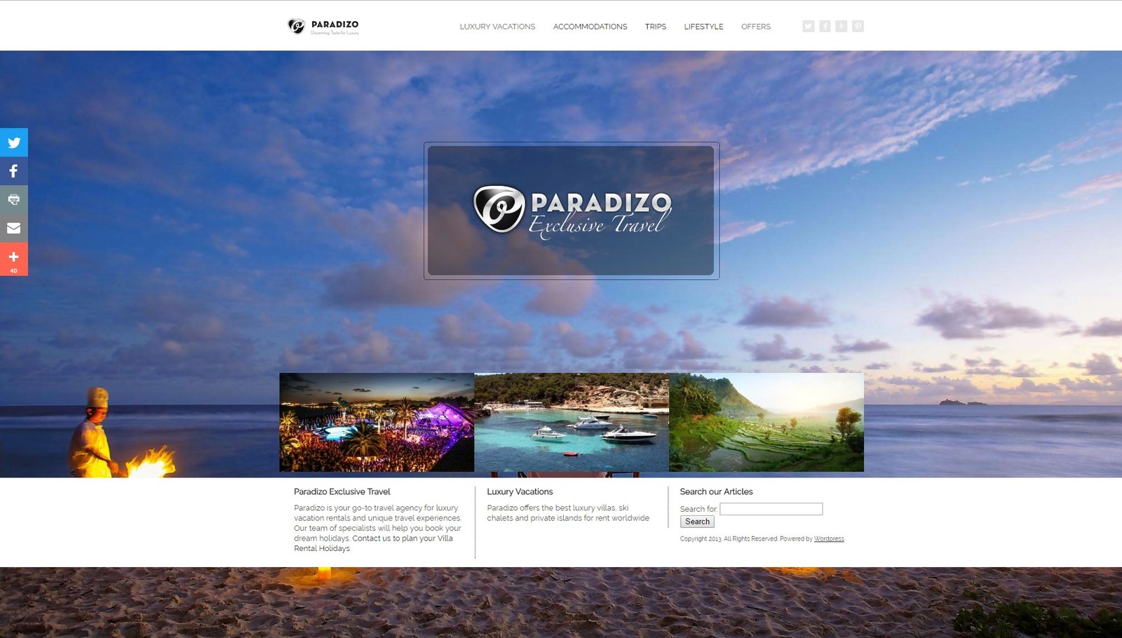
encompasses a website that looks as luxurious as they promise their vacations to be. With a full screen fixed background that has you longing for the beach, it keeps the home page simple, easy to navigate, and ready to book.
Travel is important and so is the appeal. Bigger is better in this era, and no one shows that better than these 10 web designs that will not only delight your senses, but have you craving a vacation. And if you’re in the travel industry, that’s exactly what you want to do. Please contact us today and we can help you achieve Top 10 status with your travel site, too!
