Best Pizzeria & Pizza Parlor Web Design Inspiration
It’s easy to make a bad small business restaurant. This is especially the case with pizza parlors. Here are ten restaurants that moved beyond the stereotypical pizza dive and created beautiful and customer-oriented web designs. If you are interested in creating a site with similar marketing appeal or visual aesthetics, contact us. We can help!
Beau Jo’s
Location: Idaho Springs, CO
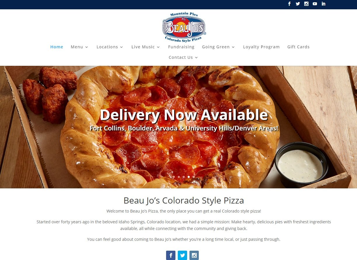
Beau Jo’s recognizes that visitors do not travel to Colorado for pizza. Instead, this restaurant incorporates the stunning landscape of the area into the website to entice customers. The design of the website clearly connects the outdoors with the restaurant.
The Original Pizza Parlor
Location: Iron River, WI
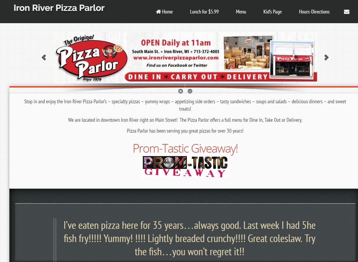
The design of Iron River’s Pizza Parlor uses a color scheme that is consistent with the storefront, making it recognizable to patrons. While the colors are otherwise unnoteworthy, the site is successful at building the brand for the restaurant. Content on the home page is an example of a strong marketing strategy without turning the site into an advertisement. Prominent features include graphics advertising daily specials and a brand apparel store.
Rusty’s Pizza
Location: Bakersfield, CA
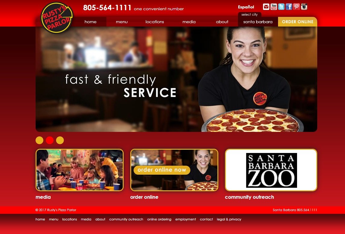
Not only does the Rusty’s Pizza website provide the standard helpful information typically found on a pizza restaurant website, but the design also makes it very clear that Rusty’s is intended to be a staple in the community. Images of smiling children and families indicate that the restaurant is a welcoming environment for people of all ages. One third of the lower menu is also dedicated to Rusty’s community outreach program. This site is not just selling pizza; it is communicating the ethos of the brand.
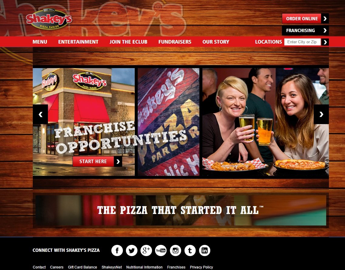
Shakey’s Pizza
Location: Various locations, CA
Here is an example of a classic, well-done design typical of a pizza joint. A red brick background is indicative of the style of the rustic, pub-style cuisine they serve. Despite being a chain, clear efforts are made on the site to connect personally to customers, including social media links as well as contests and giveaways.
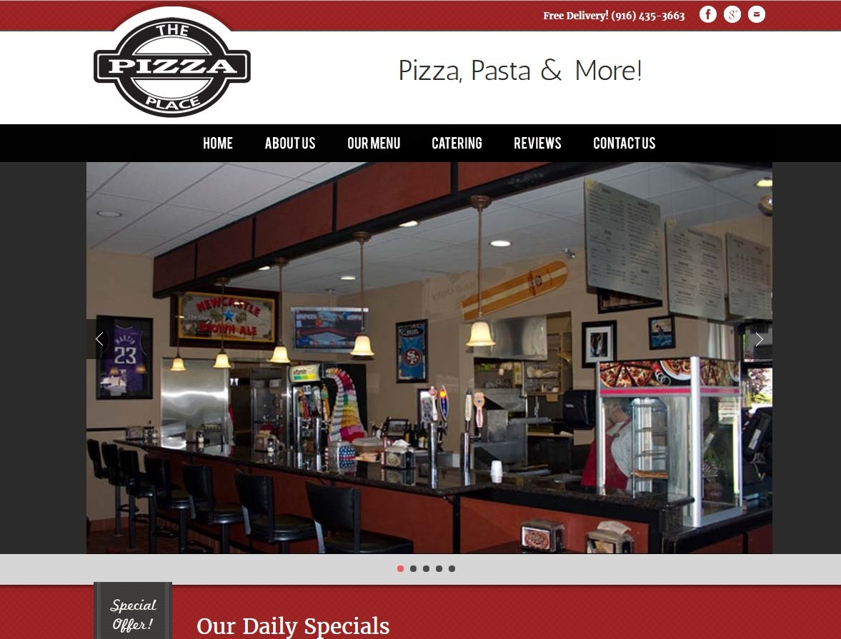
The Pizza Place
Location: Rocklin, CA
Classic red-white-black color schemes can make or break a website. This site’s design manages to soften this stark pallet by including a grey frame. The final product just looks like a pizza restaurant website
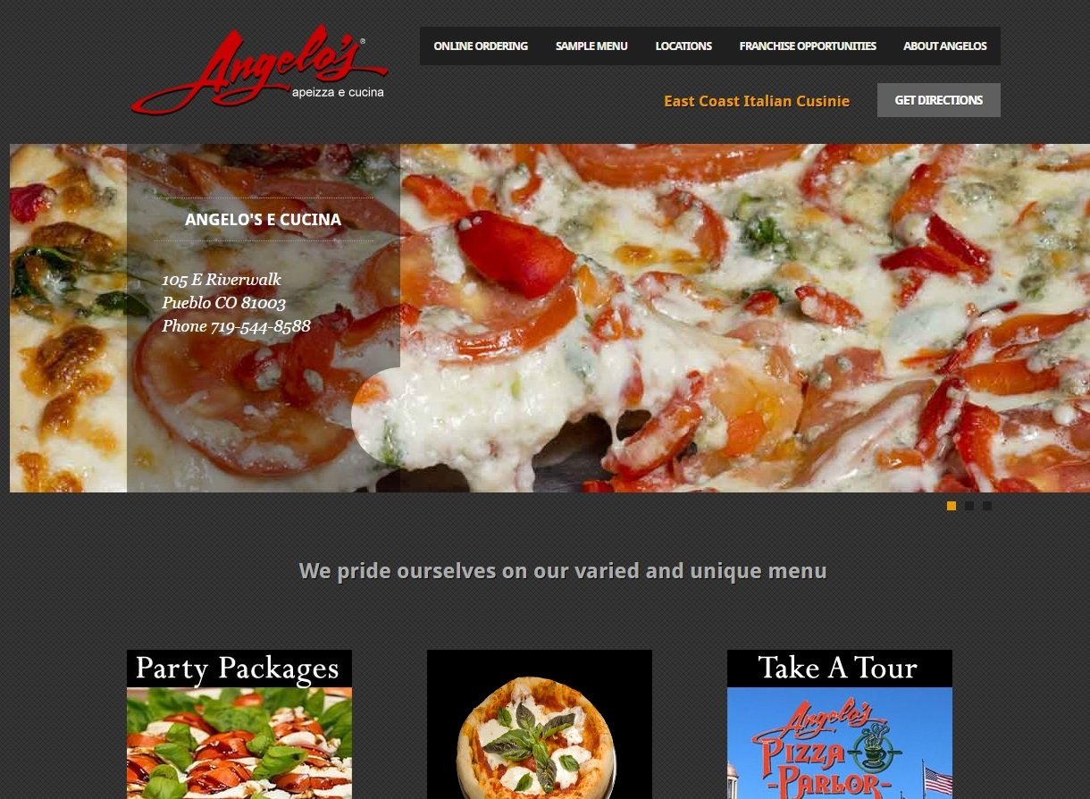
Angelo’s Pizza Pie
Location: Pueblo, CO
This website is an example of well-executed minimalist design techniques. The flat black background and small, sans serif fonts is easy on the eyes and immediately draws viewers’ attention to the images of the restaurant cuisine. An order online button is deliberately placed in the center, making it clear that the primarily purpose of the site is to sell product.
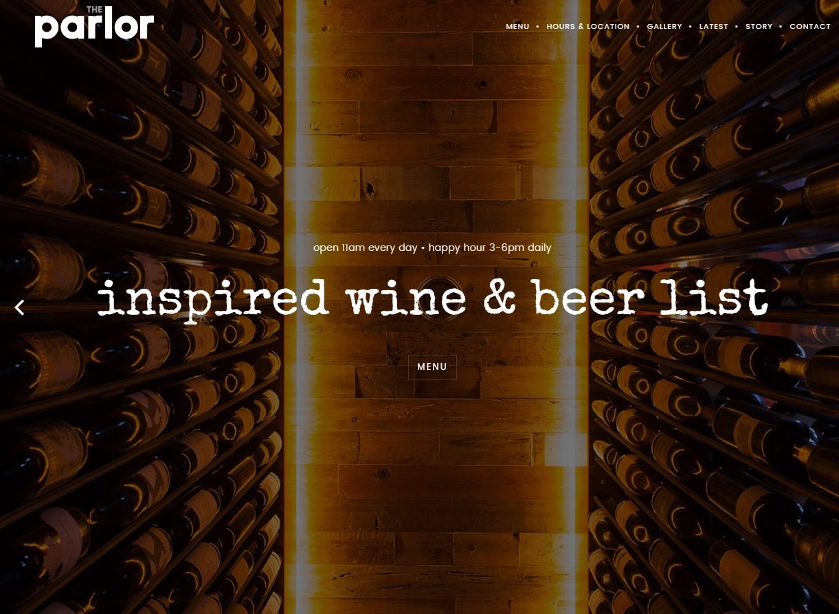
The Parlor Pizzeria
Location: Phoenix, AZ
The Parlor Pizzeria website makes it clear that they are looking to attract a young, trendy customer base. While it can sometimes be seen as a negative approach to inadvertently isolate a customer base, in this case the website sets a standard for the kind of service, atmosphere, and cuisine customers can expect to enjoy at the Parlor Pizzeria.
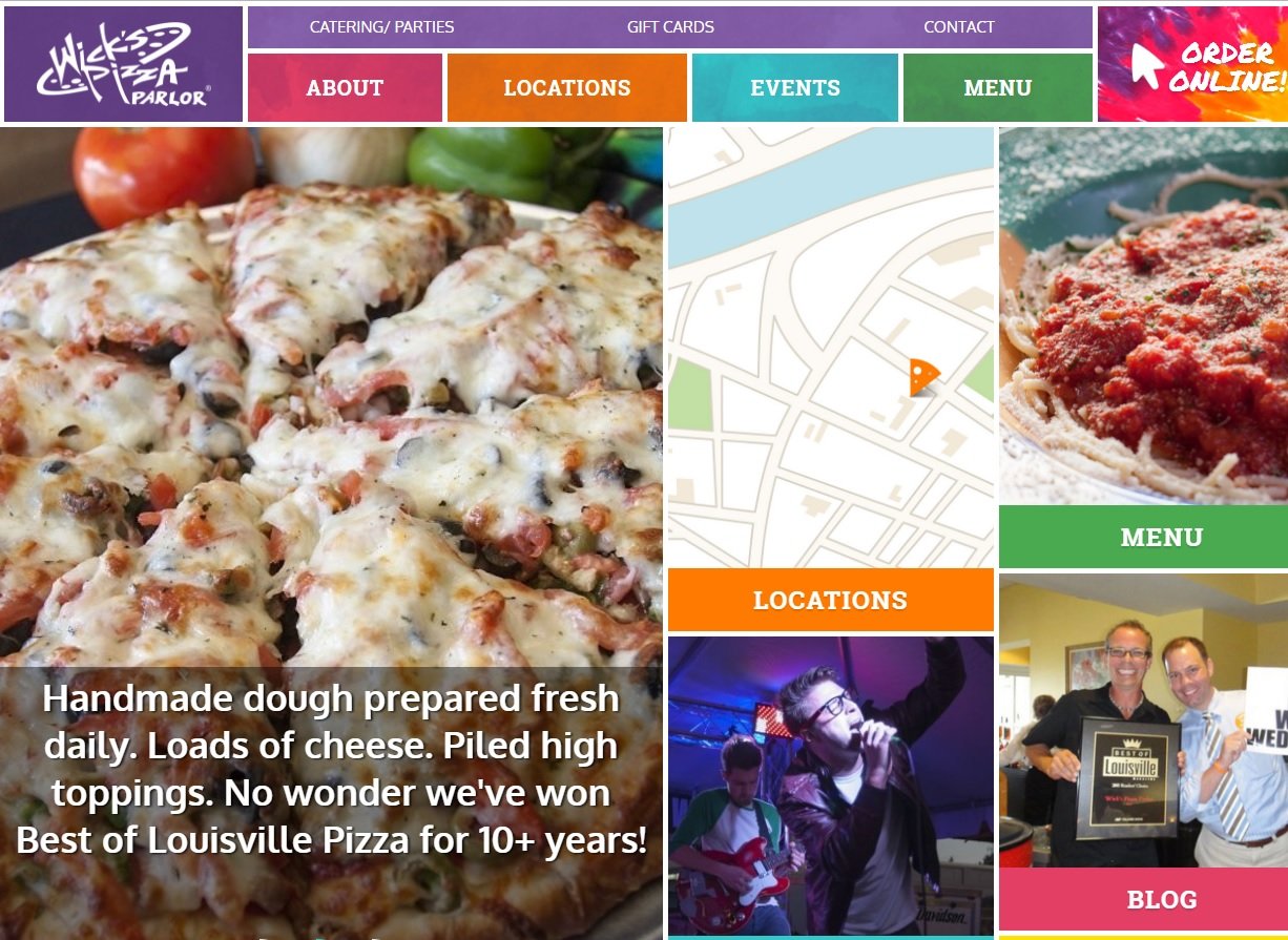
Wick’s Pizza Parlor
Location: Lousiville, KY
This site’s soft, contrasting color scheme and blocky layout is an obvious nod at the Windows 8 metro design. This works well on the site and compliments the restaurant’s tagline, “Keep Louisville weird.”
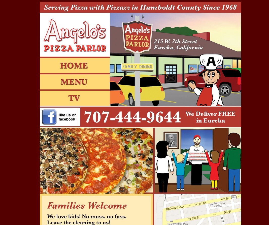
Angelo’s Pizza Parlor
Location: Eureka, CA
Like several other sites on this list, Angelo’s Pizza Parlor is clearly targeting a specific population of patrons. In this case, however, the playful fonts, colors, and cartoon mascot makes it clear, this restaurant knows families will eat where children feel welcomed.
Olly’s Pizza
Location: Pawtucket, RI
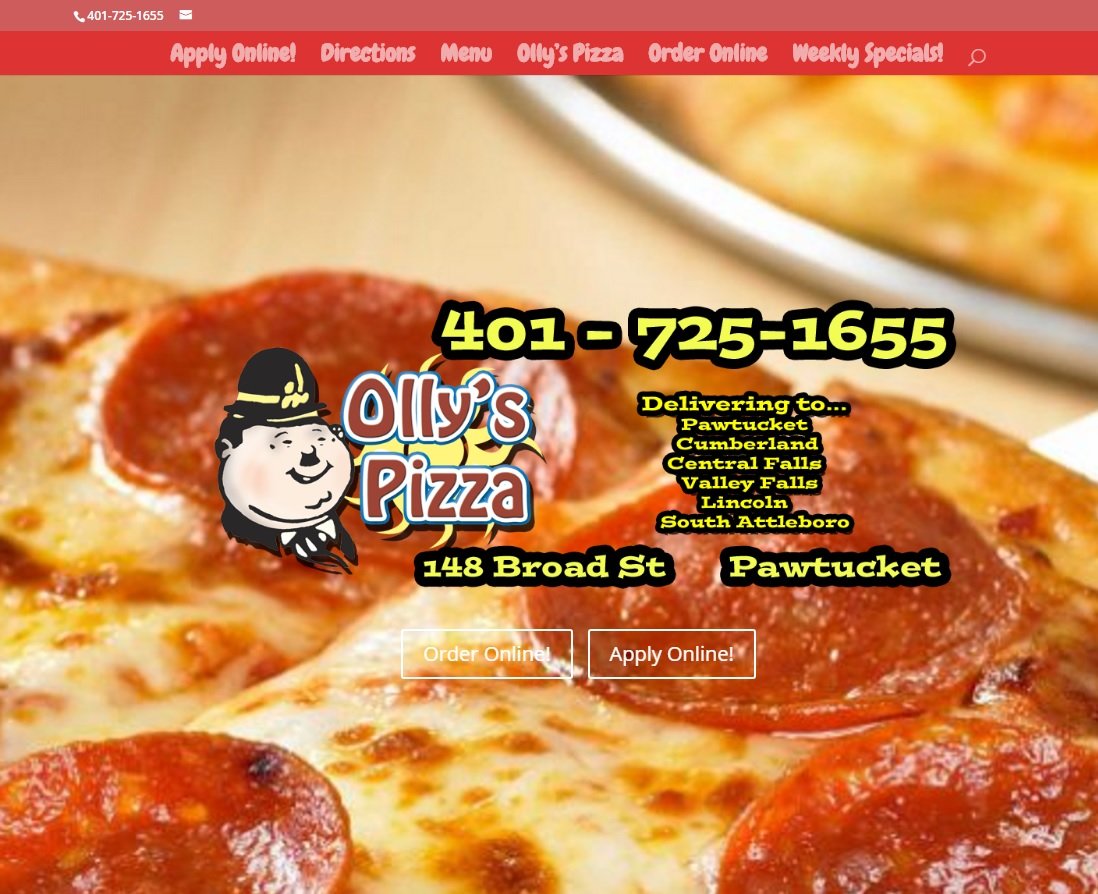
This site is an example of how breaking the rules is sometimes a great idea. In this case, the faux pas is using a fixed, full-window image as the background. Surprisingly, it creates a website that is stylish and easy on the eyes.
