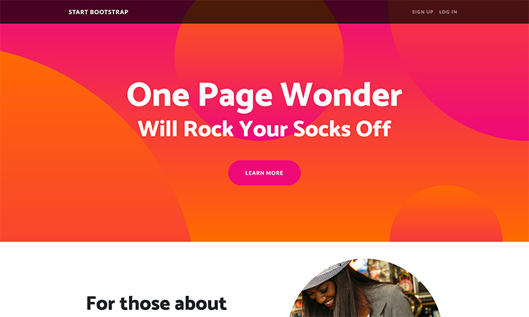
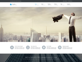
Have you heard about pageless design? What exactly is it, and why should you know about it? If you have a website that earns you money, you probably want to update it so it’s as effective as possible, right? Of course. Pageless design is a way of building a website so that all of the information is displayed on a single page that the user can scroll up or down on. There is no need to click to several pages within a website to download more information or pictures, because it’s all there.

This type of website design is gaining popularity for its ability to provide users with a better experience, drive up conversion rates, and reduce development costs. If you’ve been thinking about changing your business website to a pageless one, here are a few of the most important benefits:
One-page web design is mobile friendly
Pageless design is familiar to most mobile users, because mobile websites have embraced the pageless philosophy for some time. Simple, direct, and fun sites that tell the visitor a story are the norm, and since mobile users have surpassed all others, most people are familiar with the pageless concept already. Most of your prospects are using mobile, so you want to appeal to these visitors. Pageless design and mobile friendly are virtually the same thing.
Scrolling beats clicking
Users are already trained to scroll from using platforms like Facebook and Twitter. That means you won’t have any problem getting them to scroll down your page, even if it’s a long one. By contrast, clicking a link requires a conscious decision to be made, and then waiting for the page to load breaks the user’s concentration. This is a critical benefit of scrolling over clicking to multiple pages. You have a better chance of delivering your entire message to prospects.
Structure your story

On a pageless website, you have the opportunity to tell your visitors your story in the order that you wish. The information is presented in order from beginning to end, or top to bottom, with a clear call to action at the end. Old multi-page websites are at a disadvantage here, because visitors can click any number of links, which disrupts the order that they receive your message. With better structure comes better results, and more conversions.
With the transition of websites from bulky, multi-paged, long download-time behemoths to the new sleek, single page scrollable variety, businesses are making their websites more appealing and effective to the largest portion of the market: mobile users. Most mobile-optimized sites already use pageless design, so people are already accustomed to it. With the advent of social media platforms, users are already programmed to scroll rather than click, which is more effective. Presenting your information in the correct sequence is also much better for website success, shares, and conversions overall.
Pageless design is the way of the future, and it’s quickly becoming the only way to go. Also, development/design for a pageless vs. a multi-page website takes less time to create. It’s a win-win!


