Best Practices for Veterinarian Websites
Most individuals place a high value on their pets’ well-being. This entails buying the healthiest food and the cutest accessories and consulting the finest veterinarian. So, going online to determine which doctor is good enough for their fur baby ensures their pet gets the best care possible. This is why a robust and impactful website is critical to the success of a veterinary business. It’s just as essential as having advanced equipment and dedicated employees.
Here’s a list of features that can be included on a veterinarian office’s website:
- About Us: This section should provide an overview of your office’s history, philosophy, and services.
- Services: This section should detail the range of veterinary services that your office offers, such as wellness exams, vaccinations, surgeries, and more.
- Meet Our Team: Introduce your staff members, including veterinarians and support staff, along with photos and brief bios.
- Patient Resources: This section can include information on pet care, such as feeding and exercise recommendations, downloadable forms for new patients, and reminders for preventive care.
- Testimonials: Share positive feedback from happy clients to build trust and credibility.
- Contact Us: Provide your office’s address, phone number, and email address, as well as a contact form for patients to get in touch.
- Online appointment scheduling: Allow patients to book appointments directly from your website.
- Emergency Services: Provide information on your office’s emergency procedures and after-hours contact information.
- Blog: Regularly publishing informative blog posts about pet health can help establish your office as a trusted resource and improve your search engine ranking.
- Pet Gallery: Share photos of your office’s four-legged patients to show off the furry faces you see daily.
The design of your website is also essential, as it can impact the impression it makes on potential clients. A well-designed website can help establish your brand and communicate a professional image, while a poorly designed site can detract from your credibility.
Here are some tips to consider when designing your veterinarian office’s website:
- Easy to navigate: The design should be easy to navigate and use, with clear headings, intuitive menus, and well-organized content.
- Mobile-friendly: Your website should be optimized for viewing on various devices, including smartphones and tablets.
- Eye-catching: Use high-quality images and graphics to make your site visually appealing and engaging.
- On-brand: The design should be consistent with your office’s branding, including your logo, color palette, and font choices.
- Accessible: Ensure that your website is accessible to people with disabilities, including those who are visually or hearing-impaired.
By prioritizing these elements, you can create a website that looks professional and easy for potential clients.
Of course, ensuring that your site’s content is accurate, up-to-date, and informative is essential, as this will be the primary way you connect with your audience and establish trust.
5 Best Veterinary Websites
1. Park Ridge Animal Hospital
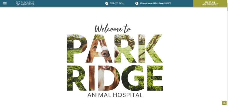
A visually attractive header greets visitors to the Park Ridge website. It also provides a unique and entertaining navigating experience. This makes for an excellent approach to entice visitors and encourage them to review the website’s content.
What We Like About It
With a lovely picture of a dog, the hero image is a see-through cutout of the hospital’s name. To begin with, everyone loves looking at photos of adorable dogs, so this grabs your attention immediately. Second, the page’s overall look is appealing enough to warrant a few more scrolls.
Moreover, the user interface is relatively unique. Instead of a full-page slider at the bottom, it enters from the right side.
In addition, the next page takes you on a tour of the hospital. As a pet owner, you’ll want to know where the veterinarian will treat your pet. Therefore, the photo tour depicts a spotless yet welcoming environment for animals.
You’ll note that the “Make an Appointment” link stays at the top of the page while you navigate the rest of the website. This feature makes scheduling an appointment with the clinic much easier for the visitor.
2. Mendocino Animal Hospital
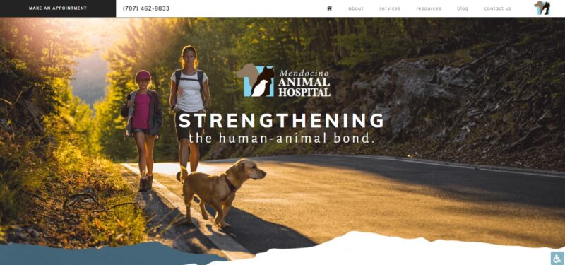
“Strengthening the human-animal bond” is the slogan of this veterinary clinic. The elements on their website demonstrate how they carry out this motto. So, if your brand has a strong vision statement, you’d want to highlight it on your website.
What We Like About It
All of the photos on the homepage depict humans bonding with animals. This aligns with the brand’s philosophy of strengthening the bond between animals and humans.
The homepage appears to be conventional yet effective. For example, each section is divided by a large photograph of humans and animals sharing joy. Furthermore, the website effectively uses white space so the page doesn’t appear crowded.
The text is placed on top of a semi-transparent image of Ukiah’s mountains. This nods to the hospital’s dedication to the community and adds a personal touch to the website. Looking through the pages makes the viewer feel like the clinic, and its personnel cares deeply about the community and its members.
Finally, there is a friendly reminder about the need for preventative care. Any true animal lover would spend a significant amount of time on these pages, as the content is highly valuable and well-written.
3. Veterinary Emergency Group
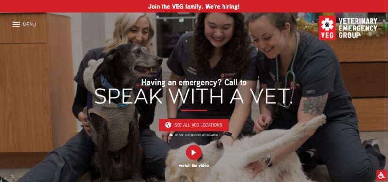
You wouldn’t want to scroll through images of happy-looking pets when your own requires emergency treatment. In such a situation, you want quick access to a page where you can schedule an appointment with a veterinarian immediately. That is precisely what the VEG website does.
What We Like About It
This site is for pet owners whose pet has just taken a tumble or eaten something it shouldn’t have. You’ll first see a photograph of the employees interacting with pets. It’s a reassuring image of the folks who will most likely look after the visitor’s pet.
The button to discover all the VEG branches in your vicinity is the most visible CTA on the header. For example, visitors with a pet emergency would like to locate a nearby clinic and get their pet there as quickly as possible. The web designer organized the branches by state and added images of the buildings, making it a lot easier to find the clinic.
Once you’ve decided on a branch, you can either get further textual information or access the location on the map on your device. Choosing the latter will take you to a website that describes the branch, its address, hours of operation, and an option to call their veterinarian.
4. Pet Poison Helpline
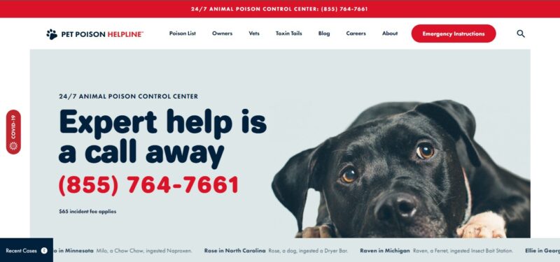
Here is another excellent resource for pet emergencies. The Pet Poison Helpline, as the name implies, is dedicated to dealing with poisoning incidents. The website provides all the necessary information if a visitor seeks assistance for a poisoned pet.
What We Like About It
On top of the hero picture, the website opens with the clinic’s contact information and fee. A pet in desperate need of help is already stressful for the owner. Not knowing how much they’ll have to pay for the services is another issue they’ll have to deal with.
The owner can make a quick choice on this website since the price has already been determined. In other words, clients can decide whether to continue with the consultation or look for a more affordable option.
The next section of the homepage contains emergency instructions. The first question it poses to the visitor is if their situation is truly an emergency. Then it lists easy-to-understand directions to let the pet owner know what they should do.
The website then discusses the clinic’s plans to deal with the problem. Again, the writing has a calm and clear tone to it. Below are client testimonies who have had a positive experience with the clinic. This is meant to reassure pet owners that their beloved animal is in good hands.
The articles on pet safety are another excellent feature of this website. They feature a carousel of photos of typical pet-hazardous items. In addition, these articles include topics such as toxic plants to keep away from your pet. Such informational content is highly relevant and valuable to pet owners.
5. Adobe Veterinary Center
When it comes to their pet’s health, owners must seek the advice of a qualified specialist. You can demonstrate this ability by displaying the veterinarian’s professional affiliations. This is one of the components prominently shown on the Adobe Veterinary Center’s website.
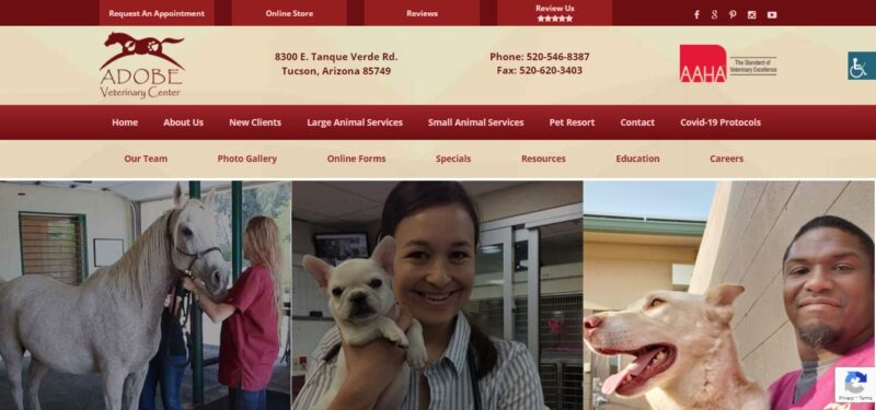
What We Like About It
The Adobe Veterinary Center’s homepage is devoted to ensuring visitors of the physicians’ professionalism and skill. First, the center’s description states that the facility has cared for all types of animals in the neighborhood since 1979. The emphasis on the number of years proves that the community trusts this facility.
The ad then says that the center’s seven vets have 65 years of experience. In addition, every year, each one of them completes approximately 150 hours of continuing education. Not only does this imply that the professionals are well-versed in their area, but it also hints that they never stop learning.
Below the center description, you can see a slider with the logos of the professional associations to which the veterinarians belong. Then, there’s a video about their participation in the American Animal Hospital Association. It defines what it means for a clinic to be a member of the organization. According to the caption next to the video, only 14% of hospitals on the continent are members of this organization.
These features reassure visitors that the physicians at this facility are highly qualified experts. Ultimately, these are indications that they will adequately care for the visitors’ pets.
Conclusion
When pet owners need health care, they look for the most comforting and professional-looking veterinarian in their area. These veterinarian site design ideas demonstrate how appealing images and videos can help attract visitors.
Following that, the veterinarians’ qualifications and consumer feedback keep pet owners returning to the website. Finally, informative content and effective call-to-action buttons help in securing new clients.


