Updated for 2021. Going through a divorce can be one of the most challenging experiences a person may go through. Even if the separation is amicable, it is still a significant upheaval in anyone’s life. If someone is searching for legal help at this difficult time, they will want to see a website that appears genuine and honest.
Every divorce is handled by a family law attorney, which makes family law a highly competitive legal practice field. If you want to stand out among the hundreds of legal firms specializing in divorce proceedings, you will need a compelling professional website to help clients connect with you.
Top 8 Divorce Lawyer Website Designs
We went through hundreds of divorce lawyer websites to identify the best designs that can allow you to stand out and communicate your distinct value to potential customers. So without further ado, let’s take a look at 8 of the best divorce lawyer web designs:
1. Berkman, Bottger, Newman, & Schein LLP
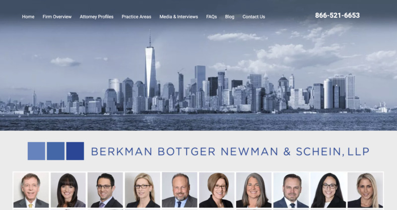
First and foremost on our list is Berkman, Bottger, Newman & Schein, which is a boutique divorce law firm in New York. Their website is easy to navigate and compelling enough to keep you interested.
What We Like About It
When you get to the landing page, you will see professional headshots of lawyers who can assist you with your divorce case. The headshots have a strong presence while still being approachable. This is an excellent strategy since you want to establish confidence and trust with your client as soon as possible.
Once you scroll past the pictures, you’ll notice some written text that discusses the firm’s competence and what sets it apart from other law firms. The text also includes bullet points to make the information simpler to understand.
The color palette used in the web design is warm and inviting. Furthermore, the contact information is prominently displayed at the top of the page, with a contact form at the bottom. This is essential since it allows potential clients to call your office directly rather than going via other channels.
2. Alter, Wolff & Foley LLP
When going through a divorce, an individual often has feelings of rejection and disappointment. In such situations, they’re looking for a helping hand that can not only guide them through the process but also make them feel valued.
Alter, Wolff & Foley LLP is an excellent example of a firm that values its relationships with its clients.

What We Like About It
On the website’s landing page, you will notice that they try to convey their brand value at first look. The firm’s client-first approach is explicitly indicated in giant, bold letters.
As you scroll down the page, there is a passage where the attorneys empathize with the individual by stating how they would work diligently to resolve disputes while avoiding any excessive stress to the client.
The Alter, Wolff & Foley LLP clearly convey that they wish to help you succeed so that you can continue to pick them as your legal advocate. In a nutshell, they are a firm dedicated to generating fruitful results for their clients by working smarter and more efficiently than anyone else.
3. Bank | Rifkin
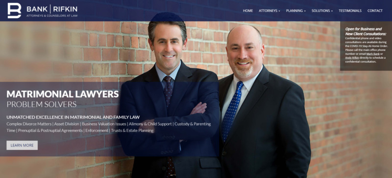
The attorneys at Bank | Rifkin have successfully helped clients overcome years of stalemate by employing practical demonstrations that present both sides with essential facts and information. The firm represents both parties in family court matters such as child custody and support, income allocation, etc.
What We Like About It
The website stands out from the crowd by making a powerful statement right from the get-go. The claim that their attorneys are “problem solvers” immediately establishes the firm’s competence. Following that section is a list of the firm’s family law specializations.
As you scroll down, you’ll come across its compelling vision statement, as well as a grid showcasing professional headshots of its lawyers.
Below that is a pleasant call-to-action that reads, “Let Us Help You.” This CTA effectively gives the potential client a sense of control over the steps they could take going into the case.
Finally, a contact form at the bottom of the page makes it convenient for the clients to contact the firm. This information is skillfully organized in panels on the website, giving it a clean and uncluttered appearance.
4. MacDonald & Partners LLP
Another example of a straightforward design with excellent functionality is MacDonald & Partners LLP’s website. The site establishes authority with its web design but maintains a friendly and compelling feel.

What We Like About It
Right away, the first noticeable feature on the front page is a relaxed photo of the attorneys. This shows potential clients that the firm has individuals you can approach and speak with whenever you need.
Underneath that photo, there is a panel of the legal firm’s specialist areas. The user can quickly determine which category their case belongs to and then click on it to learn more about how the company can help with the circumstances.
Another noteworthy feature is that the website establishes a level of competency by stating that its lawyers are the finest you can find in Canada.
Finally, there is the button that will take you to the contact form. At the bottom of the page, you can also find links to the company’s social media profiles.
Furthermore, there is a phone number given at the top that allows you to call directly from the website. Everything about this website, from the message to the color scheme, gives the impression that you are welcome to contact the company at any moment.
5. Cedeño Law Group, PLLC
The following website on our list is that of Cedeño Law Group, LLC. The firm has over two decades of experience in family law cases. Right away, the website design conveys that you can rely on their attorneys for exceptional legal services.
What We Like About It
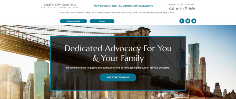
After clicking on the website, the first thing you’ll see is a large city image in the center of the main page. The purpose of this picture is to inform the potential client about the company’s location.
The next feature is the eye-catching claim that the firm delivers “dedicated advocacy” to its clients. A Call-to-Action button follows this right at the center of the page. These will surely grab your attention if you are on the lookout for a trustworthy attorney.
Something that distinguishes this website from its competitors is that it also offers a website form in Spanish. This is an excellent option for native Spanish speakers since it allows them to be more confident in their ability to grasp what is stated on the website.
Furthermore, a side-section states that the law firm offers discounts to firefighters and law enforcement officials. This gives the lawyers a humanitarian appearance, attracting customers who want to work with a firm that expresses moral community values.
Lastly, the other sections of the web design include text that instills trust. It conveys to potential clients why the company is the best choice for them. Adding to this are the 5-star reviews and testimonials from their former clients that give you an insight into how the company proceeds with its services.
There is also a link to the firm’s blogs, which offer advice and information to anyone going through a divorce. This additional information can help educate clients about the procedures and convince them to sign up with a firm that knows what they’re doing.
6. Stanchieri Family Law
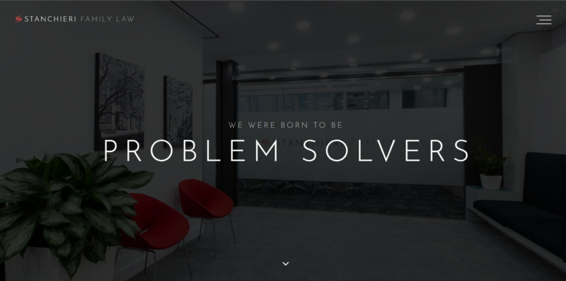
Admittedly, this website could appear intimidating to some people. However, for someone going through a difficult divorce, intimidation may be just what they need.
What We Like About It
The black backdrop of the Stanchieri Family Law website gives off a highly professional and sophisticated impression. The firm’s statement on the main page is that they are born “problem solvers, litigators, and negotiators.” This message can be powerful and effective for those going through particularly complex divorces.
As you go down the page, you will also find formal headshots of the lawyers in the firm. These glamor shots further add to the website’s intimidation factor.
There is also a prominent button at the bottom of the landing page that the user can click on when they’re ready to schedule a consultation. As a result, the customer may find it more convenient to contact the firm, making them more likely to make the call.
7. Eiges & Orgel, PLLC
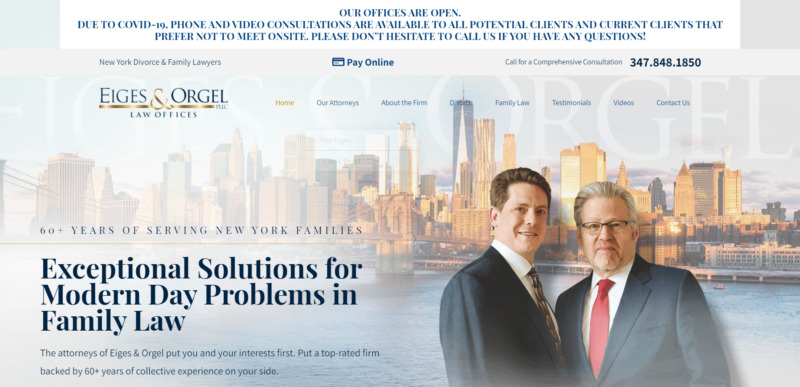
Eiges & Orgel, PLLC is a law firm based in New York, which you can tell right away because of the background photo on their homepage. Their website is dynamic and provides an immersive experience to the potential client, allowing them to navigate their way through the information with ease.
What We Like About It
One of the first things you’ll notice is that the firm has displayed its declaration of experience above its business statement. This would create quite an impression on a client looking for a firm with a lot of experience. In addition, the firm boasts that all of its attorneys are considered “Super Lawyers,” which provides a clear distinction.
The landing page also showcases photographs of cheerful family members. This resonates with potential clients who are concerned about the future of their families following the divorce. Likewise, the paneled selection of the firm’s specialty area is brimming with photos of happy individuals.
Finally, a list of the firm’s achievements establishes competence and distinguishes it from competitors. There is also a section with testimonials from previous clients to prove that the firm gets the job done right.
8. Arami Law, Inc.
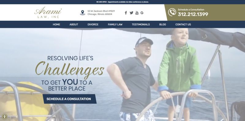
The Arami Law website calls for attention in a more subtle manner. The firm is based in Arizona with over 30 years of experience in family law. They offer premium legal services through their website, television show, and social media platforms.
What We Like About It
The video playing in the background of the website’s landing page is exactly the attention-grabbing element you need to entice your customers. It features families having a good time while engaging in fun activities. The video is calm and muted so that it doesn’t overpower the other section of the page. On the side, you can see a message from the firm along with a button to schedule an appointment.
Following that is a flowchart of the divorce process, complete with links to explain what each step entails. This is valuable since it helps the users be more aware of what to expect.
Moreover, you can find encouraging notes such as “Know you’re not alone” and “Your fresh start is only a phone call away” on the website. These are comforting signals that show the firm’s concern for its clients.
Conclusion
For the most part, law firms are known for their formality. And while there’s no harm in conveying that on your website, this doesn’t mean it should be stiff and cold. The best divorce lawyer websites on our list were able to strike a mix between formal and compassionate.
On the main page, there is always an easy-to-find contact form, a welcoming message, and a statement of expertise and competence. These websites stand out not just because their lawyers are good but also because they make potential clients feel acknowledged and valued with intuitive web designs.


