For manufacturing and industrial firms, marketing once meant showcasing products at trade fairs. They would also place advertisements in trade magazines. However, most manufacturing businesses now recognize that displaying their products on a well-designed website effectively attracts new clients.
A manufacturing website, unlike other trade sites, is not an online store. Instead, the company’s website serves as a lead generation tool. Its main goal is to influence consumer perceptions of the brand, product quality, and customer service.
To offer you an idea of how to create your own, we’ve compiled a list of the best manufacturing websites.
Top Manufacturing Website Designs
1. Viking
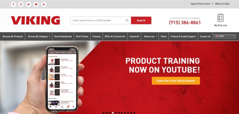
Viking Electronics manufactures communication and security devices. Its website does a great job of showcasing its products while also providing customers with the assistance they require.
What We Like About It
Viking’s website offers customers a lot of services. But, a visitor wouldn’t have difficulty finding anything that he needs. This is because the website’s organization is very intuitive. Its features are arranged on the website neatly and orderly.
If you go to their website to get information about a specific product, you don’t have to click on the menus to hunt for it. Instead, there is a product search box at the top of the page. You can simply input your search term or DOD number.
The website also features a Pick List. This is like a shopping list of the things you need for your projects. When you browse the products, each item has an “Add to List” flag. Just enter your email in the box at the bottom of the Pick List when you’re done browsing. The website will then automatically send a copy of the list to your email. The email also contains the contact information of the distributor in your area. With this feature, you don’t have to write down your list of things to buy manually.
Finding items on their product catalog is easy. Everything is neatly arranged in categories so you can choose from products for the home, campus, office, or industrial. Alternatively, you can also select a category from the drop-down menu under Browse by Category. So, if a client is looking for security products for his apartment’s entry, they need to click on Apartment Entry from the menu. All the Viking items for that category will appear in the search result.
2. Zeon
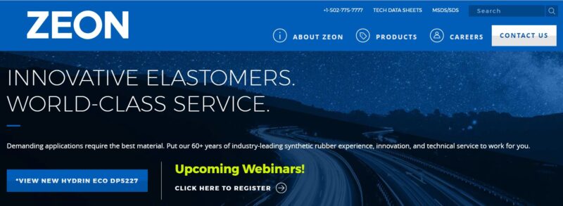
Zeon Chemicals is the world’s leading manufacturer of specialty elastomers. The website quickly informs the visitors what the company makes and what value it offers to potential clients.
What We Like About It
The hero image of the Zeon website immediately makes a strong statement. It boldly states the company’s value statement, “Innovative Elastomers. World Class Service.” If the visitor is looking for a rubber manufacturer, he would know that he landed on the wrong site. However, if he is looking for an elastomer manufacturer, this company can produce whatever he needs with world-class service to boot.
Under the hero, you will find the logos of the different types of elastomers they produce. When you hover your mouse over the symbols, you will see a list of characteristics of each elastomer.
Some potential clients may be unsure which product they need. This is not a problem. The website has a contact form where visitors can leave their information. Instead of the usual Contact Us, the website features the company’s expertise by labeling the link with “Talk to an Expert.” This is a quick reassurance that the company only lets their most experienced chemists deal with inquiries. This simple label states that the company will not waste the customer’s time,
The website makes it easy for visitors to find their needed information. For example, the product page features an information box that summarizes its properties. This box contains the summary and the product’s key attributes. So, if a customer is looking for a particular elastomer’s heat resistance level, he will find it there. Most of the information is also presented in graph form. The visual representation of the data makes it much easier for the visitor to compare products. The website also uses images for the product’s applications so that the visitor can see the product in action.
3. CST
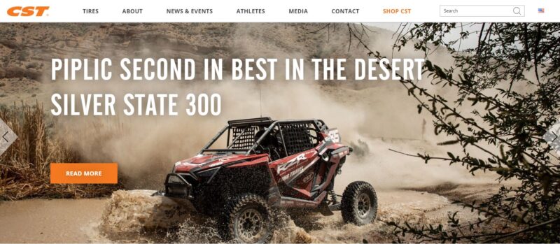
Cheng Shin Tires is the world’s largest manufacturer of bicycle tires. Its website combines creative photos, action videos, and compelling text to gain more clients.
What We Like About It
The website’s homepage knows how to hook its visitors. The homepage offers exciting visuals with very few words. Its carousel header provides a variety of content. For example, one image highlights an award that one of the company’s products received. Another leads to a news article about a winning motorcycle team that uses CST products.
The pictures on the homepage always come with memorable catchphrases. One example is the photo for the motorcycle tires catalog. It boldly exclaims, “Find roads that don’t show up on GPS.” The image appeals to the more adventurous types. These are people who do not rely on their GPS devices to find their next trail. It also sends the message that CST tires can handle the kinds of terrain that are so wild, they don’t appear on maps. When you are using limited text, you need to convey messages effectively.
Finding tires suitable for the visitor’s needs is easy with the drop-down menu. In addition, the two-level menu allows you to widen or narrow your search.
Besides the text description, the website presents the tire information in a tabulated form. It makes the information easier to scan. Each product page also features customer reviews. What’s great about the reviews is they ask the customer to rate the product based on categories. They rate it based on grip, tread life, puncture protection, and value. This is more helpful to buyers than any review that is given in random order. The reviews even contain pictures of the reviewer using the product itself.
4. Marion Body Works
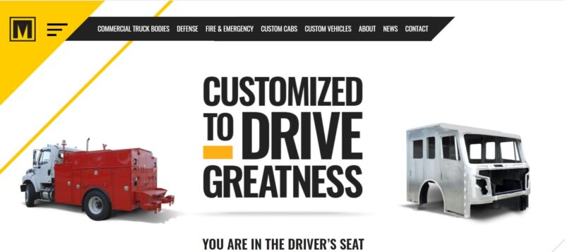
Marion Body Works is another manufacturing company that has a bold slogan. Its website features this prominently numerous times. Additionally, Marion Body Works uses striking visuals to catch the attention of its visitors.
What We Like About It
Marion Body Works focuses on providing its clients exactly what they need. For example, the company’s slogan is prominently displayed on the hero. The use of a bold font with a yellow accent makes sure that the visitor doesn’t miss it. The copy also uses the word “you’ and “your’ numerous times. This emphasizes that the company is there to customize whatever it is that the customer needs.
The company offers a free file containing checklists and tips for truck maintenance to provide their customers something extra. You don’t have to be an existing customer to download the content. What’s great about this content is that it is helpful to truck-owning visitors. Plus, it allows the company to get email addresses that they can use for their email campaign.
You can find informative content about trucks on the website. Visitors can see these blog entries under the News menu. It has articles about questions to ask before buying a commercial truck. It also features tips for maximizing truck longevity. This is quality content. Quality content is essential in boosting the website’s visibility on search engines.
5. Marlin Steel
Have you ever been on a website where you couldn’t figure out what the company does? People who need the service of a manufacturing company are likely very busy. So it should take them only a few seconds to identify what your company has to offer. The designer of Marlin Steel’s website knows this.

What We Like About It
When you get to the website’s homepage, you can immediately tell what Marlin Steel produces. There is an image-based menu right at the top of the page. If you need wire baskets, wire racks, or sheet metal, you can click on the appropriate image and instantly see the company’s catalog.
For every product page, you will find a video that shows how they manufacture the items. Watching the videos makes the visitors stay on the site longer. This increases the chances of converting them into actual customers.
At the bottom of the catalog page, visitors will find links to articles related to those products. For example, an article about budgeting tips for wire racks is linked at the bottom of the page for wire rack shelving. These articles give the visitor extra knowledge about the product. But, more importantly, it establishes the company’s expertise in the industry.
You can find a request form on every product page. This is helpful to potential customers who want to ask for a price quote.
Conclusion
A good manufacturing website tells the visitors exactly what that company manufactures. The website should do this immediately and effectively to ensure that the visitor stays long enough to check the company’s catalog.
You want to incorporate elements that showcase the company’s character and values to attract more patrons. You can do this by using images and videos. In addition, the website should be easy to navigate, especially if the manufacturer produces many different kinds of products. It is also critical that a visitor can conveniently ask for a price quotation on the items.


